5 web design trends for better UX

Even when inspired by the past, top UX designers leverage new tools to bring cultural trends in fashion, politics, music and more to emerging media. This renaissance mentality is the hallmark of good design, and the best designers always have one foot in the future and one in the past.

Below are five web design trends for the renaissance UX designer of tomorrow.

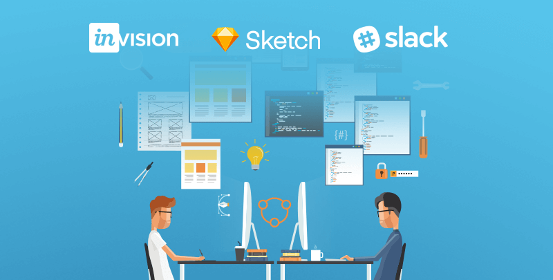
1. Stronger collaboration between designers and developers
As faster delivery times have become the norm, traditional silos between designers and developers are breaking down, creating more opportunities to push for a more interactive experience. Tools such as Sketch, Slack, and Invision allow us to communicate more efficiently across disciplines in the agency space.

This more transparent workflow—often leveraging an Agile framework to constantly test and improve design—allows constant collaboration between designers and developers, resulting in an end product that both looks better and works better.

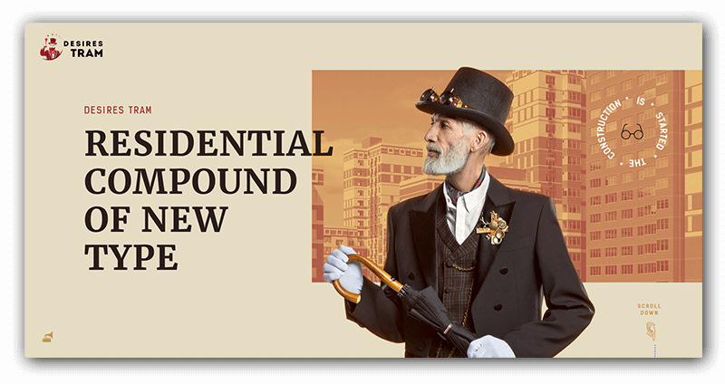
2. Complex layouts that still follow design principles
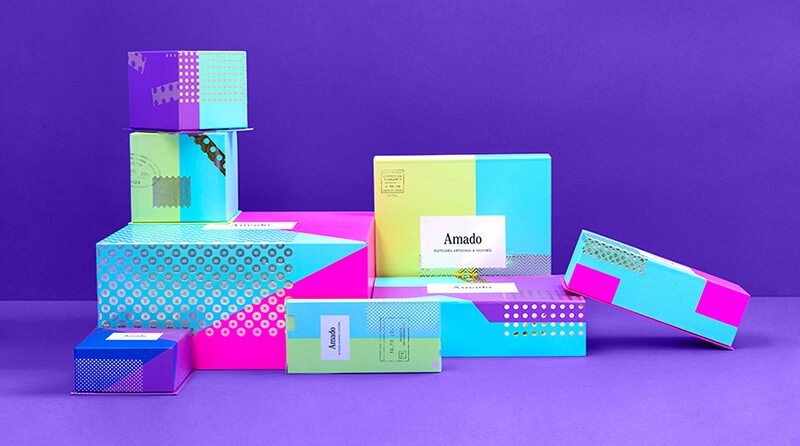
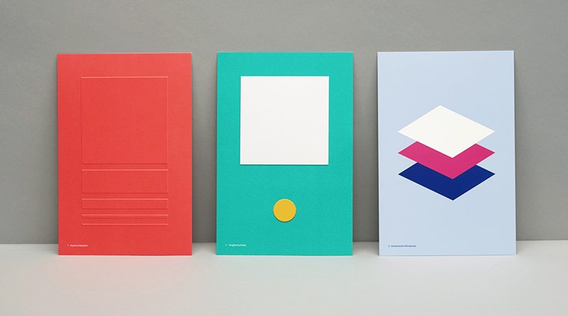
Big layouts with sectional designs provide more immersive experiences. H1s are getting bigger, body copy smaller. Options have broadened—even serif and non-serif now play nicely together. Clearly, designers are moving away from simple composition in favor of pushing the boundaries of web platforms. The future lies in how typography interacts and overlaps with images to create more distinct visual messages. As the focus on brand authenticity sharpens, classic stock shots will (thankfully) make way for custom imagery, and typography will provide the one-two punch in achieving a distinct identity and message. Adidas has always been authentic with their brand and their latest climazone microsite is no different.

3. Interactivity driving the narrative
A good web designer thinks of the experience; a great web designer thinks of the story. Purchasing decisions, both B2B and B2C, are driven by appealing to both rational and emotional needs. Well-informed content that speaks to these needs, uses data the right way, and paints a compelling narrative can make or break consumers’ decisions. Smooth animations between sections gives an extra layer to this storytelling trend. Take a look at this strong example of storytelling and interaction by Red Collar.

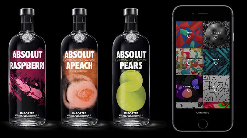
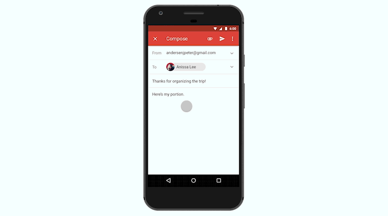
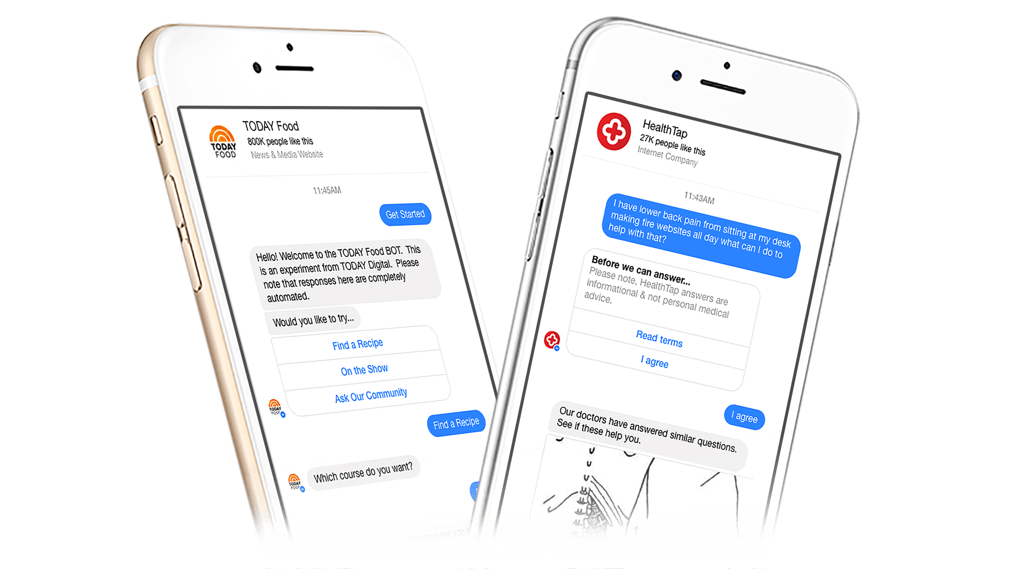
4. Every interface a personalized conversation
Chatbots are becoming the norm for many brands on platforms including Facebook, Skype, and Slack. Not only are chatbots helpful with customer orders and inquiries, they are positively affecting form systems. Exposed forms with multiple entry panels have always been intimidating, and can even cause users to bounce, but chatbot technology streamlines the process and makes the form more of a friendly conversation. This is great for your customers—and for your lead generation.

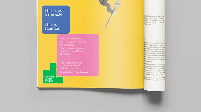
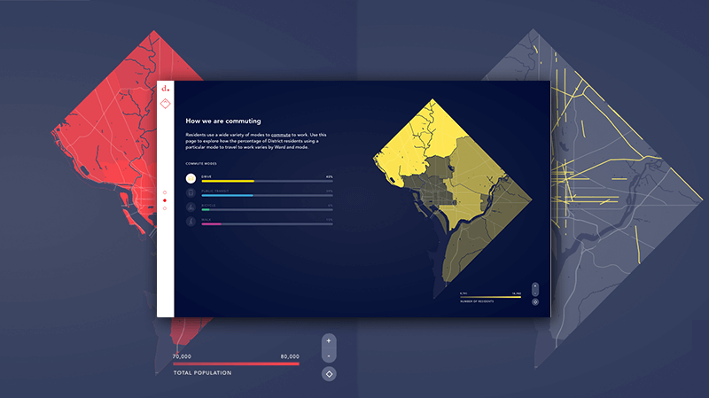
5. Data visualization for more compelling storytelling
Infographics and data visualization aren’t new to the web—it makes sense to visually simplify difficult concepts so they can be better understood. What’s changed is the way these items are being built, with scroll interactions that animate as a user progresses through an experience. The important information base layer is exposed from the start, with additional dynamic layers and elements available if users want to take a deeper dive. Proper design can make even the most mundane facts and figures an enjoyable experience.The DMV is a turmoil of traffic-filled streets, but this clean example breaks that down into very digestible segments.

Technology is always moving forward, design trends come and go—the key is keeping up. The trends above won’t all work in every project—but many can enhance your projects based on clients needs and your personal touch. Being a renaissance UX designer is a mindset; keeping these latest trends in mind will help you build more relevant experiences for your users.

Be kind with your ’80s rewind

You may have noticed the plethora of pinched pant legs, leather moto wear, and geometric patterns on your trips to the mall recently. Or perhaps you’ve begun to notice your favorite TV shows introducing layered, rotated, and juxtaposed elements within the opening credits? Now that millennials are in the cultural power seat, ’80s design has been reborn, and this trendy style is being featured in everything from consumer packaged goods to interior design.

To stay relevant, it is critical for brands to prove they have a finger on the cultural pulse, especially in industries where the product cycle is a few years or less. Design for companies with short product life cycles can be more overtly trendy, but since going full-throttle doesn’t make sense for every brand it’s important to take trend inspiration and tone it down or modify as necessary. You don’t need a box of neon Crayola’s and overly-exaggerated PeeWee Herman-style art deco to imbue designs with some ’80s-lovin’ fun. Below are four tips for embracing this trend, without sacrificing taste or your brand identity.

1. Balance those pastels and brights
Everything in moderation, as they say, and ’80s candy-colored hues are no exception. To temper neons or pastels for a culturally-relevant yet sophisticated look, add a range of neutrals (think blacks, grays, and/or a hefty dose of white space) to the color palette. If neutrals don’t exactly fit well with your bright color scheme, add small percentages of black to each color swatch to tone them down a bit. The new packaging for Absolut Vodka, developed by The Brand Union, and the Vevo rebrand, by Violet office, are both excellent examples of this approach.

2. Bring on the geometry
Incorporating geometric shapes provides visual interest and can be appropriate for audiences of all ages, if executed correctly. Triangles, squares, ovals, and circles used together in bright colors skew a bit “Tangrams” or “building blocks,” which are especially great for a kid-related organization. The newly-refreshed Children’s Cancer Institute of Australia brand modernizes ’80s visual themes by using a staid blue, neutral typeface, and simple layout.

In contrast (pun intended), use just a few shapes blown up as super-graphics, or arranged sparingly in carefully considered layouts with lots of white space, and the style becomes reminiscent of fine art. Saks Fifth Avenue and The Graphcore identity, both by Pentagram, master this approach.

3. Play with patterns
Geometric patterns were big in the ’80s, largely thanks to the Memphis Design Movement. Memphis, like so many trends, actually started in Milan. The look was characterized by geometric motifs, saturated colors, asymmetry, and confetti-like patterns—think Saved by the Bell opening credits. To make your patterns look less Beetlejuice and more Balenciaga, keep the color palette limited to black and white or black and white with saturated colors. Use swatches of pattern, rather than swaths, and leverage large variations in scale for a slightly Constructivist tone. If you’re going to use multiple patterns, use a well-constructed, neutral typography to ground the design. In Pentagram’s MIT Media Lab rebrand, the designers used a black and white color palette and gridded repeats to make the 8-bit inspired pattern decidedly modern. In the Gallery & Co. rebrand below (by Foreign Policy Design Group), the designers used a squared, neutral typeface (GT Pressura) to balance out the primary colors and variety of patterns.

4. Specialty production techniques
One final way to incorporate the exuberance of ’80s design while keeping the look refined and elevated is to embrace high-end production techniques. One of my personal favorites is foiling–achieved when a print house stamps foil into a substrate in a prescribed way. A simple, well-produced touch (like a foiled pattern!) makes room for the use of multiple other ’80s-inspired elements like neon colors, geometric shapes, and patterns to sophisticated effect. The Amado packaging by Anagrama shown below is an excellent example of this technique. Spare applications of a gold foil take the patterns up a level.

Eighties design is all about maximalism and playfulness, so have fun with it! Check out how we applied these tips to incorporate neon colors in a hip, yet clean cut way to shape up a 40-year-old fitness brand.

Work smarter, not harder with Google’s Material Design

Google has been slowly taking over the internet—and the world—for some time now. On average, Google processes 40,000 search queries every second, which translates to over 3.5 billion searches per day. And as of December 2016, Google and its parent company Alphabet, Inc. have acquired over 200 companies in and around the San Francisco Bay Area. Thankfully, in its crawl towards total domination, Google hasn’t forgotten about design.

At the 2014 Google I/O conference, Google introduced Material Design—a design language that seeks to combine the principles of good design with the reality of technology and web. Their hope was to provide a unifying user experience across the entire platform of Google apps and integrations, especially when moving from platform to platform and device to device.

This language was created out of an internal, personal need for the Google design team. With the move to a flatter Gmail UI in 2011 and a card-based system for Google Now in 2012, the team started to build the framework for Material Design. This largely entailed the use of spaces and shadows to highlight (or hide) certain parts of a mobile layout and create a hierarchy of information. By the end of 2016, most of Google’s mobile applications had applied Material Design to their UI, helping to create a consistent experience across the Google app library.

Google Design
Elevation of material objects create a hierarchy of information. Credit: Google

Google Design
YouTube, Google Calendar, and Google Drive. Credit: Google

Google’s Material Design language revolves around three principles:

1. Material is a metaphor: Though a language for web and technology use, ‘material’ is grounded in the reality of tactile feedback and traditional paper and ink. Surfaces behave according to the principles of light, surface, and shadow that we see in everyday life, and edges interact with one another in a very real way.

2. Bold, graphic, and intentional: Elements and style are based on the foundation of good print design. Material adopts grids, scale, color, templates, and type to effectively and strategically create hierarchy, meaning, and focus within the user experience setting.

3. Motion provides meaning: Motion is grounded in real world physics and movements, with user interactions serving to subtly transform the environment while providing direction and focus. Motion creates energy, and natural animations help create an immersive and purposeful user experience.

In an effort to make the language more accessible to web teams and designers alike, the Google Design team created Material.io in 2016. This site houses the principles, techniques, and guidance of the Material Design initiative, along with any releases and components that support them.

Google Design
A visualization of some Material Design guidelines. Credit: Manual Creative

Along with the launch of Material.io, new tools were released to help teams work, prototype, and design products and applications.

Resizer is a popular tool that helps designers quickly view and test typography and image breakpoints across different devices and platforms, while Device Metrics is an exhaustive list of device sizing, aspect rations, resolutions, and densities. The Color Tool helps users create and apply color palettes to the UI using the Material Design guidelines on color and can help with the accessibility and readability of users’ color palettes.

Two tools only available through the Early Adopter Program—Gallery and Stage—aim to help teams with their design workflow. Gallery simplifies the process by putting iterations, presentations, and feedback all in one place. Stage is being developed by the teams behind Form and Pixate, two prototyping services that were acquired by Google in 2014 and 2016, respectively. The beta tool allows designers to prototype and test movement much earlier in the process and helps to speed up the workflow along with an iteration and feedback tool like Gallery.

Design is never done, because the world is always changing. But Google’s Material Design initiative is a unified system created to help you and your team get to a solution quicker and easier. In conjunction with a perpetual beta strategy for web development, a fast and iterative UX/UI design process is becoming more possible. And, by incorporating the guidelines and principles of good, cohesive design into your experiments, you can help users purposefully and efficiently interact with your product, leading to better results and happier customers.

What’s at the center of UX? (Hint: not UI)

Last week, a colleague excitedly forwarded me an article written by a group of digital product designers called, “The Elements of UX & UI Visualized.” It “revolved” around an infographic whose creator took on the arduous task of visually organizing all the tools, inputs, outputs and methods pertaining to both UX and UI within one neat amalgam of concentric circles.

Instead of sharing my colleague’s enthusiasm, all I could focus on was what was in the center of the infographic: “UX and UI.”

“UI is a subset of UX,” I protested, silently. As a Creative Director, I personally value the distinction—but, all too often, I see the terms used interchangeably, and here was yet another example. In my world, they are not synonymous: UI refers to the aggregation of controls and elements that allow a user to interact with a system; UX is the end product of a user interface—the reaction, the satisfaction, the recall. After all, the “X” stands for “experience.”  But then I realized I had an even bigger issue with the infographic’s structure: completely missing from the conversation was the most important element—Brand.

Wally Olins once said, “Brand is the idea you stand for, made real by what you do.” In essence, a brand is the sum of experiences that a person has with a company or organization. Looking through this lens, it becomes clear that UX and UI can no longer be just the names of particular design silos, but must collectively work toward the common goals of an organization. UX and UI both need to be rooted in a strategy informed by an organization’s brand values and mission, with the objective of making the right thing, rather than making wrong things right. To use a very old saying, UX and UI should help us “see the forest through the trees” (occasionally, clichés can be useful).

With any new project, it’s easy to get caught up in the minutiae of methods and process and lose sight of the end goal. While the infographic did a great job visualizing the overwhelming mix of tools and elements that could be part of a company’s solution, it inadvertently became a roadmap for making the wrong thing right. Without brand at the very center of a UX strategy, there is no foundation to inform all the little decisions made throughout the process of creating awesome user experiences. Conversely, when brand drives those decisions, we’re able to craft interfaces and experiences that will truly engage target audiences and forge lasting brand relationships.


Netflix rolls out the red carpet for social media

You have a logo you like. It looks great on signage, business cards and on your website. But how do you make your logo work in a tiny app icon for smartphones? How will it look in a Facebook profile picture or in an Instagram feed? This is the relatively new branding-world challenge that doesn’t seem to have a definitive answer — how to fit your logo in something so small, yet still be recognizable and retain your visual identity.

Faced with this problem, Netflix introduced a new variation of its familiar logo for use in social media. Public statements were quick to clarify that the official Netflix logo — red sans-serif type with a curve along the bottom — is not going anywhere. The well-known logo remains prominently featured on the website, print advertising and other elements of the beautiful visual identity developed just a few months ago by Gretel.

The new social media icon, however, is something of a visual departure. It’s a ribbon-like uppercase “N” that employs trompe l’oeil shadowing to create an illusion of overlapping depth. The original logo’s characteristic curve is cleverly referenced along the new icon’s lower edge.

Visually striking, the new mark appears to be the product of some good conceptual thinking, bringing to mind a strip of film or an Oscar-night red carpet. The initial online reaction is mostly positive, with Facebook “likes” outnumbering dislikes 10 to 1. (One angry commenter wanted to know why Netflix was spending time redesigning its logo instead of addressing more important things, like offering the 11th season of Supernatural)!

Does it make sense to make your customers work harder to find your content, especially after you’ve poured so much money into building your brand’s visual identity? Some have commented that the original logo worked quite well in social media applications, so you have to wonder why this significant departure was developed. A simplified version of the original Netflix logo may have been less exciting, but probably would have been a smarter brand solution.

NRL brand launch

Last week, Grafik was on hand for the launch of the new U.S. Naval Research Laboratory brand. After working with the leadership at NRL for a number of months, it was tremendously rewarding to find ourselves standing with well over 500 scientists and engineers from NRL’s 26 divisions. With live video feed, we were connected to eager constituents at the NRL facilities in Monterey, California and Key West, Florida, as well as those at Stennis Space Center in Mississippi. Everyone was gathered for the big reveal of a brand that had not been touched in more than 50 years.

Dr. John Montgomery, who has been at the helm for more than 40 years brought the keynote address, pointing to the need to unite the distinct divisions and increase awareness of all the truly awesome work that goes on at this 100-year-old institution. He and Captain Mark Bruington, the Commanding Officer, were active participants in the rebranding initiative, and great supporters of our efforts.

“We are always advancing,” said Dr. Montgomery. “And with this new brand, we have a way to showcase that.” At the end of his brief presentation, he unveiled a new logo for NRL, as well as a new mantra — Further Than You Can Imagine® — which serves to underscore the degree to which every division at NRL is advancing engineering and scientific research.

Response has been strong, and staff have already been turning to the online brand toolkit for newly developed templates and collateral materials. A re-skinned website went live on launch day, and there’s discussion underway to evolve the site further.

We are proud of the work we were able to do with this great organization, and we’re looking forward to helping NRL bring this new brand to life.

Google IO 2016: learning curve meets UX

I don’t think I will offend anyone here (except maybe our future overlords), but I find computers to be idiots. They just sit forgotten on a table or shelf all day until you decide to power one up, at which point it looks you in the eye and says, “Here I am, and these are the things I can do for you.” Your computer has never tried to figure you out, at least not very effectively. Well, that’s all about to change.

At last year’s Google IO, Google presented many new technologies that moved toward a more integrated world. Newfangled ideas like Android Wear and Google Photos were interesting, but nothing that could be easily integrated into people’s lives. As far as the typical consumer was concerned, these new technologies were just another thing to be learned and incorporated into our already distracted lifestyles. Adding a new app to your personal lineup is energy consuming, and unless you are really gung ho about using the latest tech, you will likely be slow to adapt.

So what’s a tech company to do? For Google, it seems the solution is creating technology that is no longer learned by people, but rather, learns from people. The idea is that the lazier I am, the more dependent on the technology I become. As a result, the shiny new product becomes successful. Once the parents of our technology, we have become elderly, dependent on it for our care. Our technology has reached its 30s, and can now start paying us back for all those years we spent putting a roof over its head.

One such new learning technology, as we’ll call it, is Google Assistant. Google Assistant will be a personal AI that conforms to who you are and integrates itself into daily activities such as writing messages to friends and reminding you to pick up your dry-cleaning. With a messaging application called Allo, Google Assistant is integrated directly into your chat and, based on the content of your conversation, can recommend restaurants, movie times, and even responses to whomever you are speaking. It seems to me that Google Assistant acts like your little brother who keeps telling you what to do while playing Legend of Zelda.

Him: “Check that corner!”

Me: “I already checked.”

Him: “Kill that spider!”

Me: “That’s what I’m doing.”

Him: “Throw a bomb at it.”

Me: “Stop talking!”

Him: “THROW A BOMB!”

You get the idea. I’m sure that just like little brothers, Google doesn’t intend to be annoying; you’ll just have to spend some quality time together before you can really connect. Allo is set to come out sometime in the next year, so only time will tell how that friendship will develop.

As if that weren’t enough for us to think about, Google’s AI is only one aspect of a full-fledged drive towards the seamless integration of the digital and physical spheres. In fact, perhaps the most important upgrade announced at this year’s Google IO is the Instant App. Instant App is an update for Android operating systems dating all the way back to Android’s Jellybean OS. The new feature will allow users to get access to only the necessary parts of a software without the need to download the whole application. For instance, if you were hoping to visit Buzzfeed and watch one of their videos, you would either have to download the Buzzfeed application or navigate to the Buzzfeed mobile website. If you’re anything like me, you’ll quickly find that a mobile website is hard-pressed to compete with an application that is specifically designed for mobile devices. As such, the app should be the obvious choice, but other factors such as efficiency, security, and lack of storage push users to choose the mobile site instead of the app.

Instant App entirely changes the game. By breaking up apps into smaller components, clicking a video on the Buzzfeed website will summon only the video portion of the Buzzfeed application. No download required. This feature extends for all types of functionality, whether it’s playing videos, making reservations, or making a payment through an app with Android Pay.

This is brilliant in terms of user experience, but even better from a marketing perspective. By giving access to a modularized version of the app without having to go through an entire download, the process of converting visitors to promoters has become as easy as a single press of the finger. The feature serves as a trial version of an application served up any time a person requests content.

Arguably more important than its marketing benefits, though, are the pivotal changes that Instant App brings to the smartphone user experience. The feature effectively eliminates a decision for the user, putting us, once again, one step closer to the seamless integration of technology into our daily lives. If you want to see the whole Google IO conference, follow this link to the Keynote address.

OMG. Instagram is (finally) evolving.

Instagram has launched a colorful new logo and said goodbye to its skeuomorphic camera icon that users have come to know and love. Why would the company behind one of the most recognizable app icons of all time decide to update their image? The company said that its old logo felt “dated” and opted for a more colorful and minimalist design that Instagram feels is more in line with the aesthetic of its app’s users. Instagram has evolved from a place to share filtered photos to a much larger global community of interests where users share more than 80 million photos and videos every day. According to Instagram, the updated logo reflects how vibrant and diverse the storytelling on its app has become. While this may be true, I feel that the new icon is too far of a departure from the charming icon that takes you back to the days of instant polaroid photos.

When a company rebrands itself or simply updates its image, there is always bound to be pushback from the community. Do users like the old logo better than the new one, or is it strictly a visual shock from the status quo? I believe it’s the latter, and after users get past the jokes about the new logo and get used to seeing the new icon on their phones and tablets, they will soon begin to forget about the outdated skeuomorphic design of the old logo. Our attention spans are short, and our phones and tablets are crowded with competing app icons. Although I feel that the new logo is a little generic and lacks the charm of the original design, I do believe the bright and bold redesign will function to distinguish itself from its competition and grab your attention.

What do you think about Instagram’s new logo? We’d love to hear your thoughts. Tweet @grafikdotcom.

Best identities of 2015

Before we settle too deep into 2016, we thought we’d look at three of 2015’s most visible brand updates—plus a less-well known favorite of mine— now that the world has had a little time to interact with them.

Hillary Clinton 2016

What’s a 2015 identity recap in Washington, D.C., during an election year no less, without a presidential candidate’s logo? The design community almost broke the internet with Hillary’s logo reveal. “Way too simplistic!” “Arrow points to the…Right! In RED!” “What was she thinking?” “Rip off of a hospital sign AND FedEx!” The armchair design enthusiasts went on and on. The über-simplistic shapes also invited the inevitable, “I could have done that myself, and for much less money!” chatter that we designers just *love*. Personally, I was ambivalent about it at first—as a static mark it’s an “eh,” but as the campaign wore on, a cool thing happened. It evolved to be a living, breathing, flexible graphic system. Those simple shapes became empty vessels, open to be filled with infinite permutations of colors, photos, and imagery to reflect the electorate, the issues, and the many audiences Hillary tries to reach.

At Grafik, we stress that a logo should not be static and that, ultimately, a brand’s success lies within its endless dynamism. This serves as a great example of how a seemingly simple mark can profoundly inform an entire graphic system and continually evolve a brand.

Google

One of our creative directors and partners, Gregg Glaviano, wrote about the Google rebrand in September, so I will not spend too much time on it. But, I will say this — love or hate the wordmark, Google brilliantly executed a new monogram G, solving the scalability issue of their old logo. From a car to a watch to who knows what in the future, almost no other logo needs to exist across so many media and sizes. A logo system that scales from very large to teeny tiny is a complex design problem to solve. The perfectly compact colorful G rises to this challenge.

Netflix

Eight years after Obama (and just about a million other brands) made the Gotham typeface ubiquitous, I never again expected to love an identity that used it. But I was wrong. The new Netflix visual identity is super smart, endlessly flexible, and visually stunning. The “stack” motif — panels of imagery and information lying atop one another — perfectly drives unlimited dynamic content and executes Netflix’s brand promise to “see what’s next.” Of course, the beautiful imagery of movie stars doesn’t hurt. The logo refresh is a nice wordmark, but unlike Hillary’s H, it does not inform the brand. The entire visual identity system, with its endless graphic crops and beautiful executions, is what makes this rebrand so good.

Plenty of cases suggest a logo redesign is not strategically feasible, forcing branding agencies to think beyond the logo informing the brand. Netflix shows just how evocative a brand refresh can be.

Helsinki Philharmonic Orchestra

On a much smaller, indie scale, the type nerd in me is obsessed with this new identity. At Grafik we’re very familiar with the idea that a company is only as good as its people. Helsinki Philharmonic Orchestra takes this concept to the next level with their new logo. The logo is comprised of a beautifully typeset wordmark surrounded by the names of all 102 orchestra musicians. When reduced in size, the names become lines of various lengths, perfectly replicating the now familiar visual representation of sound waves. The typography is stunning, partly due to the myriad of relationships between the loud, bold headlines and the small, quiet nuance of orchestra members’ names. Along with the typography, the signature visuals are gorgeous—time lapse photographs of musicians that dynamically capture rhythm and sound in still, black and white images. The classic, simple color palette consisting only of black, white, and red goes to show how a good concept executed through beautiful typography sometimes is all you need.

_______________

I’m looking forward to seeing how these brands evolve over 2016, as well as what new inspiration lies ahead.

Putting the fun in functional comfort

Fun fact: the cubicle (or “Action Office System” as it was once known) was not invented to make people feel like soulless drones. In fact, it was Herman Miller’s gift to the 1960s office worker, enabling greater privacy and freedom of movement. Before the cubicle, offices consisted of large, open spaces with standard desks that made no accommodations for peoples’ varying heights and shapes. These three-walled adjustable marvels gave the office worker significantly more control over his work environment­­­—which results in a greater degree of what psychologists now call “functional comfort”.

The idea of “functional comfort” —that an employee’s comfort impacts productivity, and that each individual perceives factors like temperature and privacy differently depending on the task performed—is relatively novel in modern workplace design. Studies clearly show that flexibility is a major factor in maintaining productivity, suggesting office workers prefer private enclosed workspaces for individual tasks, but may be more effective at completing teamwork tasks in an open space.

Google has famously shaped its future corporate utopia around this idea of continuously flexible workspaces, with a modular city that can be endlessly reconfigured for changing needs. Google’s vision has even softened the distinction between interior and exterior space, with trees planted throughout the workspaces and a biome-like shell that allows for uninterrupted views of the outside. This blending of physical spaces is not unlike the blur Google has spurred between our physical lives and online lives through technology and accessibility.

As I write this blog, I relax on a couch in one of our enclosed work rooms, listening to jazz guitar. These introspective conditions are far more conducive to my current task than sitting at my regular desk in the open work space with all of its distractions. The workplace revolution is ultimately about control over one’s environment, whether that means working outside the office, or making the office a place where employees choose to spend time, where they feel most inspired, and ultimately erasing the mental creative boundaries between work and life.

Level up! Raising the bar on virtual home tours

One of the biggest challenges for homebuilders is getting someone to invest in a home before there’s even a model for them to tour (let alone their future home).  How do you accurately convey the beauty and elegance of an entire soon-to-be neighborhood when all the buyer can see is a dirt lot?

For years, we’ve been using CGI, or computer-generated imagery, to help our client, acclaimed regional developer EYA, get around this challenge. Anyone who has seen a recent Hollywood action flick or is hooked on role-playing games knows how far CGI has come in the last decade. Animated renderings of kitchens, exterior facades, and the neighborhood—incorporated into real HD video—help buyers imagine themselves in their new homes. EYA’s new townhome neighborhood, Grosvenor Heights, is located in a lush, wooded oasis—highly unusual for a downtown Bethesda location. Buyer feedback and website analytics supported our determination that we had to do far more than say this secluded yet central location is unique—we had to prove it.

“We decided to get airborne to offer a true 360-degree perspective that is immersive, authentic, and aspirational,” says Johnny Vitorovich, Grafik’s lead creative director for EYA. “We delivered by shooting from a drone.”

Collaborating with our photographer and videographer resources, our drone footage leads you into the neighborhood with a tree-top, birds-eve view, setting off these townhomes in a way words simply can’t convey.

“This is a powerful tool for EYA,” says Preston Innerst, EYA’s VP of Sales and Marketing. “Shooting from a drone lets us capture the experience of living in our homes and neighborhoods like never before. It’s a game changer.”

Grafik wins big at the 2015 W³ Awards

Grafik is proud to announce that we have been recognized with seven Silver W³ Awards for 2015 for our work on a campaign for the Cystic Fibrosis FoundationIAP websiteThe Frasier by Bozzuto website, EYA’s Montgomery Row website and video, OpenGov website, and Waldron Private Wealth website.

“Third party recognition is very rewarding—it’s objective and speaks to the real impact our work can have,” says Lance Wain, President of Grafik. “I’m thrilled not only by the number of awards this year, but also by the variety of the clients and the very different needs we addressed.”

The W³ Awards honor creative excellence on the web, and recognize the creative professionals and clients behind award-winning sites, videos, and marketing programs. Whereas other major web competitions tend to skew heavily toward recognizing projects by large, worldwide brands, the W³ Awards is the first major web competition to be truly accessible for all kinds of clients, agencies, and budgets—influenced only by the creative and strategic value of the entries. Our work was hand-selected by the Academy, an invitation-only organization that consists of highly respected media, advertising, and marketing professionals.

Grafik
Privacy Overview

This website uses cookies so that we can provide you with the best user experience possible. Cookie information is stored in your browser and performs functions such as recognising you when you return to our website and helping our team to understand which sections of the website you find most interesting and useful.