You may have noticed the plethora of pinched pant legs, leather moto wear, and geometric patterns on your trips to the mall recently. Or perhaps you’ve begun to notice your favorite TV shows introducing layered, rotated, and juxtaposed elements within the opening credits? Now that millennials are in the cultural power seat, ’80s design has been reborn, and this trendy style is being featured in everything from consumer packaged goods to interior design.
To stay relevant, it is critical for brands to prove they have a finger on the cultural pulse, especially in industries where the product cycle is a few years or less. Design for companies with short product life cycles can be more overtly trendy, but since going full-throttle doesn’t make sense for every brand it’s important to take trend inspiration and tone it down or modify as necessary. You don’t need a box of neon Crayola’s and overly-exaggerated PeeWee Herman-style art deco to imbue designs with some ’80s-lovin’ fun. Below are four tips for embracing this trend, without sacrificing taste or your brand identity.
1. Balance those pastels and brights
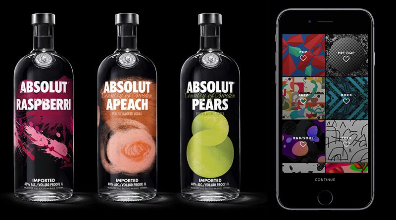
Everything in moderation, as they say, and ’80s candy-colored hues are no exception. To temper neons or pastels for a culturally-relevant yet sophisticated look, add a range of neutrals (think blacks, grays, and/or a hefty dose of white space) to the color palette. If neutrals don’t exactly fit well with your bright color scheme, add small percentages of black to each color swatch to tone them down a bit. The new packaging for Absolut Vodka, developed by The Brand Union, and the Vevo rebrand, by Violet office, are both excellent examples of this approach.
2. Bring on the geometry
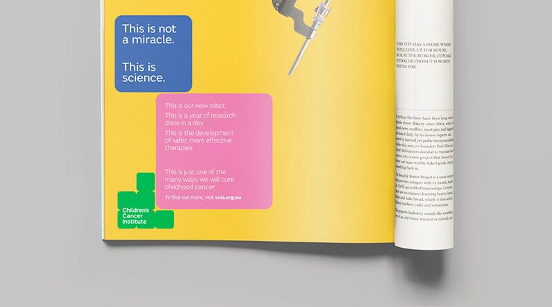
Incorporating geometric shapes provides visual interest and can be appropriate for audiences of all ages, if executed correctly. Triangles, squares, ovals, and circles used together in bright colors skew a bit “Tangrams” or “building blocks,” which are especially great for a kid-related organization. The newly-refreshed Children’s Cancer Institute of Australia brand modernizes ’80s visual themes by using a staid blue, neutral typeface, and simple layout.
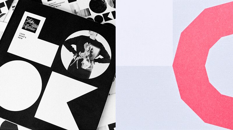
In contrast (pun intended), use just a few shapes blown up as super-graphics, or arranged sparingly in carefully considered layouts with lots of white space, and the style becomes reminiscent of fine art. Saks Fifth Avenue and The Graphcore identity, both by Pentagram, master this approach.
3. Play with patterns
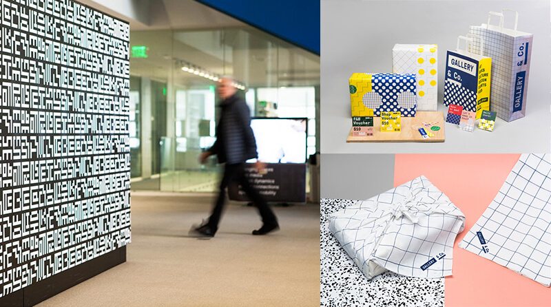
Geometric patterns were big in the ’80s, largely thanks to the Memphis Design Movement. Memphis, like so many trends, actually started in Milan. The look was characterized by geometric motifs, saturated colors, asymmetry, and confetti-like patterns—think Saved by the Bell opening credits. To make your patterns look less Beetlejuice and more Balenciaga, keep the color palette limited to black and white or black and white with saturated colors. Use swatches of pattern, rather than swaths, and leverage large variations in scale for a slightly Constructivist tone. If you’re going to use multiple patterns, use a well-constructed, neutral typography to ground the design. In Pentagram’s MIT Media Lab rebrand, the designers used a black and white color palette and gridded repeats to make the 8-bit inspired pattern decidedly modern. In the Gallery & Co. rebrand below (by Foreign Policy Design Group), the designers used a squared, neutral typeface (GT Pressura) to balance out the primary colors and variety of patterns.
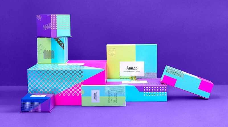
4. Specialty production techniques
One final way to incorporate the exuberance of ’80s design while keeping the look refined and elevated is to embrace high-end production techniques. One of my personal favorites is foiling–achieved when a print house stamps foil into a substrate in a prescribed way. A simple, well-produced touch (like a foiled pattern!) makes room for the use of multiple other ’80s-inspired elements like neon colors, geometric shapes, and patterns to sophisticated effect. The Amado packaging by Anagrama shown below is an excellent example of this technique. Spare applications of a gold foil take the patterns up a level.
Eighties design is all about maximalism and playfulness, so have fun with it! Check out how we applied these tips to incorporate neon colors in a hip, yet clean cut way to shape up a 40-year-old fitness brand.