Before we recommend any office interior branding opportunity, we agree on a desired tone, determine where the client is in their design and build process, and identify places where that brand can live organically. It may be as simple as how and where the logo lives, inside and outside. Some clients choose to display aspirational quotes or their core values as reminders of why they come to work each day. Others showcase their history to tell their unique progression as a company or use photography to build a sense of pride and empowerment within their community. Less literal and more evocative expressions of the brand can take the form of art or murals that capture the spirit of the company. And still, others incorporate technologies for a more interactive and immersive experience. Four of my favorite and most successful client collaborations follow.
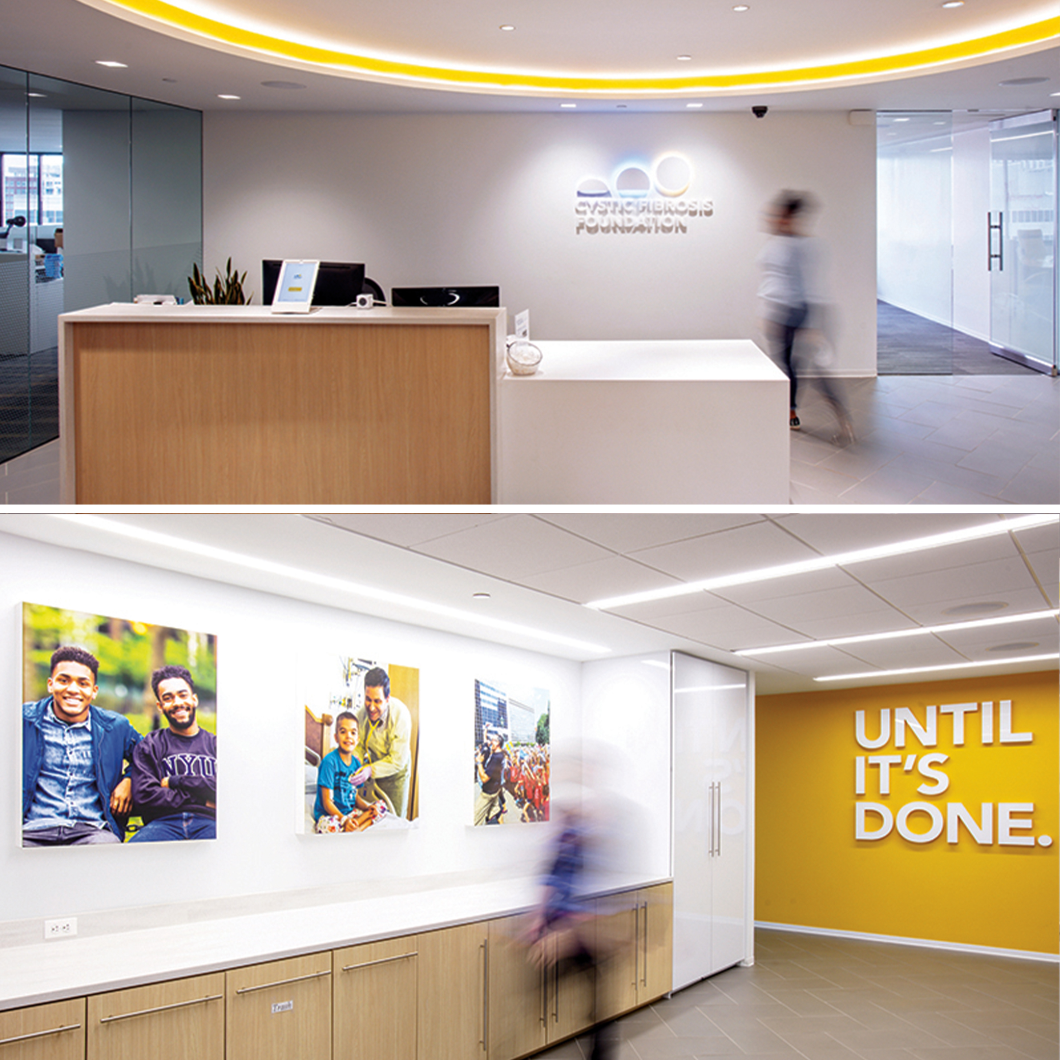
Cystic Fibrosis Foundation
A long history of work with Cystic Fibrosis Foundation (CFF), including a 2012 rebrand, gave us a deep understanding of their brand, community, and culture. Upon engaging a nationally recognized interior architecture firm to design their new office space, CFF asked Grafik to work in tandem with them and truly bring the CFF brand to life in this new workplace. The results are open, modern spaces that reinforce the Foundation’s vision. Backlit photos throughout the space echo the power of community—a core pillar of their unique brand.
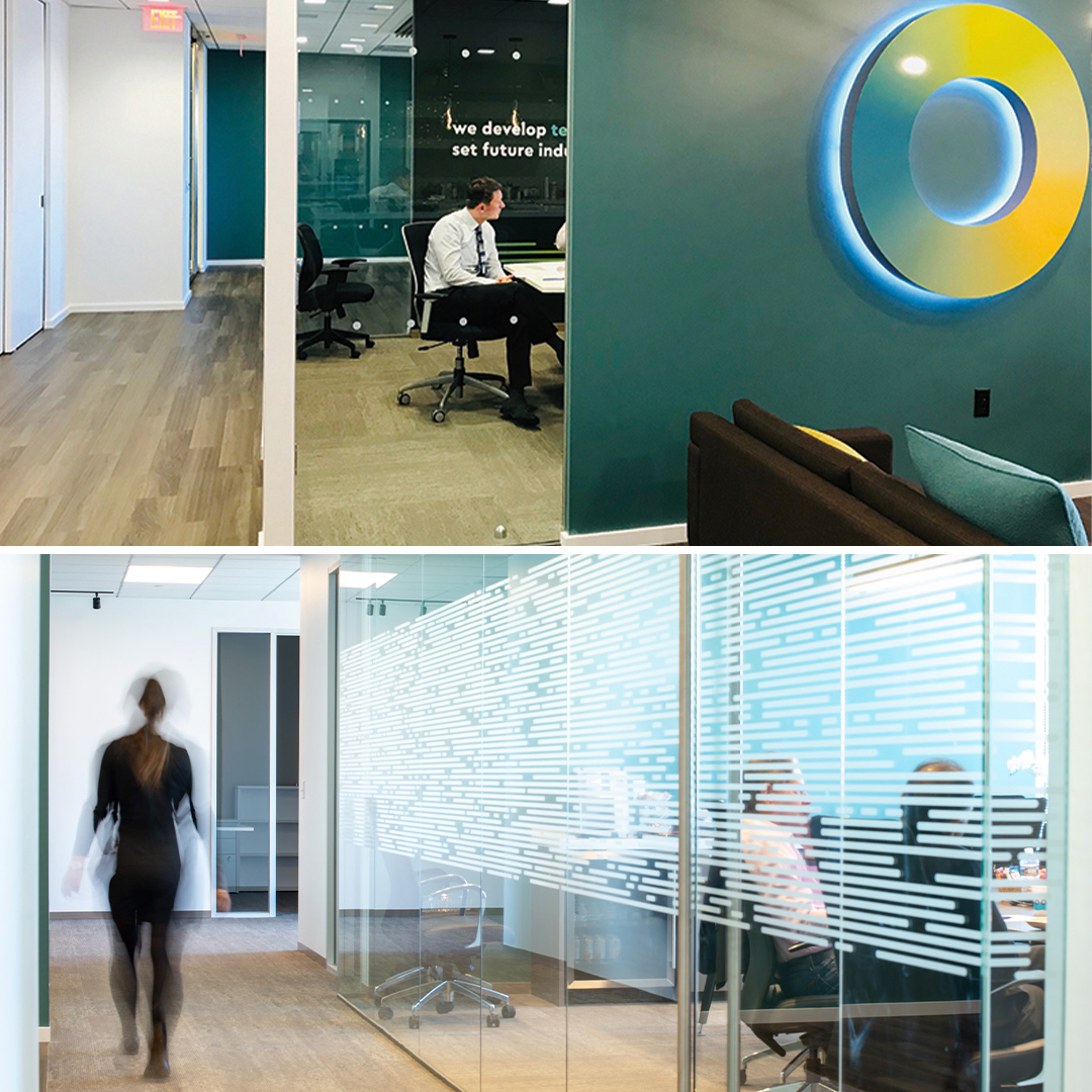
Ofinno
Ofinno is a research and development lab. Their inventors work in teams to create portfolios of patents that make future technology breakthroughs possible. With their rapid growth came a new website, positioning, logo, and visual identity—and a new office. The new space needed to reflect their future-tech focus, yet be warm and inviting with a nod to their truly collaborative ethos, all to attract and retain the world-class talent needed to excel. Their new brand pillars are now on the walls for all to read, and their joy in their home is evident.
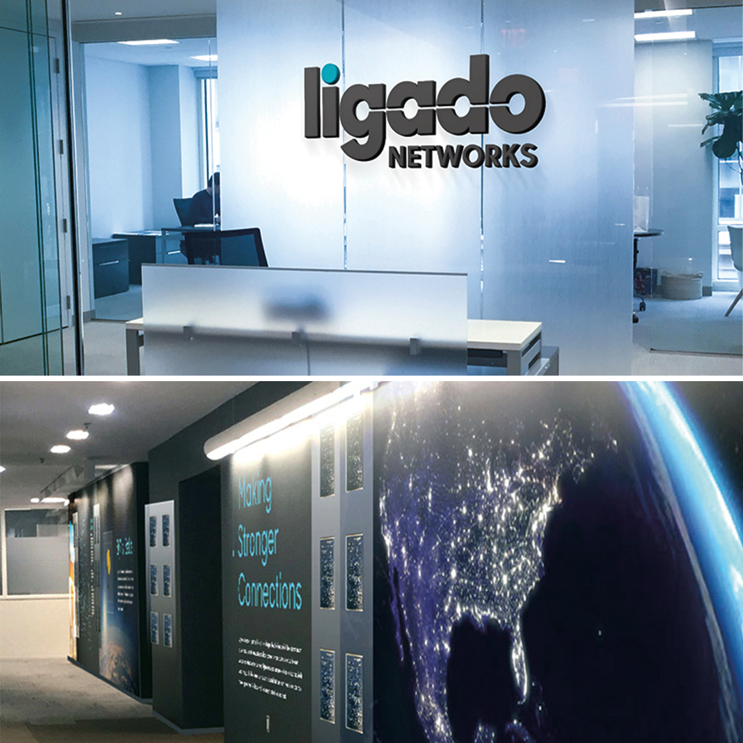
Ligado Networks
After adapting a new name and identity, Ligado Networks set out to refresh their office with new signage, colors, and materials throughout, including distraction-glass treatments. As creators of the new brand, we partnered on the interior updates, even consulting on acoustic sound clouds for greater office privacy. Together, we identified the corridor leading to their main conference room as the perfect space for introducing their storied history of patent innovations to prospects. We combined elements of the new brand vocabulary, storytelling, encased satellite artifact, and actual patents mounted to plexiglass systems to bring Ligado’s expertise to life in a short, engaging stroll.
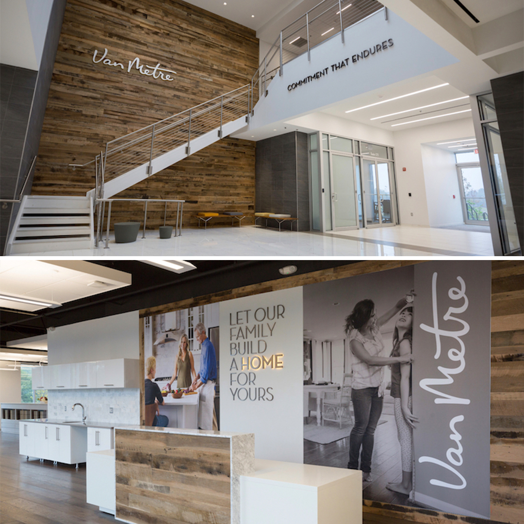
Van Metre Homes
Northern Virginia homebuilder Van Metre Homes asked Grafik to bring their brand story to life, both internally and externally, in their new design center and corporate headquarters. The Design Centre is where Van Metre consultants help clients build their dream home by showcasing the available interior finishes. Both clients and employees enter through a light-filled, contemporary space featuring a large wall covered in reclaimed wood with the newly refreshed Van Metre corporate logo. To create a cohesive experience in the Design Centre lobby, the same reclaimed wood finish serves as a backdrop for the new Van Metre Homes mantra and brand imagery. Powerful video testimonials reinforce the Van Metre brand when customers arrive to meet with their designers. We extended this branding to several Van Metre Homes community sales centers, such as the craftsman-inspired single-family home community, Meadowbrook Farm, featured in the second photo.
Incorporating your brand into your workplace can go a long way to making the practice of your mission, vision, and values second nature for your employees. Plus, it makes a terrific first (and lasting) impression on potential and current clients. Think of it as a natural extension of any branding effort.