Google has been slowly taking over the internet—and the world—for some time now. On average, Google processes 40,000 search queries every second, which translates to over 3.5 billion searches per day. And as of December 2016, Google and its parent company Alphabet, Inc. have acquired over 200 companies in and around the San Francisco Bay Area. Thankfully, in its crawl towards total domination, Google hasn’t forgotten about design.
At the 2014 Google I/O conference, Google introduced Material Design—a design language that seeks to combine the principles of good design with the reality of technology and web. Their hope was to provide a unifying user experience across the entire platform of Google apps and integrations, especially when moving from platform to platform and device to device.
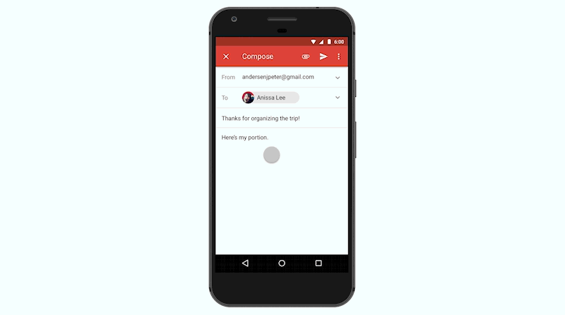
This language was created out of an internal, personal need for the Google design team. With the move to a flatter Gmail UI in 2011 and a card-based system for Google Now in 2012, the team started to build the framework for Material Design. This largely entailed the use of spaces and shadows to highlight (or hide) certain parts of a mobile layout and create a hierarchy of information. By the end of 2016, most of Google’s mobile applications had applied Material Design to their UI, helping to create a consistent experience across the Google app library.
Elevation of material objects create a hierarchy of information. Credit: Google
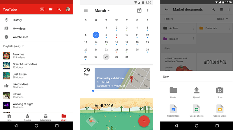
YouTube, Google Calendar, and Google Drive. Credit: Google
Google’s Material Design language revolves around three principles:
1. Material is a metaphor: Though a language for web and technology use, ‘material’ is grounded in the reality of tactile feedback and traditional paper and ink. Surfaces behave according to the principles of light, surface, and shadow that we see in everyday life, and edges interact with one another in a very real way.
2. Bold, graphic, and intentional: Elements and style are based on the foundation of good print design. Material adopts grids, scale, color, templates, and type to effectively and strategically create hierarchy, meaning, and focus within the user experience setting.
3. Motion provides meaning: Motion is grounded in real world physics and movements, with user interactions serving to subtly transform the environment while providing direction and focus. Motion creates energy, and natural animations help create an immersive and purposeful user experience.
In an effort to make the language more accessible to web teams and designers alike, the Google Design team created Material.io in 2016. This site houses the principles, techniques, and guidance of the Material Design initiative, along with any releases and components that support them.
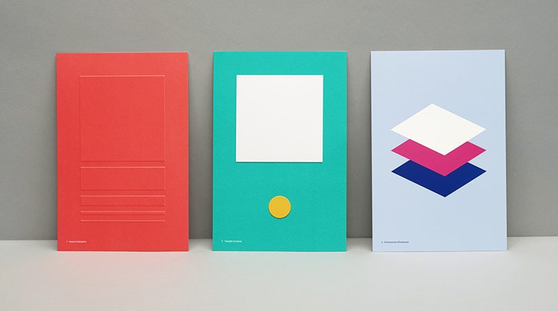
A visualization of some Material Design guidelines. Credit: Manual Creative
Along with the launch of Material.io, new tools were released to help teams work, prototype, and design products and applications.
Resizer is a popular tool that helps designers quickly view and test typography and image breakpoints across different devices and platforms, while Device Metrics is an exhaustive list of device sizing, aspect rations, resolutions, and densities. The Color Tool helps users create and apply color palettes to the UI using the Material Design guidelines on color and can help with the accessibility and readability of users’ color palettes.
Two tools only available through the Early Adopter Program—Gallery and Stage—aim to help teams with their design workflow. Gallery simplifies the process by putting iterations, presentations, and feedback all in one place. Stage is being developed by the teams behind Form and Pixate, two prototyping services that were acquired by Google in 2014 and 2016, respectively. The beta tool allows designers to prototype and test movement much earlier in the process and helps to speed up the workflow along with an iteration and feedback tool like Gallery.
Design is never done, because the world is always changing. But Google’s Material Design initiative is a unified system created to help you and your team get to a solution quicker and easier. In conjunction with a perpetual beta strategy for web development, a fast and iterative UX/UI design process is becoming more possible. And, by incorporating the guidelines and principles of good, cohesive design into your experiments, you can help users purposefully and efficiently interact with your product, leading to better results and happier customers.