Goodbye Little g

My life is riddled with the letter G. My name, Gregg Glaviano, contains four of them. My friends sometimes affectionately call me G4 or Double-G. My company, Grafik, where I’ve worked for 26 years, has a Gotham G at the center of its logomark. Why my parents gave me an extra G at the end of my name is beyond me; I’ve had a love-hate relationship with the letter ever since. As a child (and budding designer), trying to find the perfect way to sign my name was frustrating. How can I loop the second G into the first? Why couldn’t I just have one G? It would be so much nicer. Or am I just not creative enough to make a ligature of a double G that is elegant enough to stand the test of time—like the signatures of those other great artists Salvador Dali and Picasso? What’s wrong with me, I thought?

So when I saw the new Google logo, and in particular, the overhauled san serif capital G that will replace the all too familiar and “goofy” lower case serif G as its mobile app icon, I was left a bit cold.

Google's new logo mark of their trademark G

Granted, perhaps I have G fatigue? I’ve never been successful at designing my own logo. And I’ve only designed one “G” logo for a client that I’ve truly liked—“Doing Good is Good for Business” for our client Anybill’s philanthropic program.

Double-G

Google has given us sound reasons for making the switch and developed a new font—meant to resemble the simple printing in a grade school book—called Product Sans. The lowercase E is slightly tilted and edited to reflect “Google’s sometimes off-kilter thinking”. I buy it. So what’s bugging me? That perfectly crafted uppercase G.

Sure, it’s simple, clean and smart. There’s a new set of icons that will be introduced across devices to represent voice, sound and more. And it maps well to Google’s new restructuring and introduction of the holding company Alphabet. I believe this is the right idea for Google. So why do I want to ask “does G stand for generic?”

What I’m experiencing is actually very common amongst our clients when rebranding. We all have our own stories we create about the logos we must say goodbye to. Some good. Some bad. And no new logo can stand on its own without a carefully scripted brand voice and visual identity designed to support it. It’s up to us as branding professionals to craft these stories and strategically introduce them to our client’s internal and external audiences. It’s as much about developing the full brand story and a plan as it is the design.

So for now, goodbye little g. I hope this change doesn’t change your corporate motto, Don’t be evil. I’m looking forward to seeing how this new brand story develops.

Websites have floorplans too

10 years of designing EYA websites, and this is the best year ever.

You’d think I’d get bored or jaded, but because the tools are better, our own approach to the digital space keeps evolving, and our client totally gets it, the opportunity to create things you’re proud of just keeps expanding.

This year alone, we’ve already rolled out three neighborhood websites. The challenge was that each had to be unique, with its own look and feel, while still living under the overarching EYA brand.

I’d like to talk about the site for Grosvenor Heights, luxury three-level townhomes—with elevators and private rooftop spaces—very near the heart of Bethesda. Remarkably for such a built-out part of the metro region, EYA was able to build them in a heavily wooded area, keeping the surrounding trees and creating a restful enclave that is still minutes from major thoroughfares and retail centers.

With nearly floor-to-ceiling windows and rooftop decks that would let us visually establish both the luxury and expansiveness of the townhomes, we decided to approach the site design in a way that was analogous to the homes. We built it on a much wider responsive grid. This gave greater play to videos that captured the distinctive flavor of what this neighborhood offers.

Take a Look

The homepage for EYA Grosvenor Heights' new website, "Discover the OASIS next door".

Keeping score on ESPN’s website upgrades

Redesigning one of the most trafficked sites on the web is a daunting task. In 2014, ESPN.com had 22 million daily visitors, making it a traffic juggernaut. So when I saw the new design for ESPN.com last month, I have to say I was a little underwhelmed.

While visitors hoping for a unique or innovative experience will be sadly disappointed, everything doesn’t have to be revolutionary to be great. I’ve spent some time evaluating the new site and here are a few of my takeaways:

CATCHING UP ON RESPONSIVE

Most companies redesign their websites every 2 years or so; the last time ESPN did a major redesign was in 2009. That was a very different time for the web—there was no concept of responsive layouts and iOS and Android were fighting for dominance of the mobile platform.

ESPN Website Before Website Redesign
Image by ESPN via Wayback Machine.

Today’s ESPN redesign unifies the mobile and desktop versions under a single responsive architecture. It should be noted that they’ve spent the time to ensure that the user experience for each major responsive layout has been optimized. For example, on the homepage, the standard convention when reducing to a mobile viewport size is to simply stack each column atop the other, creating a fairly tall page. Instead, ESPN offers tabbing controls so users can quickly access the content and present it in a manner that is more space efficient.

A FOCUS ON PERSONALIZATION

Whether searching content or products, people often follow predictable processes for finding, evaluating, and narrowing their options. If you understand your audience’s journey, you can personalize their web experience to serve up the right content at the right time. E-commerce sites like Amazon have been at the forefront of personalization for years, and ESPN.com is applying some of those best practices to their own site experience.

When you first arrive at the site, local teams automatically populate the page based on your geo-location. When you sign in you get a robust set of controls to set your preferences on teams, location and even the devices you use. Now the site can prioritize relevant content on subsequent visits, immediately engaging the user. It also opens the door for advertisers to serve ads that are more relevant to you.

KEEPING YOUR ATTENTION

“Time on site” has become the preferred metric for advertisers deciding where to spend their ad dollars. Personalization is a great way to ensure visitors get the content they want, but how do you make it easier to consume more content if the visitor eschews taking the time to personalize? The infinite scroll.

TIME Magazine, The Los Angeles Times, Quartz, to name a few, are doing it. Content creators have fully embraced this UI convention of serving one article after another. Once you get to an article level page on ESPN.com, the user is presented with a list of article titles on the left column, and the actual article content on the right. As you scroll down, the next article in the progression is seamlessly loaded, simultaneously updating the URL and the associated ad unit displayed. This does two things: 1) it simplifies the user experience so you can keep reading if the next article interests you and 2) presents alternatives through the persistent article list and related content if you are not. All of these tactics help to keep eyeballs on the site longer, which is what content creators need for their business.

Today, all of the above are table stakes in creating an intuitive, seamless user experience. As with any site that has such a strong and diverse readership, any departure from their previous website will undoubtedly generate criticism from vocal users resistant to change. ESPN took a safe approach aligning their new website with current best practices, but in so doing missed an opportunity to use their influence to bring new ideas to the online experience.

Reading movies: type that advances the plot

As digital communication becomes central to our lives, Hollywood has had to be increasingly more creative incorporating this passive form of communication into live action. How do you use design and motion graphics to present text messages in film? For many years, the standard approach was to treat text messages the way hand-written letters had been treated, either cutting to a close-up of the phone’s screen so the audience can read the frequently enlarged text, or having the actor unrealistically read the text out loud. But increasingly, filmmakers have been showing the disembodied text onscreen and alongside the actors.

In his video series Every Frame a Painting, filmmaker Tony Zhou hypothesizes that films in the digital age could better represent real lives if they focused on solutions that lie “not in content, but in form.” He points out that showing the texts on the screen rather than on a close up of a phone feels more seamless, allowing the action to continue uninterrupted and the viewer to witness the actors’ reactions to the information they are reading.

A Brief Look at Texting and the Internet in Film from Tony Zhou on Vimeo.

Zhou cites the design of the BBC production Sherlock as the closest to ideal he has experienced. Sherlock uses clean and simple typography, removing the bubbles from the text content to avoid dating the material. Sherlock‘s method is aesthetically pleasing and definitely eliminates some of the more glaring and clunky issues that distract from other films.

In the Liam Neeson film Non-Stop, released last year, text messages are practically their own character. Neeson plays an Air Marshall receiving anonymous text messages from an unknown terrorist aboard his flight. The film had to show the texts since Bill obviously cannot read them out loud, but seeing them on the phone would slow down the action and take up a lot of screen time.

While the simple, elegant method Sherlock employs works for the mood and aesthetic of that show, the more frenzied way Non-Stop presents the texts, animating the typing in real time, complete with autocorrect fixing misspellings, adds the correct visual interest to a movie whose main action is essentially watching the bad-ass Neeson reading his phone. Non-Stop relies on the tension it creates to make it a thriller, and it successfully uses the visual treatment of the text messages to help amp up that tension. The audience witnesses Bill attempting to keep his cool, Air Marshall composure as the stakes keep getting higher. In one particular scene, as he receives another threat from the unknown terrorist immediately following the death of an innocent passenger, the camera spins around Bill reading as the texts also fill up the screen and move around him, creating the sense that Bill is finally beginning to spiral under the immense pressure of saving everyone’s lives (though at this point in his acting career, this should be nothing for Neeson.)

I think Zhou is onto something: successfully integrating digital communication into films depends on experimenting with new design techniques. I, for one, am excited to see what other variations of this kind of motion graphics work will be popping up on my TV.

Let yourself be a beginner

In recent years, medical schools began accepting more candidates who hadn’t followed the usual path to becoming a doctor, those who’d taken a few years off to travel or pursued a PhD in dance before discovering their calling was medicine. What they bring to top medical schools and residencies are ways of thinking that can’t be taught in a classroom. Their interdisciplinary studies aren’t holding them back from being professionally competitive—they communicate effectively, are excellent with patients, and report high levels of satisfaction in their work.

The design world can learn from their example. While we’ve been quick to shift our focus from craft to concept, we’ve failed to shake one craft-driven habit: getting absorbed in our product. How many designers do you know that claim to “eat, sleep, and breathe” design? Who is inspiring them besides other designers? What else are they passionate about except the latest font family, hot trend or UX conference? This narrow focus can improve technical expertise, but you won’t be truly innovative unless you are willing to learn other, non-design things. Maybe even things you are really terrible at because they are so far removed from your field of expertise.

Choosing to devote time to interests outside of design does not make you less of a designer. It is a strategic choice that can improve interdisciplinary thinking and inspire fresh ideas.

When I reached a high level of technical skill and my personal art began to feel stale, I bought a loom. It took a few basic tries before I attempted more artistic projects, which are still very rudimentary. I can’t rely on any of my pre-existing skill sets; every bit of time spent weaving is educational. As a beginner, there is no pressure to produce a masterpiece so there is complete freedom to experiment without inhibition. Weaving has ultimately changed my way of thinking about color, texture, and process, which I have been able to carry over to my creative work with great results.

Even more recently, I started practicing yoga. It has no relation to anything I do in my work or spare time, so I am truly a beginner. Humbling myself enough to keep practicing and take advice from those more experienced is a healthy exercise. There is also something to be said for the pride of learning a new skill; it makes for eager artists.

Weaving and yoga are not directly relevant to client projects, but some hobbies can be more obviously beneficial. For example, an interest in the stock market is a great advantage when a financial client comes around. No matter their perceived relevancy to client work, side projects spark ideas and help push aesthetic boundaries. So try something you’ve never done before and see what it can offer. You may even find a new passion to master.

Here are some ideas to get you started:

  • If you’re a web designer, try something tactile like watercolor painting. It’s basically permanent once on paper and you’ll probably want to tear your hair out when you can’t input a HEX number to get the same color twice. This is great for practicing a creative process you may not use when working digitally.
  • All about typography and WhatTheFont? You might like other classification-based fields. Have you ever found an animal skull on the ground and wondered what kind of creature it was? You can clean it up and deduce a lot just from examining the teeth. This would play to a typographer’s strengths of recognizing small details and shapes, as long as you can get over the yuck-factor.
  • If you’ve mastered layout composition, try bouldering. Bouldering is a type of rock climbing that is done without ropes. You’ll have to nail some difficult climbing techniques in order to get good at it. The basic moves of bouldering may feel reminiscent of editorial design fundamentals. Instead of margins and a grid, you have finger and toe holds.

Eye candy that’s nutritious: infographics!

Infographics have gained a lot of traction as visually stunning and engaging ways to share and communicate information online and in print. Examples of data visualization date as early as 1858, with Florence Nightingale’s “Diagram of the Causes of Mortality” and the works of William Playfair, who are considered the fathers of charts and diagrams.

Infographics are easily digestible, attractive, and memorable visual tools for communicating complex information. Clever and creative charts and diagrams make the information visually stimulating. The human brain is able to remember images easier than text, making infographics a very effective communication tool. Why are infographics so adored now? Thanks to the web and social media, infographics are easily shared, reaching massive amounts of people and telling complex stories within seconds.

Being able to distill complex data sets into visuals that properly tell the story and are still easy to understand is a difficult skill to acquire. Below is a list of books, websites, and courses for learning the best practices to creating effective infographics. The list is comprised of educators, designers, illustrators, and companies who are producing some amazing infographics in the world.

Books:

Websites:

Courses:

Sculpting a new brand identity

To help us transform complex financial documents into something both beautiful and meaningful, we turned to design giant Stephen Doyle of Doyle Partners.

Our client, Waldron Private Wealth, services ultra high net worth individuals and family offices by providing the multiple skill sets needed to efficiently manage significant wealth, simplifying their clients’ lives. However, the way they organized their services as well as their messaging had become overly complex. We helped them refine both to fully embody their revised tagline, “Simplifying wealth. Simplifying life.”

We immediately thought of Stephen’s sculptures as a way to communicate the story we needed to tell: Waldron takes on all the complexity of wealth so you don’t have to. Our first step was to wade through the various tax, legal forms and contracts that comprise the financial world. Armed with thousands of jargon-laced documents, along with an array of news and market headlines, Stephen worked to create a purely chaotic form. The result: a truly uncomfortable visual experience showing how all of the messages, data and information—positive, negative, often conflicting and always confusing—play on investors’ psyches.

The answer to that emotional chaos, a second sculpture—representing Waldron’s clear and transparent processes—was created. The perfect summation of all that Waldron does, it shows the chaos of the first structure organized and simplified into a beautiful and pleasing polyhedron star. The form is balanced, symmetrical, open and simple, yet beautifully complex—the exact visualization of what Waldron provides.

Supporting image for the blog entry, Sculpting A New Brand Identity, shows a complex shape and an organized shape represented by abstract paper sculptures.

We also wanted to represent not just the end result of crystalline clarity, but the way Waldron experts, in so many disciplines, function as a truly integrated team.

We mused over mobius strips (does that say integration or infinity?) and even more complex-yet-organized polyhedron shapes that interconnect (will that be too similar to our star?). For a past project, Stephen had created a simple star-like shape out of intersecting Eames cards, which led us to think about a freestanding structure created out of interlocking planes. The final piece uses whole Waldron documents representing disparate disciplines, literally integrated with one another. This may be my favorite of the suite.

For the blog entry, Sculpting A New Brand Identity, this image shows the creative stages of brainstorming, the idea, and the final finished paper sculpture.

These intricate and painstakingly built sculptures transformed the way I think about wealth—I hope they’ll do the same for you. Check out the finished products (and more of Doyle’s sculptures) here.

Top five best practices for website design in 2015

When planning for a new website, there are a lot of things to consider if you want reach your goals.

Here are five website design best practices that will help your site succeed:

1. Know your audience and goals.

All websites need to start with a solid strategy and achievable goals. What is the purpose of the site? What are your goals and how will you know you’ve achieved those goals? Selling goods? Brand awareness? Converting leads? Establishing achievable (realistic) goals for your site will set the foundation of how to design the site and write the content that will help you get there.

After you’ve established your site’s business goals, it’s important to make the site fulfills the needs of its core audiences. Who are the audiences that your site is meant to reach? What will they want and need from visiting the site? Are they looking for particular types of information or education? Do they need to learn about your company? What will engage them and make them want to come back? If you want to capture information from them, what can you offer them to make it worth their while?

If you’ve identified five basic types of users that visit your site and will help you reach your goals, what is different about them that your site will need to address? What kinds of information do they need? Are they very informed about your product or services or do they need guidance and education? Are they power users or new to your site?

For example, if you are selling goods or services, the end goal might be to sell products, but users may need different paths to get to that goal. Some may need the easiest path to quickly get what they want. Others might need education or reviews from other users before they make a purchase. Others may be new to the topic and need help in the form of videos or customer service.

2. Develop use cases.

Once you’ve identified your audiences into groups or personas, you will need to develop use cases. Use cases are a list of top objectives that each user type wants to accomplish. It’s helpful to list them so you can address these needs when designing the site. Put yourself in the mindset of one of your audiences and determine — how hard is it for me to complete each of my needs on the site? Where would I need to go? Is it intuitive and easy to accomplish? Are there multiple ways to get to what I need?

For example, if the site sells products, one persona that is familiar with your products might have a use case like this:

  • Search for items
  • Comparison shop
  • Do research
  • Share with others
  • Learn how long it will take to get my product delivered
  • Purchase items
  • Create an account

Another persona that is not familiar with your products or company might need the following:

  • Learn about the company and types of products
  • Verify the company’s credibility and reputation
  • Search for items
  • Learn what others think about this product
  • Purchase items
  • Ask for help

Use cases should be about basic needs not specific site actions. For any one need there may be a variety of things to consider. Example, a new user may need help with a purchase. You may decide there are many ways to help a user. Self help is always a good start with video tutorials, FAQs and inline help completing a form. You may also need a prominent 1-800 number or click to chat, or customer forms.

It’s also important to note that even though both of my persona examples above had “purchase items” as the same need, we need to design the interface for both first time and returning customers which have different perspectives. Returning customers need to be able to quickly complete an error-free purchase potentially with shortcuts or remembering information they’ve already given us, while a new customer needs more description, cues to show how many steps have been completed and still remain, and the ability for inline help. Both need clear confirmation and follow-up.

Once you’ve developed the use cases, they will serve as a guide to test your site’s information architecture and designs against. Is it easy for the users to accomplish their goals if they’ve never been to the site before? If you have the time, usability testing can also help validate that users are more likely to complete the important tasks you have outlined before you go live.

3. Write compelling content.

You know who your audiences are and you know what they want to achieve, now you need to determine how to write the copy that will engage them and tell them what they need to know. Get to the point. Grab their attention and help them understand what they need. If your audience doesn’t care about it, minimize it or get rid of it.

Does the headline grab their attention and tell them what the page is about? Is there a strong call to action? Does a user know what to do on the page? Is it easy to skim?

When you are developing the content, remember to break it into bite-size readable chunks. Not only will this help users get the point, it will also support mobile compatibility.

Lastly, keep it fresh. A site with new or recently updated content creates a reason for users to come back and it will help your SEO ranking.

4. Make it engaging.

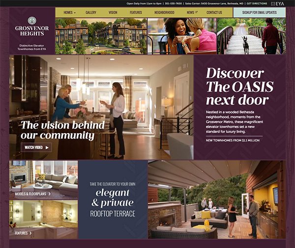
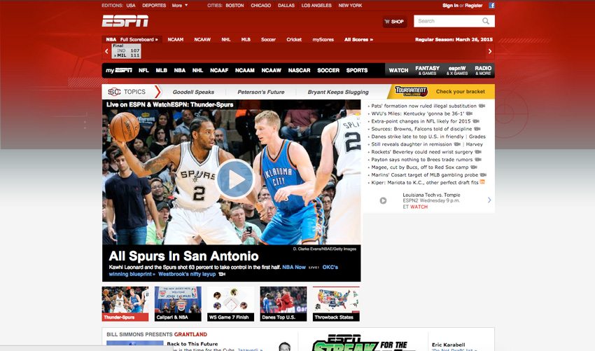
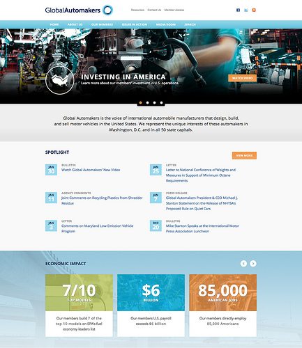
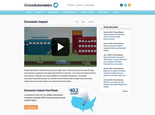
Will your users engage with the site? A thoughtfully designed site encourages a user to spend more time to read the content, watch the videos and perhaps purchase products or services. A well-designed site with quality content and clear navigation will increase engagement and ultimately improve your site’s performance. A variety of content and types of interaction are important considerations for engaging your users.

You will also want your site to be sharable. It extends your audience, it improves engagement and it will also help your SEO ranking.

5. Go responsive.

The last best practice I’ll mention today is the importance of mobile compatibility. The percentage of mobile traffic increasing each year is staggering. Users are adopting a wide variety of devices to view sites. Often users will view your site through multiple devices during the buying cycle. It’s become more important than ever to make your site work for all devices that it will be viewed on.

What’s the best way to accomplish this? More and more sites are considering a responsive format. What is responsive? A responsive website is an approach that allows a site to be optimized for each viewing experience—font sizes, easy to navigate with a minimum of resizing, panning and scrolling. Ideally, the same content should be viewable from desktop computer monitors to tablets and mobile phones.

This is usually accomplished by adapting to each environment and using fluid, proportion based grids, flexible images and media queries to present different CSS style rules based on the width of each device.

While it is harder to design and develop a responsive site, it is far more efficient than developing multiple sites developed for each device category. I would have a very hard time recommending a site that is not responsive these days.

Technology and best practices will continue to change, but as long as you are aware of what you are trying to achieve and who you want to reach, you will stand a far better shot at reaching your website goals. I hope these high-level tips were helpful.

Practical wisdom for young designers

It’s a sad reality that schools are ill equipped to impart some of the necessary practices that make a truly successful designer—and I don’t mean the kind of success that comes with money. I’m referring to maintaining your sanity and creativity in the face of a relentless onslaught of external pressures and your own internal anxieties. The truth about this industry is that it will eat you alive if you’re not prepared for it—the competition is fierce, the environment fast-paced, and burnout is rampant. However, if you’re a young designer fresh out of school, there are fundamentals you can learn to sustain your creative career.

Many of the obstacles I had to face were overcome because I was able to establish some key habits to keep my creativity on a steady course. And I was fortunate to have some amazing mentors early on to guide me. It is with gratitude to my mentors that I pass along some wisdom to you. But before diving in, I should note that this is not by any means a comprehensive list; I invite you to comment and provide your own ideas and insights.

So, here are three habits to get you started:

1. Creativity is a battery. Recharge often.
If there is one thing you take away from this article, it’s this: our creativity is finite, yet infinitely rechargeable. We are all born creative, but not all of us know how to harness it and fewer still do well at managing it (mostly because they don’t understand it actually needs to be managed at all). Without actively bolstering your creative input, you are risking the worst possible outcome a designer can face: burnout. Believe me, it’s not pretty to watch or be around, let alone experience—creative blocks that last for weeks and unchecked apathy, just to start.

To help you maintain the creative flow, you need to establish some hard-set habits and stick to them. We’re all different, and I’d be lying if I said my methods will always work for you. But to get you going, here are a few habits I’ve learned to manage a steady creative output:

  • Focus, then step away. Creative thought needs time to germinate and stew—the constant churn of rapid-fire ideas only leads to one outcome: lame ideas. So, take the time to really think about a problem (without external distractions). And once you’ve given it some thorough meditation, just step away. Although it may seem counterintuitive, giving your brain a good rest will often yield some brilliant “ah-ha” moments when you least expect them.
  • Get. Away. From. The. Computer. Take a walk. Try to get out of the office if you can. And always make an effort to eat away from your desk—desk lunches suck.
  • Set aside actual, honest-to-goodness time for inspiration. Note that this does not mean staring at Pinterest or dribbble. Go somewhere new. Learn something you haven’t studied before. Read actual books. Talk to strangers. Make human contact.
  • Travel. You will never regret it and it makes you more interesting. As Buddha said, “It is better to travel well than to arrive.” The journey is the most important part—so be in the moment.
  • Remember, long meetings are the enemyavoid them like the plague. They will drain the life from your body, do irreparable harm to your productivity, and make you hate people in general.

2. Find a mentor. Then become one.
Finding someone to act as your trusted counselor, motivator, and advisor on whom you can rely for sound guidance will be one of the single greatest decisions you make in your career. Forging a path can be frightening, and like all great explorers, having a guide is the key to making wise, long-lasting decisions. Your choice of mentor should always be made carefully as you will be (or, should be) talking openly about your career. Also, you should seek out a mentor with relevant industry experience.

As Sir Isaac Newton once said, “If I have seen further it is by standing on the shoulders of giants.” Understand that your success will not be by your hands alone. Your mentor—and many others—will contribute greatly to your learning and experience along the way. If you are able, you owe it to them to pay their kindness forward. Know that in doing so you will reap rewards far beyond what any monetary compensation will bring you.

3. Failure is not an option, so embrace it.
A simple truth of a creative career: if you’re doing it right, you are going to fail. And you’re going to do it in so many fantastical and stupefying ways that, like an out of body experience, you’ll hardly believe it was you. However, making a habit of planning for failure in your creative process will defuse your anxieties toward trying new ideas and being truly innovative.

Accepting a mistake is not an acceptance of defeat, and the sooner you embrace the uncertainty and adapt, the stronger your career and creativity are going to be. When creating the light bulb, Thomas Edison famously said, “I have not failed. I’ve just found 10,000 ways that won’t work.”  From your stumbles will come a deeper understanding and knowledge than any immediate success can bring you. So don’t brood over it. Learn from the experience, pick yourself up, and quickly move on.

If you’re new to graphic design and find yourself overwhelmed, these are but a few methods to help you better manage your creative output. Long-term success depends on you establishing effective practices and tools to overcome the everyday pressures of the job. My hope is these habits will help get you started.

Rebranding the Redskins

Ok, let’s just take it for granted that I find the Redskins name odious. I think that Bob Costas put it best during last Sunday’s game between Dallas and our home team. So I am not going to talk about that here.

Now what really really has my blood boiling is the logo design contest that is being run by the “San Francisco design firm” 99designs. First of all, 99designs is not a design firm—they are an aggregator that run logo contests where freelance designers can enter designs with the hope that one of their designs will be chosen and they will be paid the princely sum of $200–$2,000. In fact on their homepage, they crow about the fact that for just $714 they received 1,887 designs from 347 designers for the Redskins logo. So much is wrong with this statement that I do not know where to begin. I should be clear from the start that the Redskins organization did not start or sanction this contest. No, designers are doing a great job of shooting themselves in the foot.

1. Let’s start with the fact that Dan Snyder runs one of the most profitable football franchises in the nation. According to the Forbes list of NFL team valuations, it is valued at $1.7 billion as of August 2013. One hopes that should he decide to change the name and therefore the logo, he will not stoop to putting this through a contest. And let’s also remember that he will rake in millions of dollars from merchandising the mark. Should designers give him a logo at a cut rate? You decide.

2. In the logo contest sponsored by 99designs, the winning names were one of the  following: Washington Warriors, the Washington Renegades and the Washington Griffins.

• The Washington Warriors designed by Mixaurus is a very fitting name for the football team in the U.S. Capital. Really? And how do you think that name will play overseas? Think the State Department or the Defense Department will like that one? And does anyone else find that this reminds them of the Pentagon’s 911 memorial logo?

Washington Warriors Logo

• The Washington Renegades. Do you suppose that is referring to the Tea Party elements in the recent budget negotiations?

Washington Renegades Logo

• The Griffins?! Really?! Well, I guess it goes along with the Wizard theme

Washington Griffins Logo

3. The creative brief given to the hordes of designers that entered is a great example of why you should never ever go to an organization that cares less about delivering up a quality brand, and more about generating buzz. “The Washington Redskins are a professional American football team based in Washington, D.C. They’ve won 5 NFL Championships, 13 NFL divisional titles, and 6 NFL Conference Championships – so they’re kind of a big deal. ….Our goal with this contest is to rebrand the franchise based on three different name suggestions with a logo that’s a little more PC. And to have fun with it!” Not sure about 99, but normally there is a stringent creative brief, and having “fun with it” is fine as long it is on the mark!

4. 99design’s image suggestions direct the designers to try to use an American infantry soldier with a GI combat helmet, a curly R for the Renegades (go figure that one out!) and a part eagle, part lion for the Griffins…and looking at the marks submitted, I guess the designers have no idea of the rivalry with the Philadelphia Eagles. More important, there  is little consideration on what might sell, what might inspire fans, and what might offend various constituencies. Having a white man in a helmet….I don’t think so.

Washington Warriors Logo Alternative

5. If you think that a brand is created only by a logo, well, you know even less about logos than these designers know about football. The Forbes list has valued the Redskins brand at $145 M. And you can bet that lots of those zeroes come from merchandise. I simply can not see fans shelling out lots of bucks for a curlicued R.

6. So many of the comments on the 99design site ask if it is possible to play around with the colors. Lindajo asks, “So if they aren’t the ‘Redskins’ anymore, can the colors be purple and gold or orange and blue or whatever?” Obviously Lindajo has never rooted for a college or NFL team, but colors are kind of sacred. Can you imagine Ohio State changing their logo and colors to brown and orange? How about if we make the Eagles pink and purple to mix things up?! Not!

Philadelphia Eagles Logo

When design organizations, freelancers, or crowd sourcing logo sites do not follow a coherent process, they end up with third-rate work, no strategy, and a poor outcome. Brands are carefully orchestrated, and sports brands have an often irrationally fervent fan base…which is why we are in such a pickle over the name Redskins. If this was not a sports team, if it was the name of a clothing brand, I dare say the name change would have been made a long time ago.

Global Automakers redesign: Part 1 of 2

Grafik has launched phase one of a staged website revamp for Global Automakers.  In February, a sleek, responsive look for the homepage was launched, an approach which mirrors the clean lines and green design of Global Automakers’ K Street office.

Built on Drupal 7 with additional custom code, the page features an elegantly-scaling slider which showcases large photography and a new video lightbox. The look and functionality of the navigation strip were enhanced with color, text, and drop-downs to improve impact and ease of use.

Big plans are afoot for the sequence of Economic Impact blocks. These will ultimately click through to a highly-interactive Economic Impact experience, drawing on national and state-level economic statistics.

Global Automakers' New Homepage
Grafik gave Global Automakers’ website a makeover with a fresh new look for their homepage.

Global Automakers Economic Impact Tool
Grafik revamped Global Automakers’ Economic Impact Tool with additional features and an updated look.

To provide a richer experience in the interim, the previous Economic Impact page (which consisted of simple text and bullet points) was also improved by way of an embedded video and some more graphics and downloadable information.

Stay tuned for more news as the rest of the updates go live!