APIs: building app-cred

API, or application program interface, is a source code base that is released by the developers of an app that allow communication between the platform and third party applications. Foursquare, Facebook, Twitter, to name a few, each have their own APIs that developers can utilize so their apps can communicate with these platforms. The result of this technology is a collaborative atmosphere where information is shared and sometimes even controlled centrally.

Up until recently, I haven’t been exposed a great deal with using APIs. The only APIs I have interacted with are Google Maps and the occasional Facebook commenting system on other websites. Since I’ve become a little more in the know as to what APIs are, and how they can empower an app/service, I’ve become more fond of apps/services that use them.

Path Social Media Platform
Path Mobile App

Path, a journal-like, mobile-only software, is an excellent example as to how developers and designers alike are making use of APIs. Path, which is very similar to the popular social media services pointed out above, is actually a hub of sorts. It allows for content published in the app to be pushed to Twitter, Foursquare, Tumblr, and Facebook. Path is an interesting step in mobile software. For starters, it is mobile-only, meaning users can only post content from their mobile device. You can still “like” and comment on content in the web version, but only by clicking through a permalink when an update is posted. This facet of the software was a little jarring at first, but what Path has created is an on-the-go social media platform that makes use of these popular services. For me, it made me more willing to trust and engage with the app. Not to mention it’s incredibly well designed.

I’m not necessarily here to plug Path, but I wanted to take a minute and share a service that I enjoy using. Path was an acquired taste, and I think it’s important to note that partnerships with the big players might even help start-ups like Path gain momentum. No one wants to post their content to a service that will die in a few months. With the conceived failure of Google+, I have been left a little exasperated when it comes to the birth of new social media platforms. The fresh approach to Path is they aren’t necessarily introducing something new, rather, they are building on the services we use today. In Path, I am able to check in on Foursquare, push to Twitter, and post pictures and status updates to Facebook. All the while it lives in my Path timeline.

APIs are something a developer or designer (and even client) should consider when starting a project. It is true that APIs are not always viable, but in situations where they are, it creates a more comfortable user experience. In the case of Path, I was at ease using this program as it used the APIs of other services that I have come to know and trust. All of these are important components that factor into the success of an app or service.

Simply arresting: designing for technology

IBM Ad Chicken Lips

While waiting for my flight at Reagan National Airport, I happened to look up and experience one of the most striking technology campaigns I’ve seen in a while. The Smarter Planet campaign, designed by Ogilvy Paris for IBM, employs a collection of simple yet sophisticated illustrations by Noma Bar titled Outcomes. His work precisely uses shapes, form, and negative space showcasing his skills as an artist, illustrator, and designer. The resulting images are deceivingly simple and often require an extra moment to see the meaning within. I only wished I had taken a photo of the actual display at the airport, however the images below should give you a good idea.

Noma Bar's Outcomes illustrations for IBM's Smarter Planet campaign
Noma Bar’s Outcomes illustrations for IBM’s Smarter Planet campaign

Design by code: algorithmic art

Algorithmic art
Algorithmic art

Algorithmic art is a subset of generative art that is the result of an algorithmic process—devised by an artist—usually using a random process to produce variation based on external inputs.

If that run-on sentence sounds like a bunch of gibberish, think of the algorithm as an elaborate recipe and the inputs as your assorted ingredients. Where it gets interesting, is that in this type of art you can generate an infinite number of results by using different “ingredients” based on the original recipe.  These inputs can be random number generators or some other source of data like frames from a movie.

I first became interested in algorithmic art back in 2006 through a project by BMW. BMW commissioned artist and designer, Joshua Davis, to develop an algorithm to generate a set of 500 limited edition prints, based on the forms found in the Z4 coupe that they were launching at the time. The pioneering aspect of Davis’ work was that each print was entirely unique and comprised on average of 120,0000 layers and 50,000 vectors, all generated by the algorithm. It was a highly complex process that required Davis to check countless iterations of his code to ensure that it would produce viable results. After months of intensive code refinement, his computer and printer begin to generate the artwork, as he supervised each output, print by print.

One of Artist Joshua Davis' illustrations
One of Artist Joshua Davis’ algorithmic illustrations

Paul Krix is another artist who I recently discovered who uses algorithms to individually laser cut jewelry that is aesthetically informed by patterns in nature. The early seeds of his inspiration were planted when Krix read a paper that compared city street networks with common leaf vein patterns, concluding that pictures of either were indistinguishable to most people. Krix decided to use this research as a foundation to his modeling algorithm, and drew inspiration from various natural patterns and processes that are both beautiful and complex: crystal growth, moth wing patterns, leaf veins, tree growth, petals, and the zoological colorings/patterns.

Pieces from Paul Krix's jewelry line called Neat Objects
Pieces from Paul Krix’s jewelry line called Neat Objects

The idea of “one-of-a-kind” is something that is lost in this age of perfect digital copies and mass production. It’s fascinating to see how designers and artists are pushing  technology to create artwork that is entirely unique, and yet at the same time repeatable because it is digitally informed. This is where it’s worth emphasizing that the artist’s self-made algorithms are an integral part of the authorship, as well as being the medium through which the ideas are conveyed.

So if you’re inspired, learn a new programming language. Become your own factory. And start creating.

Grafik’s new responsive web design for Honda Government Relations (GR)

Honda In America web and mobile site
The Honda In America web and mobile site

Grafik helped Honda GR shift into high gear with the launch of www.hondainamerica.com. Directed towards policymakers on the Hill, the site features the most up-to-date information about Honda’s efforts in the areas of fuel efficiency and advanced safety technology, as well as detailed investment data about the company’s manufacturing, employment, and purchasing history in America.

“It’s a responsive web design, which means it adapts to its environment. The same site looks different on the web and on mobile,” said Greg Appler, VP Interactive for Grafik. This provided great cost savings to Honda, as they didn’t have to build a separate mobile site, but their users are able to easily view the site on mobile devices. “Additionally, the magazine style format leverages contemporary experience technologies to enhance interaction and usability.”

In previous years, Grafik helped Honda GR produce a comprehensive data book, however with this new effort, not only is the company able to extend its reach—but it is more environmentally sustainable.

“We now offer our audiences the same valuable information, and more, via the web with HondaInAmerica.com,” said Edward B. Cohen, Vice President Government & Industry Relations for Honda North America, Inc.

Grafik was so proud of the work, we entered it into the DC Ad Club’s Best of DC Agency Showcase, featuring the year’s best marketing presented by the area’s top creative agencies.  The panel of judges selected the site to be among the work that will be presented. On November 15, Greg Appler and Creative Director Gregg Glaviano will share the inspiration behind the execution of this, deemed one of the best marketing campaigns of 2011.

JK Moving has its cake and eats it too

Last week, I opened an email from a client—to say the least, I was pleased at what I received in my inbox. Let me just start by mentioning, the greatest part of being a designer is seeing your finished work have a life outside of the studio.

Over the summer, I was heading back to DC from the beach. I was nearing the Bay Bridge stopped at a red light, and saw one of JK Moving Service’s brand-new, 53-foot moving trucks in oncoming traffic. This truck makes a huge statement when you see it on the highway or down the street in your neighborhood. I simply remember the sheer excitement of seeing my design the first time driving down the road on the pristine, glowing-white 18-wheeler.

JK Moving truck
JK Moving Services truck

So back to this email. I began to read it and it was not about a current project, rather it was about cake. Yes, cake. Unfortunately, there was no actual cake on my desk to blissfully devour, but the email left me drooling just as if there were. JK had a meeting with a contact of theirs and decided they needed to really make an impression, so one member of the staff baked a cake modeled after a JK Moving Services truck! If seeing my work on the highway wasn’t enough—now it had been “temporarily immortalized” with delicious ingredients that are easily consumed. It makes me think of TV shows where people create the cakes to commemorate things like a beloved Disney character or a famous landmark—all with a story to tell. This cake may not be on some prime-time television bake-off, but in my eyes, it sure feels like someone was inspired enough by my design to pay tribute to it. Obviously this wasn’t the case, but just let me have my moment.

Homemade JK Moving cake

As cool as it is to see a logo, identity, or website outside of the studio that I’ve worked on, this definitely takes the cake (that pun is super intended). It’s amazing to see just how much life can be injected into a brand—especially when that brand is given an extension like a cake. I mean, who doesn’t like cake?

By the way, my birthday is coming up. Now how do I get my hands on one of them cakes?

JK Truck Cake Front
Looks delicious!

Getting the details right: Apple

Illuminating LED on a Mac Book Pro
Illuminated LED on a MacBook Pro

I was watching TV the other week when the screen suddenly powered down and went blank. The status light that would normally be a solid red to indicate it was off, was flashing in a rapid, urgent succession, indicating to me that something grave had transpired.

Connected to the TV lay one of my Apple computers. The gentle, white, undulating light on the front reassuringly communicated to me that unlike its TV cousin—it was not dead—it was merely “sleeping.”

There are things we immediately, if subconsciously, find comforting or soothing and, in that moment, I found comfort in that little white light. In designing and engineering something as complicated as a computer, a status light seems like a minor detail in the grand scheme of things. But it’s details like this that can psychologically make a block of aluminum and silicon more communicative and more personal. And it took Apple two patents and hundreds of hours in R&D to make it happen.

In 2002, Apple filed a patent for a “Breathing Status LED Indicator” (No. US 6,658,577 B2). The status light is intentionally designed to simulate sleep and the patent filing described it as a “blinking effect of the sleep-mode indicator in accordance with the present invention mimics the rhythm of breathing which is psychologically appealing.”

Prior to the patent filing, Apple carried out research into breathing rates during sleep and found that the average respiratory rate for adults is 12–20 breaths per minute. They used a rate of 12 cycles per minute (the low end of the scale) to derive a model for how the light should behave to create a feeling of calm and make the product seem more human.

But finding the right rate wasn’t enough, they needed the light to not just blink, but “breathe.” Most previous sleep LEDs were just driven directly from the system chipset and could only switch on or off and not have the gradual glow that Apple integrated into their devices. This meant going to the expense of creating a new controller chip which could drive the LED light and change its brightness when the main CPU was shut down, all without harming battery life.

On more recent machines, you’ll also notice that the status light is completely invisible from the surface when the computer is in use. There’s no transparent plastic or glass where the light emanates from. The light seems to glow straight off the surface of the aluminum and, in fact, that’s exactly what it’s doing.

This feat of engineering is achieved though Apple’s “Invisible, light-transmissive display” (No Us. 7,880,131). During the manufacturing process of the computer body, a CNC machine first thins out the aluminum. Then a laser drill creates small perforations for the LED light to shine through, creating the illusion of a seamless surface when the light is off.

Other computer manufacturers have tried to mimic Apple, and add a similar sleep status feature to their computers. They used faster rates for their indicator which is more indicative of strenuous exercise rather than rest.

Attention to detail is what makes Apple products feel so impeccable. The team there doesn’t just pore over financial spreadsheets and personnel issues as most companies do. They don’t just think about design, they obsess over it to the smallest details. There are many companies that have the talent and the resources to potentially mimic Apple’s success, but without getting the details right, it ends up just looking like strenuous exercise—inelegant and labored.

The new Pandora: the Music Genome Project meets contemporary front-end technologies

Pandora is slowly rolling out its new iteration to premium subscribers. In the coming months, the newly-redesigned service will eventually be available to all users. As a subscriber to the Pandora One service, I’ve been eagerly awaiting for my chance to experience the new Pandora. I’ve spent years listening to Pandora, discovering artists that were similar to my favorites, but new to me sparking interest.

Pandora Interface
Pandora has always marketed themselves as using “The Music Genome Project,” an algorithm that helps individuals find artists and songs based on the similarity of an initial user-identified artist/song. As the user begins to listen to the random selections based on this algorithm, liking and disliking the songs being played provide more criteria for the algorithm to evolve. Because of this, Pandora has separated themselves from their competition. With Spotify entering the scene and posing a threat to the music exploration market, this key marketing feature has kept Pandora strong. Although, one issue that concerned me was their user interface.

A shortcoming of Pandora’s service was its clunky web interface. Mostly flash-based, Pandora up until this point was sluggish, prone to freezing, and just created an overall poor user experience. It was unfortunate to me as I loved this service so much. I upgraded my account about five months ago and haven’t regretted it one bit, drawing much satisfaction from the no-ads and desktop app afforded to premium subscribers. Pandora even sent me a free shirt to say thanks for my ongoing Twitter support.

I was pleased to read TechCrunch’s exclusive look at the new Pandora. Pandora’s new interface is fresh, clean, and promises higher responsiveness to its user. It is true that I have been eager to use this new service. As of this morning, I am now an official user of the new Pandora.

The interface is clean, well-designed, and has the features of the old Pandora, but reinvented with new front-end technologies. The HTML5 makes the interface look app-like, allowing the user to navigate without leaving a single page. I can configure everything imaginable without having my music interrupted or a new window open up. The front-end technologies employed in this user interface provide amazingly fast response times. Music plays within seconds after being loaded and scrolling through what has been played is seamless.Pandora is also revving up the social aspect to their service by allowing users to follow their friends by connecting to Facebook or email. I can’t quite get this to work for me yet, as the service still has a few bugs.Front-end technologies are becoming increasingly important as a component of creating a cutting-edge website. HTML5 and CSS3 create an opportunity for a richer web experience, while reducing site loading times, a convention that has been absent from cumbersome flash websites. As a studio, we have embraced these new technologies, utilizing the services and talents of some of the most skilled developers. Web browsers are moving in a direction (Internet Explorer included) to make their browsers fully support HTML5 and CSS3, making a holistic, standardized platform for contemporary web technologies to be made viewable by the world at large.

To learn more about these exciting new front-end technologies, check out this link.

Art appropriation in a digital world

Graffiti around Miles Davis Album

Looking at my Twitter feed, I came upon an interesting headline, Millionaire Extorts $$$ from Artist, Street Artists Strike Back. Since I follow a lot of street art, I decided to look into the article further to see what this was all about. After all, it is hard to see how a millionaire could blackmail a street artist.

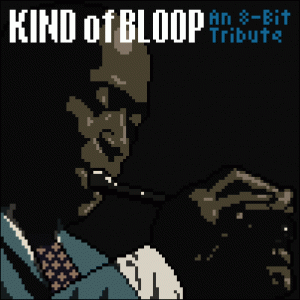
The basic story: Andy Baio, a writer and tech entrepreneur in Portland, Oregon, produced a chiptune tribute to Miles Davis. For those who do not know what a chiptune is, according to Wikipedia, it is also known as chip music, and it is synthesized electronic music often produced with the sound chips of old computers and video game consoles. Andy wanted to remake one of Davis’ seminal works and one of the best selling jazz albums ever, Kind of Blue. Andy is no dummy and he  went out of his way to pay fees to the original musicians.

Andy explains, “To create this album, I hope to raise $2,000 to pay royalties, pay the artists, and print CDs. Legally releasing cover songs requires paying mechanical licenses to the song publishers through the Harry Fox Agency, totaling about $420 for every 250 downloads and a $75 processing fee. I’ll be using the remainder to print a very limited run of CDs for Kickstarter backers, and split the rest evenly among the five musicians for their painstaking work. (This is a labor of love for me, so I won’t be keeping a dime.)” And, he secured permission to use the score — but he neglected to contact photographer, Jay Maisel, to get permission to reuse the photo on the album cover  originally produced for Miles Davis’ record. Maisel found out about it and was not pleased. He contacted his lawyers and let them handle the copyright infringement.

Miles Davis 8bit
Miles Davis Album Cover

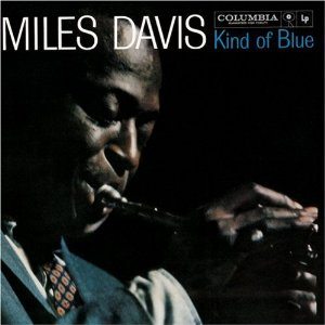
Jay Maisel, the photographer whose work was used without permission, is a well-known photographer.  His most famous work includes images of Miles Davis, Marilyn Monroe, and a host of well-known luminaries. His bold use of color and his graphic eye made his photography worthy of many awards in the design and photography worlds. He is definitely a heavyweight in the world of professional photographers.

Maisel’s lawyers wrote Andy a letter to cease and desist which he did, but after a year of negotiation, he still ended up paying Maisel $37,500. It is worth reading Andy’s version of this dispute. It is quite lucid and fair-minded and is a really good explanation of “Fair Use” — what constitutes an infringement of copyright and what is allowable under the law. Baio, very successful in his own right, writes clearly on the battle between artists and copyright holders and makes this relevant to digital reinterpretations of copyrighted works. Naturally he felt angered that he had to absorb a large financial hit.

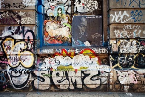
Cut now to a blog posting on Hyperallergic, a blog that in their own words “is a forum for serious, playful, and radical thinking about art in the world today.” Here is where the rant starts. The blog heard wind of Andy’s story and decided to take action. Working with  several street artists they decided that the way to “punish” Jay Maisel for collecting a payment from Andy Baio was to take the original digitized image of Miles Davis and make a street poster adding the line, “All art is theft” and plaster these on Jay’s building at the corner of Spring and Bowery in Manhattan. The blog’s initial headline stated that Maisel was ripping off a poor street artist — which is laughable since Baio is a well-to-do writer and tech entrepreneur.  The blog basically claims that these posters were a “legitimate artistic and political expression.”

A legitimate artistic and political expression? About what?

In the late ’60s and early ’70s photographers were fighting to protect their work from being used without permission. Through the ASMP and the dedication of many important artists including Jay Maisel,  photographers were able to secure rights that limited the use of their images without compensation. It is from these early battles that photographers were able to secure copyrights for their work, and that designers were taught to ask before using, and negotiate payment before using it. These early battles were hard fought and there was a steep education curve as most people were accustomed to use a photograph as many times as they wanted without paying the owners one red cent. This was also an era where most photography was commissioned and you were either dealing directly with the artist or the artist’s representative to negotiate pricing so there was no confusion regarding rights. And back then, with the internet in its infancy, it was impossible to steal an image by merely dragging it to your desktop.

Barack Obama Portrait

Enter the world of computers and stock photography, and the age where lifting images is as simple as drag and drop. Enter the digital age where no image is sacred — rather it is a base from which experimentation starts…. Well, that is all well and good if the people using an original photograph have actually secured permission, but increasingly there is a trend where people think that it is not necessary to ask permission if you are going to significantly alter the image.

Reading the  comments to Hyperallergic’s post was even more interesting. Some of comments were clearly against Jay Maisel and took him to task for protecting his work. Many felt that Maisel was being inflexible. After all Baio did cease and desist and tried to work things out. Many of the comments saw a difference between stealing music — which in their eyes is wrong versus stealing imagery —which is allowable and is classified as art.

“Stealing music and fair use are completely separate issues. One is genuine theft, the other is creating something new and adding to culture. Every generation has fed off the ones before.”

Thankfully many more of the posters understood Maisel’s position and supported his right to protect his copyright:

“Jay Maisel busted his ass for 50+ years in the fine art and commercial art businesses, is a pioneer for artist rights, took massive risks, and became a success. I hope Mr. Maisel WINS his case…Fair use?! BULLSHIT…That is a VERY iconic image that is known by even those who know nothing of jazz (plus all the phonies who SAY they love jazz yet only have a CD of Kind Of Blue)…ALL ART IS NOT THEFT, but theft is the FOUNDATION of the trash put out by talentless punks who need to sample and steal to produce anything…There’s no technique, no practice, no SACRIFICE. We are SURROUNDED by mediocrity in this “user-generated” digital-piracy age…”

And yet another poster comments:

“You guys are idiots — this wasn’t even a symbolic victory. Just because you hipsters grew up in a steal music, free-for-all generation, doesn’t mean intellectual property shouldn’t be respected or that there isn’t value placed on creative work. Commercial artists have fought long and hard to be paid for their work, just because no talent idiots like you think it should be free doesn’t make it right.

There is also a right way to go about using other peoples work, like contacting them beforehand and asking for permission, and if they don’t grant permission you don’t use it … PERIOD. This is a process that generations of designers and art directors have followed. I have an idea … why don’t you create your own artwork? Shoot your own photographs? This generation has become fat and lazy, feeding off of the creatives who came before them and then go off on righteous indignation when people want to be compensated for their work.”

I suspect — although I have no proof — that there are two different generations having these discussions. Younger generation was never schooled in copyright or fair use and was born with a mouse in their hands. With so many ways to share photographs and find images — from stock houses to Flickr et al., a visual vocabulary that is often multilayered and put through Photoshop filters of some sort or another, along with new mobile applications that allow images to be transferred and shared with a click, it is not hard to understand why this generation sees no problem in sharing images, reusing them and claiming authorship if the original image is sufficiently altered.

Barack Obama Hope Google Search

The older generation having lived through the battles to secure rights, is probably not as adept at using the technology at hand, and associates appropriation with piracy.

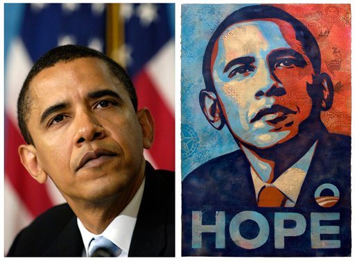
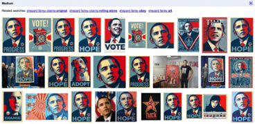
It is clear that there are passionate spokespeople on both sides. There is enough legal precedent to decide issues in court, but there is still a fuzzy line on what is influence, what is derivative, what is appropriation, and what is downright piracy. Even this blog post uses images to illustrate points without contacting the original source for permission. Witness the google search page you get if you search Shepard Fairey. This is only one of pages and pages of images all in thousands of  places, all probably used without the permission of Fairey let alone the original AP photographer.

The debate on what is original and what is borrowed will always rage on. But the digital world has created a new set of what is allowable and what is not. It will be interesting to see how a new perspective effects other parts of the art world and redefines what is original.

Wave of the future

Wave of the Future

The year was 1981. We had a brand new software company as a client—VM Software, and they needed a poster to attract visibility at a trade show. The 80’s were a tumultuous time in the technology space. Mainframes were king, and it would be the mid to late part of the decade before we would even own a Macintosh which we leased  along with a 10″ (maybe 12″) monitor, keyboard and mouse, for the princely sum of $15,000.

Along with my former partner, Alex Berry, we conceived a poster that would take the famous Hokusai wave and morph it into a  new format—representing the transition from analog to digital and is reflective of where the software/hardware industry was starting to move. Mainframe technology and legacy systems were on their way out, and a new order was in its infancy. The internet was still just an experiment and would not be available to the public for many years to come.

3D Chart

Bits and bytes were just starting to be seen and I had this idea of morphing an image from an oil painting to a digitized version to line work. I had recently graduated from the Harvard Graduate School of Design in 1977 and was fascinated with the research being done there by Eric Teicholz and the Harvard Laboratory for Computer and Spatial Graphics. They were located one floor above my studio space and I remembered seeing a very different kind of map. I remembered being fascinated by the line work on the maps and intrigued that they were generated by mapping data sets using a computer—not by hand. These maps gave birth to an idea for a poster for our new client, VM Software.

Charting the Unknown Book

Unfortunately, mapping of this kind was prohibitively expensive and out of our reach. I contacted the Harvard Lab and remembered talking to Eric, but it soon became clear that if I wanted a digitized image, or a bit mapped one, I was going to have to create it myself—and in 1981—that meant creating it by hand.

Wave Pixel Drawing

Getting an image of the Hokusai wave was easy. I then contacted an illustrator that I had worked with and asked him if he would be able to create a digitized section of the map. Brad Pomeroy labored on creating hundreds of tiny little squares by overlaying an acetate sheet over a copy of the original lithograph and coloring each and every one by hand using Prismacolor pencils. While Brad was working on the digital version, we tried to figure out how to attack the line work. While this might be easy today using Illustrator or Photoshop—back then those programs did not exist. Instead, I had two designers laboriously ink each line on another vellum overlap using rapidographs and ink. Since the line work had to be precise, each artist could only work on it for 1/2 hour at a time—so three of us spent untold hours switching off.

Wave Original Drawing

Then we had to figure out a way to blend the digitized portion with the original and the line work to the digitized portion. That involved two more overlays and yet another one for where the black would appear. With a total of six overlays—there was really no way to be certain how the final piece would turn out. I handled all of the transitions, hand coloring odd shapes, carefully adding squares that would blend into the line work and supervising the colors that would peak out from the line work. Then we had to turn the entire set over to the printer, Virginia Lithograph, and trust that it would work out on press.

As a young designer, I was nervous that my brainchild poster would flop and untold hours of time and expense would not be successful. Plus, I had a client that was growing impatient and needed this poster for the upcoming tradeshow. I remember the butterflies in my stomach as I watched the poster emerge on press—I was terrified and almost could not look at it. Luckily, the owner of Virgina Lithograph, master printer Roger Chavez took over and made sure everything went well.

The poster was a huge success for VM Software—and was reprinted many times. It went into commercial printing in 1983 and was actually part of a divorce settlement between my former partner and his third wife. After that, I lost track of how many times it was reprinted. I have seen the poster on TV, in movies, and I even have a jigsaw puzzle that was made from the poster. I still get requests for copies of the poster and people often want to know what program I used to create it and what filters I used. I get a chuckle out of that thinking that this poster really did portend the wave of the future. Oh, and one last hidden clue that I have never revealed—the Japanese calligraphy in the top left hand corner—it means “Grafik.”

If I were an automobile designer

Working recently on a rebranding effort with the Association of International Automobile Manufacturers has rekindled my childhood interest in automobile design. As a nerdy kid in the ’70s, I was fascinated with the auto industry. On long drives during our family vacations, I would sit in the back seat of our gold Dodge Coronet with black vinyl seats and count how many Ford, GM, Honda and Toyota cars were on the road. I think even at 12 years old, I was thinking that the American automobile industry wasn’t quite looking ahead at design, or answering the changing needs of the American public.

Ford Pinto 1971

You have to admit, that from the late ’70s and through the ’80s American auto design went though a plastic, one-car-uglier-than-the-next period of complacent design. As a patriotic and liberal designer-to-be, I wanted more from our manufacturers.

A representative from GM once came to my 7th grade class and asked my class to design the car of the future. To this day, I swear I designed the GM Saturn prototype concept car on looseleaf paper with colored pencils, but unfortunately, I have no proof of that other than Saturn is my favorite planet and rules my zodiac sign.

Chuck Jordan

This morning, I read that Chuck Jordan, former vice president of GM design died. His work in his early reign as design VP inspired and reflected American culture in that period. It’s worth taking a quick look at how he helped shape the American automobile.

Today American designers have FINALLY caught up and are arguably even leading the design of future vehicles. I can’t say I’m proud of the path taken, but there is a notable difference in the quality and design of the latest crop of American vehicles offered. However, in a shrinking world where GM has developed new designs in China and many of Toyota’s vehicles are co-designed in California, we’d be hard pressed to call any automobile design “American.” What automobile isn’t truly “global” today? My point is that I’m glad that “design” is back and considered a priority of our American manufacturers’ business strategies. And by design, I’m not talking about tail fins and cup holders. I’m referring to fuel technology, electric applications, and how they literally shape the cars of tomorrow and our interactions with our vehicles.

That’s design. Thanks to the Association of International Auto Manufacturers for the opportunity you’ve given Grafik to rekindle my passion. And thanks for indulging this road trip into my past. If you have a moment, take a look at some of Chuck Jordan’s inspiring work. Oh, and yes—I love my new Toyota Prius for what it’s worth.

Chuck Jordan Car

The Grafik website earns a Gold W3 Award

The 2010 W³ Awards program honors creative excellence on the web, and recognizes the creative and marketing professionals behind award winning sites, videos and marketing programs. Sanctioned and judged by the International Academy of the Visual Arts, entry into this global award program is accessible to the biggest agencies, the smallest firms, and everyone in between. Grafik’s Gold was in the category of  “Agency Self-Promotion.”

At Grafik, we are particularly pleased with the award because the new site, launched in early 2009, was a dramatic online evolution of our own brand that included a new identity, a comprehensive portfolio, and an integrated team that has grown to include interactive talent from some of the nation’s top agencies and consumer brands.

In keeping with Grafik’s sweet spot—building unique and branded experiences—Grafik.com is a non-traditional one-page site that provides a surprisingly fresh and intuitive user interface that also presents some unique challenges for page rendering, navigation, and search engine optimization. A client-side font rendering engine and a healthy dose of jQuery were called in to address these and many other issues–and to show off our technology chops.

Internally and externally, the response to the new site has been positive. We like that. And, now and then, it’s nice to win an award for our efforts.

Grafik Website: www.grafik.com

MacArthur Fellows

Matthew Carter

I have always looked forward each year to the announcement of the MacArthur Fellowships. This award- also known as the “genius grant” is awarded to “talented individuals who have shown extraordinary originality and dedication in their creative pursuits and a marked capacity for self-direction.” MacArthur Fellows are given $500,000 in unrestricted monies so they can keep on doing what they have been doing without having to worry about funds. Every year the list includes some of the most amazing people in all walks of life, but this year, finally, it included 2 people that are intimately involved with type.

Matthew Carter Type

Matthew Carter- one of the old school of type designers has not stayed old school. In addition to designing well over 60 typeface families and over 250 individual fonts,  he recently finished work designing fonts that would be legible on low resolution hand held devices.

The second person to be awarded a fellowship is Nicholas Benson, a stone carver and calligrapher who has worked on carving letter forms into stone at such notable places as the National Gallery of Art, the National World War II Memorial. and the soon to be opened Dr. Martin Luther King National Memorial National Gallery of Art.

Mr. Benson

In these days of computer generated fonts, Mr. Benson is notable for painstakingly carving every serif into granite or marble- one letter at a time.

So few people today notice typefaces let alone understand the difference between Stone Serif or Meta. Few recognize what proper leading or letterspacing can add to legibility and most believe that it is an art that anyone with a computer and fonts can master. These two notable fellows are a testament to the part typography can play in our world today. They are two examples of two craftsmen that love and labor over letters, and reading the list of people awarded “genius grants” today I felt a burst of pride in our profession and for all of those who look at type as art, not gray matter.

Benson Type Sample