Typography is a powerful thing. It can elevate a brand or it can destroy it. In some special cases, it can keep a brand alive for hundreds of years. It can be the glue that holds together an entire civilization’s visual identity. Nowadays, it’s extremely difficult to find cultures that remain loyal to their typographical heritage. You can walk around different cities in the world and see infinite varieties of fonts, a wide range from beautiful to the dreaded Comic Sans. They are certainly not cohesive and fully representative of the city’s brand.
I recently got back from a family trip to the Basque Country, a territory in Northern Spain and part of Southern France. The Basques have their own unique culture, architecture, color palette, and language that has no connection to any other spoken in Europe or the world. It’s one of Europe’s oldest and most mysterious civilizations, dating back thousands of years.
My brother-in-law, a proud Basque, gave us the most amazing tour of this special place he calls home. As we travelled through the beautiful, quaint towns of this region I noticed how loyal the Basque are to their heritage, and how desperate they are to keep it alive. It’s very easy for a culture to lose its identity when it spans two different countries. So, how do they do it? They follow strict guidelines for cities to maintain the “Basque” look. And what caught my eye the most: one primary typeface. Everywhere.
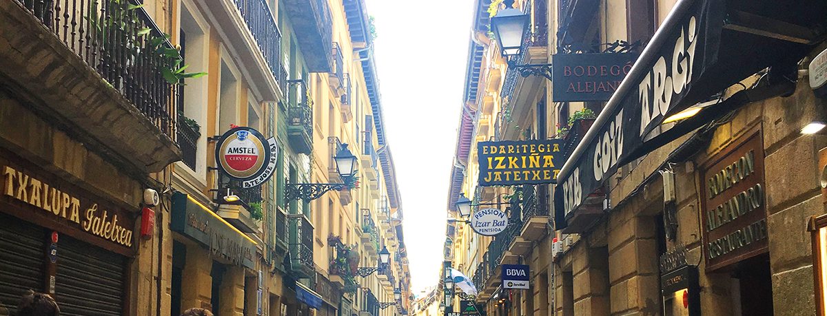
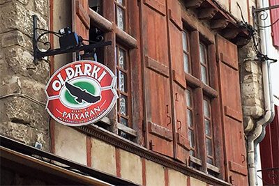
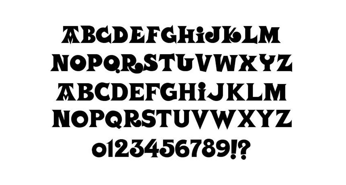
They use the same typeface for anything you could imagine: house numbers, storefronts, dental offices, government buildings, even napkins. It’s called (no surprise here) Basque. Or Euskal, which means, (what else?) Basque in their language. Basque is a folksy font, but eerily enough it is inspired by inscriptions in old Basque tombstones and cemeteries.
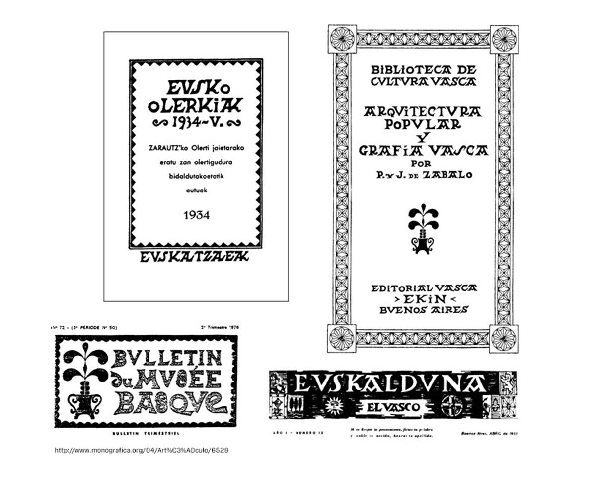
If you see that typeface, you know you are in Basque Country. They use it with pride. There’s so much history and value behind each character. I don’t think they’ll be re-branding anytime soon. It’s who they are and always will be.
As a designer, one should question every typeface you select when creating a brand. Does it help tell the brand story? You never know. It could still be around hundreds of years from now.