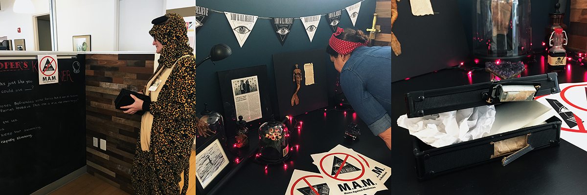
The Halloween work day at Grafik ended with an agency-wide solving of a murder mystery created by two of our designers. While done purely for fun, once we had finished with the game, we realized how much creating a path to solving a mystery had in common with creating a website’s UX. And just as with user experience testing before launch, there are always surprises. Here are some of the surprises and parallels.
1. No one will use your product the way you expected
We had big plans for our mystery to be solved by learning A, then figuring out B, which would lead to discovering C. We truly thought we had anticipated how everyone would play the game. But in murder mysteries, as in UX design, you can never really plan for how your users will interact with your product. Sometimes they will go from A, to B, to C. Other times they will start with F (where did that come from?), move straight to B, then zig zag through all kinds of interactions before finally getting to the end result, leaving you scratching your head. There’s no wrong way to use a product. Leave room in your user flow for “non-traditional” interactions.
2. Sometimes you have to break open the locked box
One of our major clues in the mystery game was an intriguing box locked with a number code. Three riddles had to be solved to open the box, but it soon became clear that the combination had accidentally been reset and it was permanently locked. The box was the centerpiece of the mystery and we didn’t want to spoil the storyline by smashing it open and revealing the contents to everyone. But, ultimately, finishing the game was more important than the “integrity” of the storyline. The same is true for UX. When users find issues, don’t immediately dig in your heels and say “they just don’t appreciate the experience we are crafting for them.” You are trying to make their lives easier, not harder. Show your cards, open that locked box, let them have the experience they need.
3. What’s obvious to one isn’t obvious to EVERYone
Remember those riddles I mentioned? One of them could be solved with a little bit of internet sleuthing. We didn’t tell the players because that would make it too easy. And yet, even at the end of the game, no one had bothered to try and solve it. What gives? We made the mistake of assuming the players would Google it instantly. But without any guidance, it just seemed like an unsolvable riddle. So the next time you catch yourself saying “of course people will know this,” or “this feature is completely intuitive,” take a moment to re-empathize with your user. You might be making assumptions that will disrupt the UX.
4. User testing is the best testing
All the planning, strategizing, and QA’ing in the world can’t prepare you for seeing users interact with your product. In addition to learning what to change for version 2.0 (and 3.0… and 3.5…), you’ll learn a great deal about your own biases and preconceptions (see point 3). Whether you’re building a website or writing an office-wide murder mystery game, your users are the ones who will give you a Pass or Fail. Let them play the game, solve the mystery, and then put everything you learned into making an even better experience next time.