One of my favorite clients recently sent me a link to Private Wealth magazine. There I found a very interesting article that discusses how high-net worth (HNW) clients make choices selecting an investment advisor. Which do they rank higher, expertise or brand? Before reading the article I would have thought that while brand is important, expertise has to win out. (And this coming from a person who makes her living off of branding no less!) The authors, Russ Alan Prince and Bruce Rogers have proven me wrong. They submit that “…the ultra affluent want to work with exceptional experts. So you might conclude that expertise trumps brand. In a perfect, rational world, that would be correct. However, the world we inhabit is far from perfect and rational. In sourcing the ultra-affluent, it turns out, brand outshines expertise all the time.”
They have created an expertise/brand matrix that I think can be applied to most professional services businesses. Most professional organizations want to be in the upper right hand corner—Talented Leading Authorities: they have the expertise to do an excellent job for their clients and they will “have the opportunity to do so,” as they are well-known among their target audience.
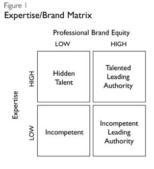
A person who is an Incompetent Leading Authority has the brand awareness and visibility—but no skill set to accomplish the tasks. The authors make this point, “Talented Leading Authorities and Incompetent Leading Authorities are actually on the same playing field. The reason is really quite simple. When it comes to choosing professionals in complex, specialized and unfamiliar fields, the ultra-affluent and their advisors are usually incapable of making proper evaluations.”
Professionals also do not want to be in the Hidden Talent box. This translates to a person who is very experienced but has no visibility and a weak brand. They have the knowledge and skill set to meet their clients’ expectations, but no brand recognition—so they remain invisible. In situations where a Hidden Talent is matched against a Talented Leading Authority, brand will cast the deciding vote for the latter. Prince and Rogers conclude that in building an HNW practice, Leading Authorities dominate. “Incompetents are rarely successful except for the rare wealthy client or two—often relatives. Hidden Talents tend to stay hidden. Hence, the competition is among the Leading Authorities—and, as we’ve stated, they’re on equal footing.”
The Private Wealth article was clearly addressing the financial services industry. But really, it is applicable to any service professional. You can be the best thing since sliced bread, but if no one knows about you, you are toast. And we have all run into examples in every industry where we expect to see an expert only to find that the King is wearing no clothes. Unfortunately when there are no ways to get an objective assessment, consumers fall back on brand. Famous imposters will continue to steal business from the Talented Leading Authorities based on name alone; witness the success of Bernie Madoff.