The LeBron brand — just freakin’ do it!

Sports and branding: I am passionate about the former and I love to consult with my clients on the latter. So I can’t help but be fixated on the recent buzz pertaining to LeBron James and the so-called “hit” on his brand equity ever since he made, in my opinion, the ill-advised television special to announce he was switching from his hometown team to the Miami Heat.

To set some context for those of you who have no idea what I am talking about—LeBron James, the all star player formerly of the Cleveland Cavaliers, and probably the most celebrated basketball star since Michael Jordan, went on national television in July and announced that, as a free agent, he was leaving the team that drafted him seven years ago. In his mind, joining the Miami franchise with a few other all stars already in place, would give him the best chance to win an NBA championship.

Now I’m cool with athletes switching teams when they are free agents. Happens all the time and it is the prerogative of any free agent to go where they feel most comfortable. But the manner in which he made the announcement made headlines all over the sports world­, and it was seen by many as a selfish and backstabbing move against his home state (he grew up and attended school in nearby Akron, Ohio). Here is a brief clip of the announcement:

Shortly thereafter, the backlash started. According to Mark Cuban, the outspoken owner of the Dallas Mavericks, “LeBron’s brand will take a $1 billion hit, give or take a few bucks.” While that statement may be a slight exaggeration, a recent poll about LeBron by the Q Score company—the Q Score is a measurement of the familiarity and appeal of a brand, company, celebrity, or television show used in the United States­—shows LeBron’s popularity rating has plummeted since his announcement and is currently below the average sports celebrity.

But I found it really interesting to see how Nike, a key LeBron sponsor, took the opportunity to not only come to his aid in what appears to be an attempt to help him repair some of his brand image, but also make sure they are protecting one of their biggest assets. Weiden & Kennedy did the spot and I personally love it. It is somewhat bold, in your face, and guaranteed to grab attention—just like Nike always does.

Now I can’t say that this ad will start the path to brand rating recovery (although I think it is great for Nike), but considering what other elite athletes have done over the years­—adultery, domestic violence, using banned and illicit substances—this sports fan gives LeBron credit for staying clean and living by his sponsor’s famous tag “just do it.” Yeah, he made a mistake in how he delivered his decision to move on. But I believe his success on the court will ultimately define his brand which I am sure will be memorable and plenty lucrative, to say the least.

A gap in judgement

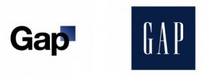
Gap Logos

I think most people would agree that a brand is someone’s gut feeling about an organization, or company. In other words, it’s intangible, individual, and very personal. That’s why managing a brand is so tricky: it’s really managing expectations. So it shouldn’t surprise anyone that the reaction to Gap’s new logo was so overwhelmingly negative.

Millions of consumers have adopted Gap as an essential facet of their own personal brands. And it reflects more on them than it does the company. It’s like the old maxim, “Your brand doesn’t belong to you, it belongs to your customers.” That’s not to say that the company doesn’t have the right to change, or evolve the logo, but there has to be a really good reason.

Over the past week or so, as the company was responding to the overwhelming criticism, one Gap executive noted that the company is changing, and management was hoping the new logo would represent that change. But what is that change? And shouldn’t that change have been perceptible to consumers before Gap made any effort to reflect it?

Gap’s new logo failed because there appears to have been no real rationale for it. I imagine the lousy economy and decreased sales might have been the catalysts, but even these don’t support sweeping changes to the most significant visual expression of a major consumer brand.

In the end, this entire ordeal will serve as a cautionary tale for other brands, and a proof point for anyone seeking to illustrate the power of social media. But for now, we can only scratch our heads and wonder what Gap was thinking. If the short-lived logo represented anything, it conveyed a sense of uncertainty, carelessness and frustration — all of which is painfully revealing for a retail company that has seen better days.

Does a logo have to change? A look at the Grafik logo.

We have been working with a very successful business that has been around for about 30 years. As part of a strategic plan we recommended that the company revisit their logo. And some very interesting questions were raised. How critical is a logo as part of a brand? The company has been successful as a mom and pop organization, has never done marketing, and wants to increased visibility.  Will upgrading their logo add revenue or effect their bottom  line positively?  In this case, the company has a huge public facing infrastructure that would have to be changed; unlike some companies that would only have to revisit marketing materials and corporate stationary if its logo changed, this company could have as much as a $3-5  million price tag linked to changing a mark. Any logo change results in retooling a fleet of trucks, issuing new uniforms, new crates and new boxes in addition to building signage, business papers and marketing materials. Not an insignificant change.

Grafik Logo 1

It got me to thinking- how much can a logo really change things? My overall philosophy has been and continues to be that a logo is only a small part of a brand’s identity. It is  signature or a punctuation mark- it is never the whole story. I often counsel clients- especially new start ups- not to spend too much time and money on logos unless there is a budget to fully support the mark. By that I mean a sum of money that is large enough to imprint a new logo on the viewers’ minds. Normally  a logo becomes a strong foundation to a much larger brand exercise. And as many times as not we may only update a mark rather than create a new one if we feel that its contribution is not significant. In this case, the mark is seminal to the brand and very visible, and the current mark is somewhat problematic.

I started to look inward at our own mark to see if Grafik’s logo, untouched, could have carried us to where we are today. The flat out answer is “No”- but then again- we are playing in a visual space, so the way we portray our organization has ramifications.

Our first logo- created in the mid-seventies was created by a former partner, Alex Berry. The seventies were characterized by an abundance of warm colors and a love affair with san serif type faces- both apparent in this early version of the Grafik stationary. Sidenote- we thought we were being very hip by always using the logo rather large ( horsey now that I look at it) and always vertically. Our presentation materials were non-existent, and as a start up we created our identity on the fly.

Grafik Logo 2

After about 6 years we knew we needed a refresh. The company was migrating from a small boutique design firm of three or four people to a group of about 8-10 designers. We felt compelled to redesign the mark to look more “professional”. While this is a bad scan from a really old piece of stationary- this was before computers- we went for a much more conservative look.Typical of the time- the mid seventies- we opted for a soft moss green and a warm brown- subdued and subtle. Everything about the new look was restrained. We still really only viewed our brand as a logo and the way it was applied to stationary and business cards and did not really understand that it had to be used consistently. Along the way, the foundations of our brand, strong thinking, creative excellence and great client service were starting to be formed. I’m not sure that at that point we even understood who we really were- but we started to understand who we wanted to be.

Grafik Logo 3

By the 80’s I knew I needed to make a bold move. Our company was growing, our reputation was spreading and with the advent of the computer, our business model was evolving. I threw out a number of ideas to some of my creative staff- and decided we would have an internal competition to redesign the new look. I fully expected that one of the art directors would clinch a new look and feel. Low and behold, Dave Collins- at the time one of our youngest designers and now one of our partners, came in with the winning logo- a complete departure from where we had been.  It had the swagger that our studio needed- a fresh new look and feel that symbolized  a company on the move. Bold, yet restrained, we moved all of our materials to red and black- from our proposals, our pitch books to our stationary. For the first time we were getting compliments on the packaging of our proposals and on the quality of our communications. And for the first time we were starting to understand how a brand can really extend its reach.

But nothing ever stays the same. Dave’s logo carried us for about 5-6  years and in that time Grafik was growing from a design firm that had a good local reputation to a firm that had a solid reputation for branding intitiatives regionally and to some extent nationally. In the mid 90’s we realized that our good old red and black logo was dated and we went for a more refined elegant look. We were working with a lot of fashion and luxury clients and it was important to have a contemporary identity. Again we looked to one of our younger designers, Jonathan Amen, to give us a mark that had a relationship to our existing logo.

Jonathan not only revisited our mark, but he pushed us to look at an entirely new color palette and a new family of fonts. Gone was red and black as the dominant color palette. In- a soft green, an orange, a light blue and a switch from coated papers to uncoated papers. The new logo was reinforced with a series of ultra light circles that was a more sophisticated treatment than the heavier logo from the 80s. Our presentations became increasingly sophisticated but one thing was lacking. While the mark produced beautifully on paper, embossed or stamped, it was not as successful on the web. As more and more of our work became interactive we realized that we needed to capitalize on our web presence and that our current logo had limitations.

A combination of designers including Mike Mateos, Ivan Hooker and Gregg Glaviano  joined to create a new mark.They kept aspects of the original “G” created by Dave Collins, and transitioned the color of the mark to a more orange-red. The new “G”, while evocative of its predecessors, stands on its own and marks the transition of Grafik from design firm to branding agency. Our logo is an accurate depiction of the Grafik brand that still values intelligence, creative and service excellence. This time, with 20 years of branding under our belt we understood the importance of brand consistency and so we changed everything from the website, to email signatures and business templates to the interior of our offices. We launched the new logo with an online video and built internal consensus by making the logo change the focus of our annual company t-shirt.

Grafik Logo 5

Back to the original question. Could Grafik have grown as much if we had kept the original logo? In a profession that is judged in part by style and execution, it would have been hard to use a mark created in the late 70s to symbolize the organization we have become today. Looking at successful brands there are very few that have not had to adapt to new trends, new technologies, new ways of presenting themselves. A mark that might have worked a dozen of years ago may lack the energy, sophistication or professionalism to carry the company forward. Now we even have to consider the mark’s proportions to be successful on a mobile device.

So back to the dilemma faced by my current client. The question that I posed to him was not if the old logo matched to goals and positioning that we set forth for his company today. The question posed was would the logo take the company where it wanted to be 5, 10, 20 years from now. The answer was no. It was a hard answer given the costs associated with a change. Nevertheless, it was the right answer.


Why the term “green homes” is all fuzzy and “LEED for homes” is all Greek

Thanks to an army of late-comer home builders, all vying to jump on the latest trend bandwagon, the term “Green Home” has been so overused and ill, defined thereby rendering it confusing and ultimately meaningless to new home shoppers. Let’s face it, to really live in a “Green Home” today you’d have to harvest your own rainwater and store it in a cistern on the roof of your bamboo hut.

LEED for Homes on the other hand, has been virtually invisible to the average consumer. Although the term does have equity with some savvy home buyers, the same ones who are down with all the latest trends in New Urbanism and Sustainable Developments. But, by and large, it’s likely the average new home buyer still doesn’t have a clue as to what it really means. Yet some new home builders continue to tout the fact that their neighborhoods are LEED for Homes certified. That would be fine if the USGBC (US Green Building Council) promoted their LEED for Homes program to the public in a major way. But they don’t right now and it’s still not common knowledge.

Welcome to Old Town Commons, located in Old Town Alexandria, this is EYA’s newest residential neighborhood. And it’s one of the largest LEED for Homes certified neighborhoods in the entire country. So, since we’re a big believer in speaking plain English, we proposed a new way for EYA to talk about the features of current construction best-practices and energy efficiency design to prospective home buyers. “Smart City Living,” is the term we’ve coined to highlight the advantages of buying a new EYA home; and it’s prominently displayed in the sales office as well as a soon-to-launch interactive counterpart for EYA.com. The objective is to translate technical features into tangible homeowner benefits so prospective buyers get a clearer picture of EYA’s holistic approach to “green” building, as well as a better understanding of the advantages that a new EYA home offers.

EYA Smart City Living

2009 online annual report for Volunteers of America breaks new ground

Longstanding client Volunteers of America (VOA), has been working with Grafik for over five years. Together with the VOA creative team, there was an initiative to keep the organization on the cutting edge to maximize budget and reach for their 2009 Annual Report. The collaboration yielded the amazing work that can be found at http://annualreport.voa.org/.

The Annual Report is groundbreaking for the organization for many reasons. It takes what was formerly a one-dimensional product with limited reach to a limited audience and turns it into a multi-purpose tool, with unlimited reach and potential. Eco-friendly, using no paper product at all, the interactive website is not only a tool that informs stakeholders and interested parties in VOA’s 2009 activities, but can be used by VOA in future presentations and meetings throughout the year.

Gregg Glaviano, Creative Director and Partner at Grafik says, “Having worked with VOA for over five years designing their printed annual reports, the online delivery allows us a richer more versatile experience that can reach a broader audience than before and with less waste. I believe Grafik’s advantage is understanding both mediums and working with our clients to recommend the tactics that will deliver the greatest results for their investment. ”

This is a wonderful example of Grafik’s history of creating partnerships that forge new paths of excellence that serve not only our clients, but the greater good of us all.

Cadbury

Cadbury logo

If there was a list of great examples of brand, Cadbury would have to top the list. As the Kraft/Cadbury deal (takeover) becomes finalized, it is not the chocolate bars or creme filled eggs that Britons are fearing they will lose, it is what Cadbury stands for. Britons, yesterday, were so angry at the takeover that the former trade minister, Lord Digby Jones, was quoted as saying, ” My big wish is that Kraft get it when they see what made Cadbury the iconic brand they wanted to buy, and that’s its people, its reputation. That’s what Cadbury’s is, and they’re buying something that’s more than just a chocolate company.”

Hard at work

“…more than just a chocolate company.” That is the epitome of a successful brand; more than the sum of its products. The Cadbury brand is successful due to its people, its values, its history, its relationship with its employees, and of course the chocolate candy that the English have grown up with. Cadbury is seen as a force for good, constructing a model village in 1879 for workers to live in away from the industrial wastes; pioneering worker involvement in labor negotiations; and treating its workers fairly providing an excellent pension and medical benefits before they were mandated. Even the founding of the company was based off of a social benefit: the founder, a Quaker, developed chocolate drinks as a way to wean people off of alcohol.

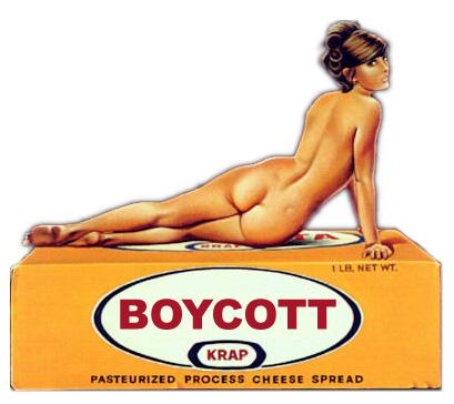
The Cadbury brand has come to be synonymous with fairness, warmth, decency, compassion. And the Kraft brand? Cold, huge, uncaring, impersonal. And ironically, Kraft was rated highest in a yearly survey analyzing brand sincerity. The Reputation Institute analyzed the data of their annual Global Pulse survey and figured out that U.S. corporations perceived to be communicating with the most sincerity had the best reputations. Kraft was the top of the list.

Krap

And so, while the ingredients for the chocolate bars may not change, and the taste may remain the same, the brand will not. And if Kraft is smart, they will look beyond the total number of units sold, and they will do everything in their power to preserve the Cadbury brand, because the brand loyalty they have is hard to replace.

Branding bologna

Dietz & Watson

There was an interesting piece this morning on Morning Edition about a branding battle between Boars Head deli meats and Dietz and Watson.

Deli meats

Steve Chiotakis speaks of a branding battle for deli counter space between a nationally known producer, Boars Head and Dietz and Watson, the local “kinder and gentler” meat producer. This piece really speaks to B2B branding—since the sale is between the deli meat producer and the supermarket—where normally only one brand of meat is carried. Boars Head is the clear bologna behemoth in deli shelf space and holds a monopoly in some areas. In terms of branding, Dietz and Watson portrays the company as a smaller regional mom and pop operation and plays into the new local craze—buying locally to reduce carbon footprints.  And both brands heavily rely on their distributors and sales force to be brand ambassadors. Chiotakis relays a voice mail recording from a Boars Head rep:

Aggressive Voicemail: Hey Dietz and Watson: I dare you BLEEPers to come up here with your BLEEPing product. I’m a Boar’s Head guy. You bring your BLEEPing little BLEEPing circus up here, I’ll bury you BLEEPing guys.

Clearly this is not the brand steward that Boars Head marketing had in mind….

But this story is really about B2C marketing. Neither brand has made a convincing argument to the consumer on why their brand of mortadella is better than the other ones. After all ham is ham and smoked turkey is smoked turkey… right? Wrong. Both companies have failed to give the consumer a compelling reason to ask for pastrami by name. And so deli meat is a commodity and the decision is left up to the supermarket chain.

It reminds me of ordering a drink 10 years ago—if you ordered a gin and tonic—you got your drink… no questions asked. Now order a G&T and every bartender will immediately ask what brand of gin you would like. That is because most people know there is a difference between Gordons and Bombay Saffire… And even if they can not taste the difference—there is a perception that one brand is better than another. In terms of branding, Absolut is a model of how to change a commodity into a luxury brand…

Well the same for corned beef. When Boars Head or Dietz and Watson start talking directly to the end consumer they will have a better chance of either protecting their turf or breaking into the deli counter. When consumers start asking for Dietz and Watson by name, then supermarket officials will sit up and take notice. When they start to impress their brand on the minds of the consumer then the battle of the bologna will change course.

Hoopdeedo or what’s in a name?

There was an article today in Investment News talking about the problems of naming a business in the financial services arena. It seems that a guy named Sid Blum had been running his own firm, GreenLight Fee Only Advisors, for more than three years when in April he received a threatening legal letter from Greenlight Capital Inc., the hedge fund led by legendary short-seller David Einhorn. In sum, Sid pressed his suit to keep his name, lost and spent a lot of dough on lawyers. And at no point did he talk to anyone who does naming that might have steered him clear and saved him beaucoup bucks in the end.

Naming. It seems like such a simple thing to do. After all what’s in a name? Years ago, before many of you were born, you figured out a name, printed stationary and you were done. If Mike Meyer opened up a Meyer’s Shoes in Indiana, and Sidney Meyer (no relation to Mike) opened up a Meyer’s Shoes in Alabama, they would not have known about each other or even cared. Now in modern times, the internet has changed all that forever. Now if Harry Meyer wants to open up a Meyer’s Shoes or a Meyers Footware or Meyers Slippers in Philly, he most likely will not be allowed to IF either Sidney or Mike registered their trademark and secured a url. Now Harry is going to have to do some fancy footwork.

Naming exercises can go for as high as a quarter of a million dollars if it involves an international search and if it is necessary to purchase multiple urls. More often than not our Harry Meyer is going to be forced to look at names that are either a bit crazy or made up like hoopdeedo or combinations of words like Meyoes (Meyers Shoes—and if you don’t think this ever happens, think again). And often these names—strange as they may seem—form a first impression to a viewer. Would you ever buy wingtips from a store named Hoopdedoo? You might from Meyer’s Shoes, but you most certainly would not from the former.

So for the sake of argument Harry was able to secure the url for Meyers Footware and decided to develop his brand using that moniker. Well—he still needs a lawyer to make sure that that name is free and clear. Probably 90% of the lawyers out there would nix that name if there is another Meyers or Mayers or Meiers or MyOrs in that category that might have a trademark that could cause confusion in the market. Now if Harry wants to open up a computer software company called Meyers Shoes—he probably would not have a problem.

Lets also say that Sidney in Alabama has been in business selling shoes for 60 years under the name Meyers Shoe, even if Sid did not apply for a trademark (who knew about that then?!) he has been doing business under Meyer’s shoes for generations and has first dibs. So even if he does not own the trademark you may still be in trouble.

As a firm that does naming we know how time consuming and expensive this exercise can be. Sitting with 3 or 4 windows open on our computers, one connected to USPTO, one to go-daddy.com as a start to see if the url is available and who owns it, one open to Wikipedia—which comes in handy when you want to research arcane information about shoes—or look at the derivation of the name Meyer, and one open to a blank document in Microsoft Office waiting for brilliant names to appear. And sometimes you nail it, and sometimes it takes endless rounds of sleuthing to find the needle in the haystack—the name that is available, that has a free and clear status on USPTO, has a good url and does not damage your brand, like hoopdeedo.com.

Oh and by the way, hoopdeedo.com is taken!

Raw ingredients

Let’s say someone gives you a list of ingredients: no measures, no instructions, not even a clue as to what the ingredients should combine to make. It’s an absurd notion, and yet branding firms do it all the time.

For the third or fourth time in as many months, Grafik has been asked by organizations to try and make heads or tails of strategic documents delivered to them by firms who were happy to drop a stack of research on their doorsteps and dash. In each case, there were no real conclusions, and absolutely no hint of what the organization’s brand focus should be.

As far as I’m concerned that’s less than half the job.

Before you can begin to express a brand, everyone needs to agree on a concise recipe—a directive that identifies the key components, weighs their significance, and details how they need to come together. This is a critical step. One you can’t skip because it informs imagery and messaging, ensures relevancy, and helps define tactics across every customer touch point.

We have a couple of branding projects in the works now, and you can bet that when they’re launched, these brands will be fully baked. The way we see it you shouldn’t have to settle eggs and flour, when you’re in the market for cake.

A healthy relationship

It’s not often you have a great client who always lets you do great work. But the American College of Obstetricians and Gynecologists (ACOG) has provided numerous opportunities for Grafik to do just that. Penny Murphy and Amanda Hall are extraordinary partners in that they consistently bring us in on projects where we can offer strategic insight and flex our creative muscles. They’re wonderful to work with because they value our perspective and really appreciate our work.

Recently, we helped them develop print ads showcasing both the value of specialist care, and the need for tort reform. The two sample ads shown here are just a few of the pieces we created. We hope to extend these campaigns soon, but right now we’re busy helping ACOG launch a microsite for their new online publication, pause magazine. I’ll have more to say about that in coming weeks, but for now I just wanted to say thanks to Penny, Amanda and Adam (the latest addition to the team) for making my job easier — and a heck of a lot more rewarding.

Cheers to good work and good clients.

Lady running through waves, ACOG
Lab coat hanging in a lab, ACOG

Grafik chosen to develop branding for Women’s Campaign International

Alexandria, VA — July 1, 2009. Grafik Marketing Communications, the DC/Metro area-based marketing communications shop has been named agency of record for the Philadelphia-based non-profit, Women’s Campaign International (WCI). Founder and former Congresswoman Marjorie Margolies chose the Grafik Team because of their keen ability to compassionately get to the heart of the brand, creating an identity and communications platform that commands market share and increases awareness in a highly-competitive sector.

“In a short time, Grafik has not only become experts on WCI, our work and our peers – but has been able to get to the essence of our brand and help us see how to distinguish ourselves to our supporters, donors and governmental grant-making bodies ,” says Margolies, who is herself, not only a former NBC reporter and five-time Emmy Award Winner, but a best-selling author. “They completely understand cause-branding and we look forward to working with them as a partner for many years to come.”

Since its founding in 1998, WCI led by Margolies, has focused its passion and resources on increasing the participation of women in political and democratic processes worldwide. Even as successful initiatives are fulfilled, the need and opportunity for new programs continues to grow. And after 11 years of operating on boundless conviction, WCI’s leadership has concluded that building a larger, broader base of support and funding is essential. At their last major event in NY, WCI honored many well-respected female luminaries such as Hillary Clinton, Katie Couric, Gloria Steinem and Geraldine Ferraro to name just a few.

“Grafik has always been concerned with doing important work, and as a woman-owned company, we are particularly committed to working with WCI,” says Grafik founder and CEO, Judy Kirpich. “We believe that working with WCI will not only make them more effective, but it will make Grafik a stronger company, keeping us close to our founding mission and contributing to make the world a better place for us all to live in.”

Grafik will redefine the brand identity and strategy, from logo to interactive presence. Additionally, Grafik will be assisting with PR messaging and the WCI annual fundraiser in November 2009 featuring luminaries in the field and to be attended by policy-makers, opinion-leaders and superstar spokespeople in women’s issues. For more information on donating to or creating strategic partnerships with WCI, please contact Kerri Kennedy at 215.387.2602 or go to www.womenscampaigninternational.org.

Editors Note:
Women’s Campaign International (WCI) is a United States-based, non-profit, non-partisan organization dedicated to incorporating women into political, democratic and decision-making processes worldwide to impact legislative agendas. WCI works toward this goal by promoting and assisting women leaders at all levels in post-conflict countries with the skills and knowledge needed to influence policy, laws and social issues in the areas of education, environment, healthcare, social welfare, women’s, children’s and family issues. www.womenscampaigninternational.org.

CEO Judy Kirpich interviewed

CEO,  Judy Kirpich was recently interviewed along with 9 additional nationally-known design professionals as part of the AIGA/Aquent Survey of Design Salaries 2009. This group of select design professionals was asked to share advice on how to remain competitive in these challenging economic times. Here’s her advice for staying competitive:

Control only the things you can control

Here’s my advice for staying competitive in tough times:

Always manage your business like you are in a recession. That means putting money away in good times so you can weather the next recession—because there will be a next recession. Resist the temptation to spend profits during fat years because lean years always follow. Remember, cash is king.

“Business” is not a dirty word. Many of us designers look down our noses at the business aspect of our profession, in which creativity reigns supreme. Never forget that if you do not operate your practice like a business, there will be no place for your creativity to live.

You cannot control many things, but you can control your budget. During difficult economic times you can’t control if a business cuts back its marketing budget or Wall Street tanks. But you can control what you spend. A budget can help you understand where your money is flowing and is the best picture into your economic health. Create one yearly; look at it monthly; revise it if necessary.

A “Grub first, then ethics” mentality is shortsighted. If you abandon your professionalism by entertaining spec work, or by severely undercutting your competition, it will come back to bite you.

The health of the economy is not your fault. If your business is not doing as well as you would like, it won’t do any good to beat yourself up about it. There is less work and more competition for accounts and projects. And jobs are often cancelled right after they are awarded! That’s the definition of a recession. Just remember that you are going through tough times due to external circumstances out of your control— not because you are a bad designer or a bad person.

To read the comments of the other luminaries:

http://www.designsalaries.org/advice.shtml

Grafik
Privacy Overview

This website uses cookies so that we can provide you with the best user experience possible. Cookie information is stored in your browser and performs functions such as recognising you when you return to our website and helping our team to understand which sections of the website you find most interesting and useful.