Discovery District Maryland

Discovery District Maryland

Brand StrategyIntegrated MarketingVisual IdentityWeb Strategy & UX

Discovery District Maryland is where groundbreaking research meets real-world scale. Where one of the country’s top public universities connects with a community of scientists, visionaries, and entrepreneurs, industry-shaping leaders. With considerable expertise in placebranding, Grafik was selected to build the brand and marketing platform for this remarkable ecosystem. Our top strategists and designers framed the Discovery District as a place where firsts are regularly realized, sustained, and nurtured.

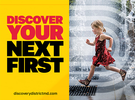
To showcase the brand story and highlight what is truly unique to Discovery District Maryland, we established a new brand name, brand identity, and mantra, The Next First. It all comes together in a vibrant new website.

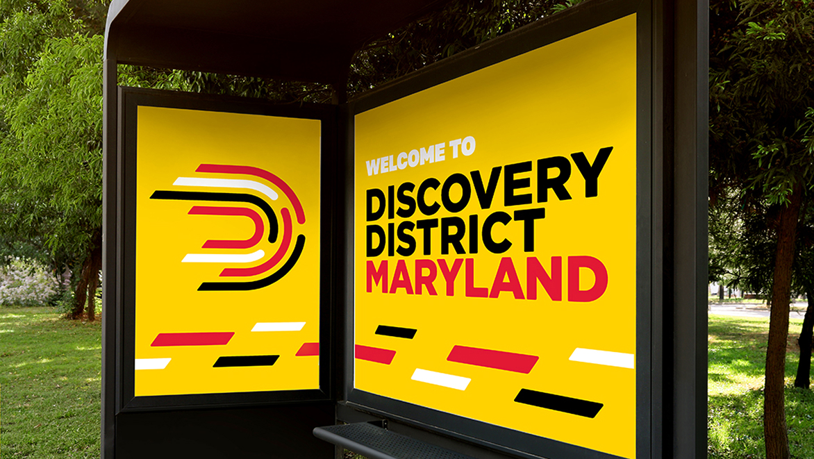
One of the many distinct features of Discovery District Maryland is its focus on quantum computing. So designers turned to quantum science for inspiration. The result is a logo that’s constantly moving. The work of accelerating breakthroughs never stops at the Discovery District so we insisted on a brand identity that reflects that.

Sarah Miller Quote

Activating Stakeholders

From meetings with key development partners and civic leaders to conversations with UMD president, Dr. Pines, and his board, the Grafik team laid the groundwork for a highly collaborative network of stakeholders who saw how they could be part of the Discovery District brand, sharing a consistent story and leveraging brand assets for use in their own marketing and communications efforts.

We built a streamlined website that showcases the experiences and opportunities that abound in Discovery District—and, vitally, will be able to grow as the community does. The hero features a dynamic slideshow highlighting key audiences and messaging, while other sections emphasize innovation and quantum science leadership and a news carousel shares the latest Discovery District updates.

Discovery District Maryland Mobile
Website Gallery

Defining The Community

Fence banners are popping up in all corners of Discovery District’s 150+ acres, and signage is now delineating its boundaries. With a fresh new design vocabulary, developers, property managers, and marketers are showcasing the many opportunities for locals to experience their next first.


Breaking Ground — Literally

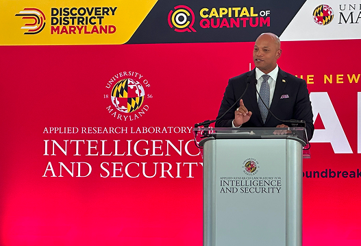
Governor Wes Moore is a regular visitor to Discovery District. His support for this destination as a hub for the Capital of Quantum Initiative (another Grafik project) brings him back often for news conferences and ground breakings. We’re proud to have our work closely associated with one of UMD’s top strategic priorities and one of state’s signature initiatives.

Outcome

Our work with Discovery District was strategic and comprehensive. From naming this remarkable destination to establishing a framework for audience-specific messaging and activating brand ambassadors, Grafik worked shoulder to shoulder with the team at Terrapin Development to deliver a versatile placebrand. Our efforts are fueling conversations with companies looking for the optimal homebase and uniting local stakeholders eager to see their community grow and thrive.
Our Featured Case Studies

MORE CASE STUDIES

MHFA

Associations & Nonprofits,Education,Health & Wellness

Canopy Neurodiversity Foundation

Associations & Nonprofits

National Human Genome Research Institute

Associations & Nonprofits,Health & Wellness

American Physiological Society

Associations & Nonprofits,Health & Wellness

The Hertz Foundation

The Hertz Foundation

Brand StrategyIntegrated MarketingVisual IdentityWeb Strategy & UX

Hertz Fellow Dario Amodei

Supporting a lifelong interdisciplinary community of innovators tackling the greatest challenges the world faces today, the non-profit Hertz Foundation was little known outside of the research world. Awarding no more than 25, five-year fellowships to PhD candidates in the applied sciences, mathematics, and engineering, the community may be small in number, yet its collective achievements, as seen in the video below, are outsized.

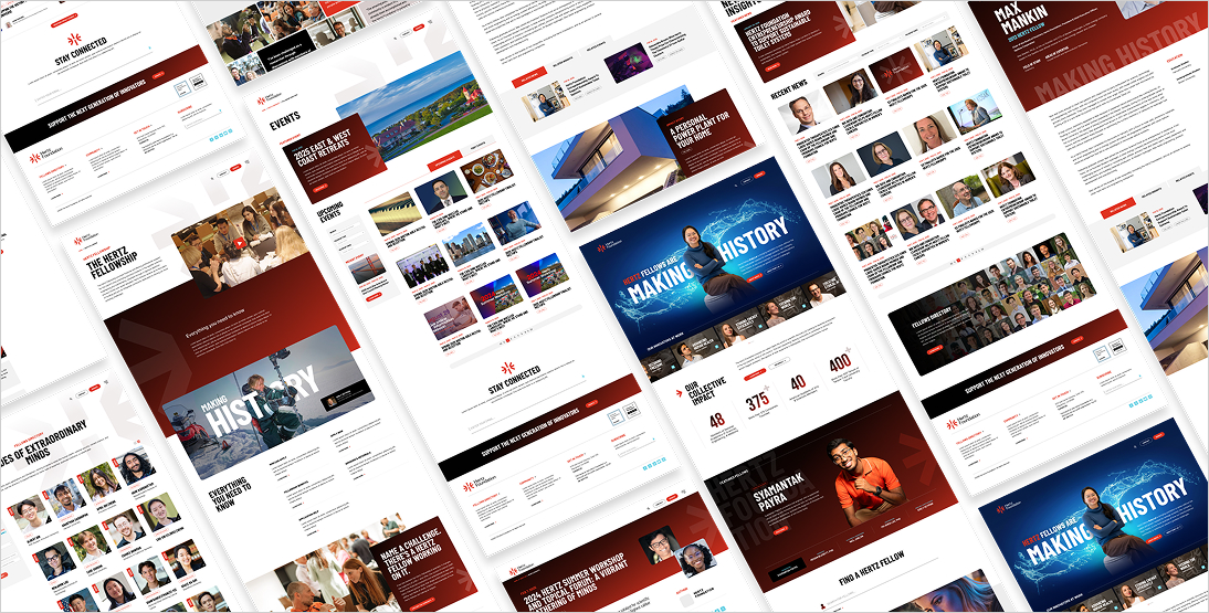
To memorably deliver the stories of Hertz Fellows, we created a new visual ID, logo, and mantra, Making History, all introduced via a totally re-imagined website.

Conveying how collaboration sparks innovation, distinct elements converge to form an “H” within the new logomark. Once seen, it is not forgotten.

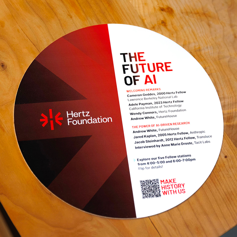
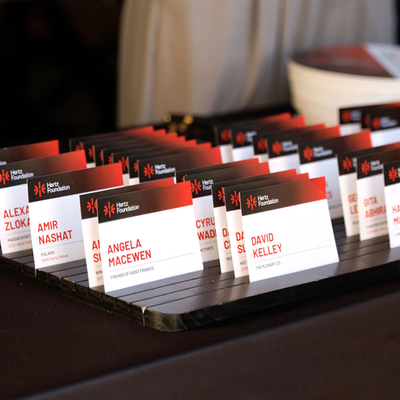
Hertz Foundation Coasters
Hertz Foundation Business Cards
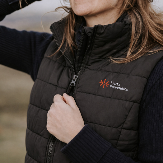
Hertz Foundation Embroidered logo
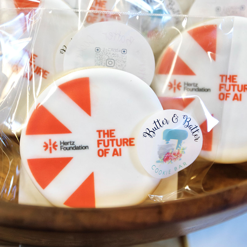
Hertz Foundation Cookies with Branding
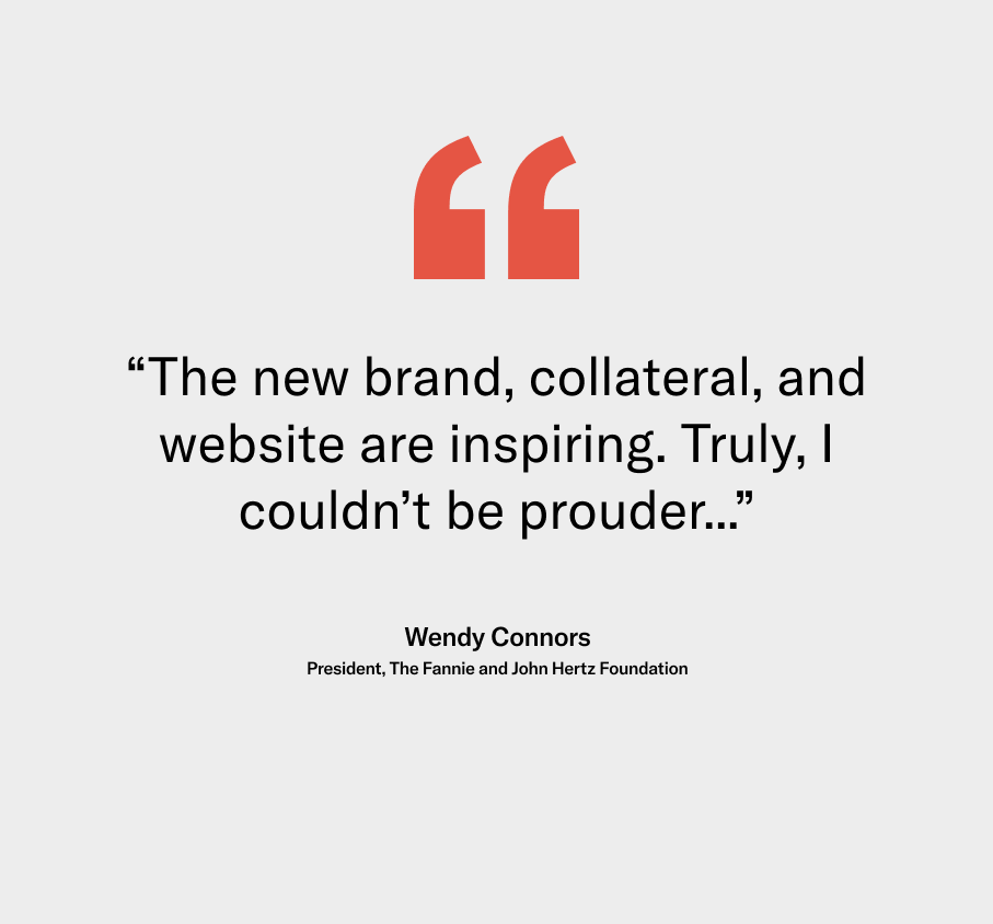
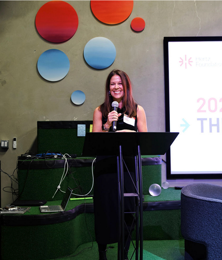
Wendy Connors Testimonial Wendy Connors

Putting Fellows Front and Center

From the start, it was clear the accomplishments of Fellows would be central to the Hertz brand. It was also clear they needed to be presented without hyperbole and in a way that reflected the scientific rigor leading to their many breakthroughs.

At launch, the new website saw traffic increase by 70%; its lasting impact is an ease of use that supports the interdisciplinary nature of the Fellows’ research.  

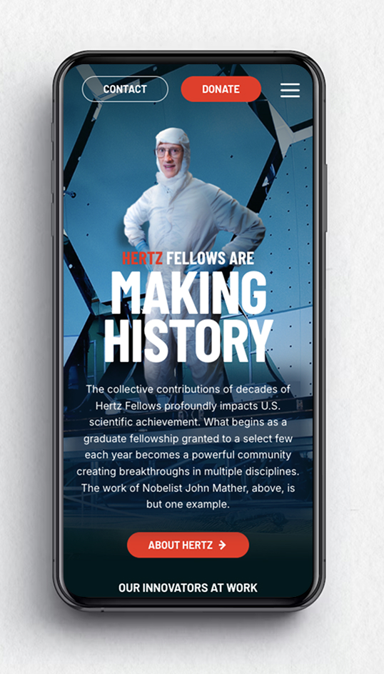
Hertz Foundation Mobile Display
Hertz Foundation Layout Designs

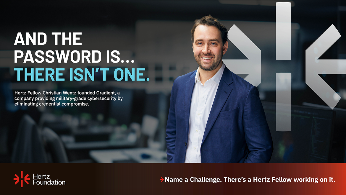
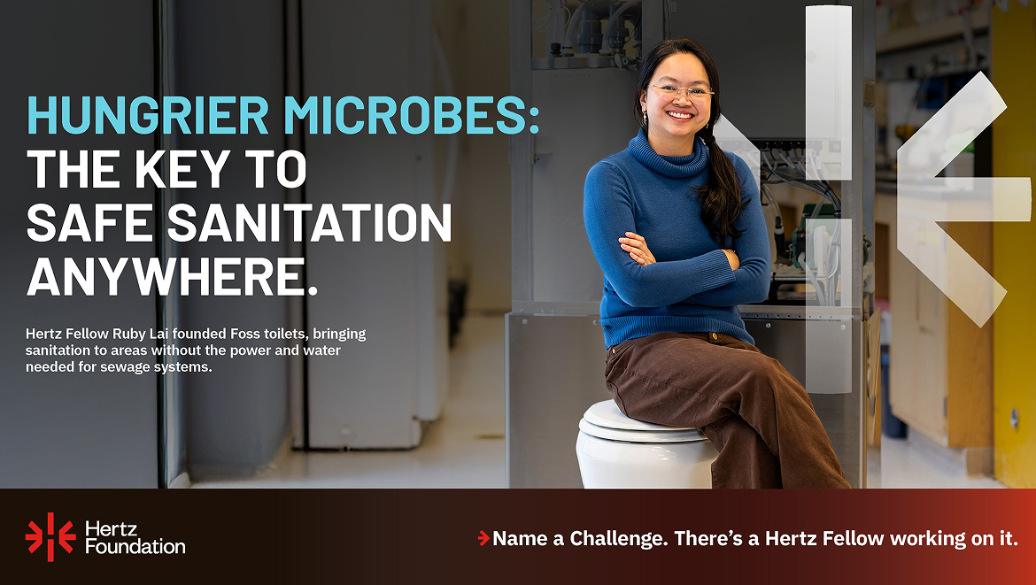
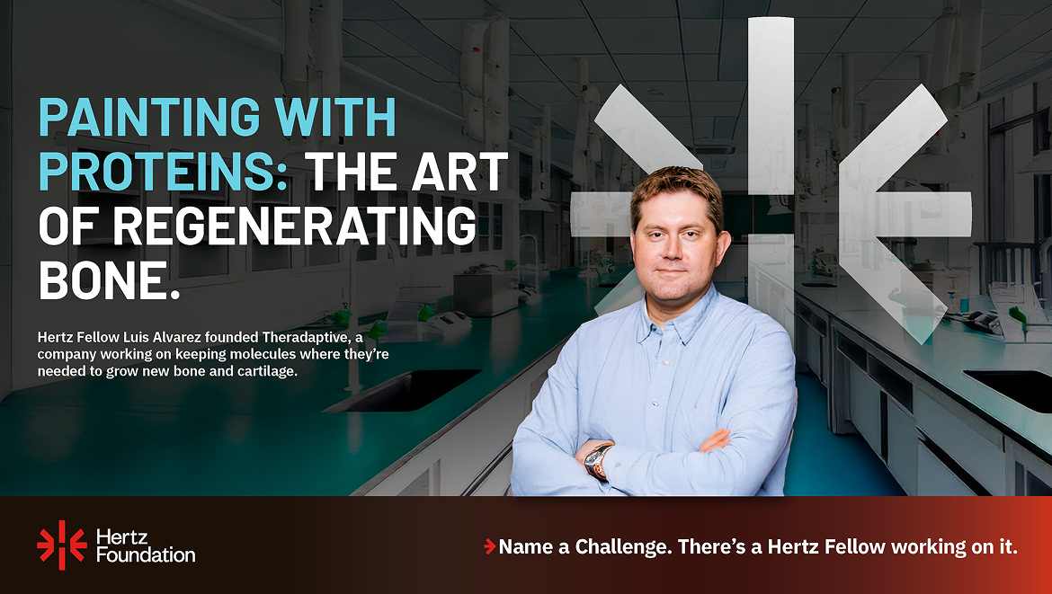
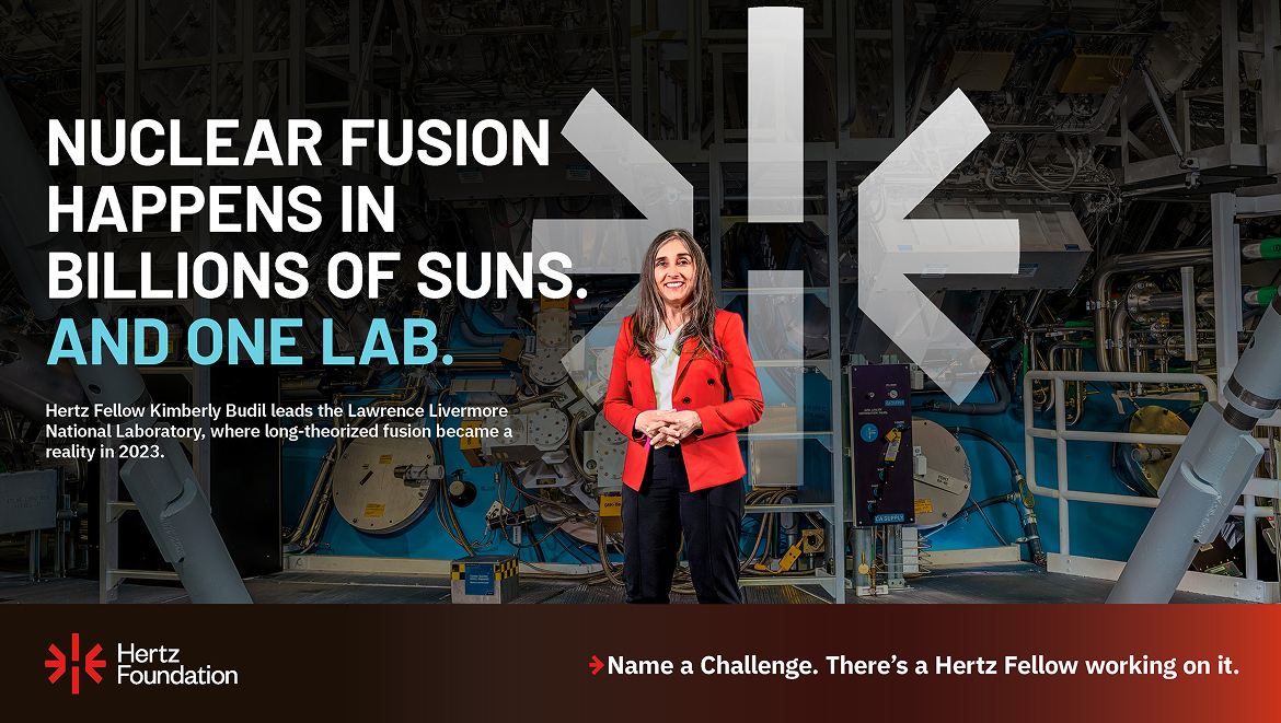
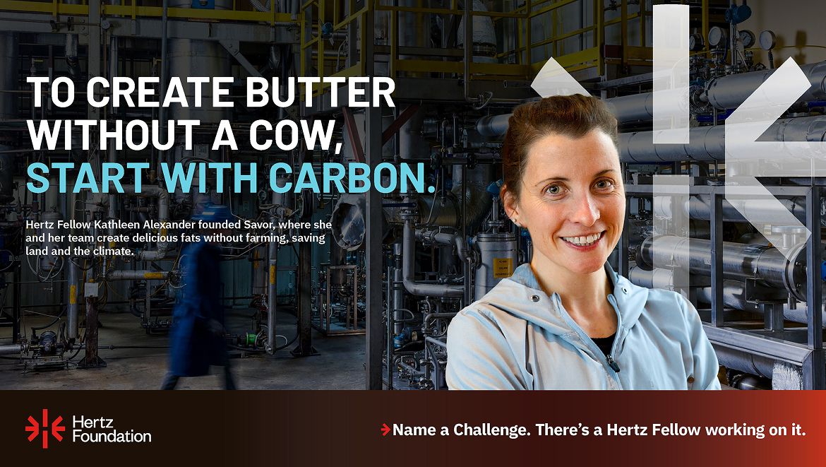
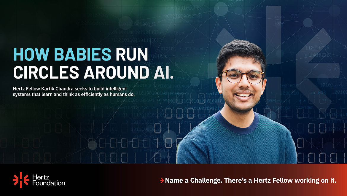
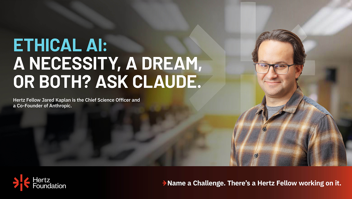
Awareness Ads: Name a Challenge

Increasing overall awareness was critical to the Hertz Foundation reaching both its fundraising goal and its increased fellowship applications goal.  To that end, we created a social media campaign: “Name a Challenge. There’s a Hertz Fellow working on it.”

2025 saw the largest fellowship applicant pool 
in the Foundation’s history.

Supporters want to see their donations are making a difference. What was a static printed piece/PDF became a dynamic narrative called, appropriately, the Impact Report—an easily navigated compelling read.

Creating a never-ending story
The new brand:

Established the Foundation as a significant, one-of-its-kind organization whose Fellows are tackling the world’s toughest challenges

Increased overall awareness while bringing clarity to its role within the scientific ecosystem

Provided consistent messaging for the community of fellows and its friends

Cemented the thought leadership reputation of the Hertz Community

Increased applications to the graduate fellowship

Attracted new partners

Supercharged fundraising

Grafik created much-needed awareness of the Foundation’s pivotal role in helping our nation maintain global technological superiority, a position threatened today both by attacks on expertise and subsequent reductions in research funding. 

The growing Hertz Community now speaks with one voice through their most credible advocates, the Hertz Fellows themselves. Supplying a solid narrative all could use means they can tell the whole story while citing their own achievements in a way that matches their personalities–humble, not braggadocious, yet still impressive.

Our Featured Case Studies

MORE CASE STUDIES

MHFA

Associations & Nonprofits,Education,Health & Wellness

Canopy Neurodiversity Foundation

Associations & Nonprofits

National Human Genome Research Institute

Associations & Nonprofits,Health & Wellness

American Physiological Society

Associations & Nonprofits,Health & Wellness

MHFA

Web Strategy & UX

Mental Health First Aid

A streamlined site for advancing mental health

Mental Health First Aid, a program from the National Council for Mental Wellbeing, set an ambitious goal of training 1 in 15 Americans in first aid designed to address mental health. To continue pushing toward that goal, the organization needed a website designed to convert. They came to Grafik for a new site built on a strong strategic foundation.

Mental Health First Aid
Mental Health First Aid Homepage
MHFA Colors

User Testing for Refined, Clear Journeys

Two major goals for the new site were 1) to create a clearer hierarchy of content and action, rather than presenting multiple calls-to-action with the same level of visual weight, and 2) to make it abundantly clear to the user which of MHFA’s training options they should pursue. To solve for these, Grafik focused intently on developing a sitemap and IA with clear pathways, and conducted user testing to assess and refine that sitemap before moving into the wireframe phase.

MHFA UX User Testing

We also worked to refine MHFA’s personas, to ensure the site structure we created would be able to drive them to the correct areas. Although the organization had previously established user profiles, we realized as our strategy developed that we needed to organize them in three major groups based on the call-to-action that applied to them. This led us to structure the site for the two primary user groups of B2B and B2C, as well as a secondary Advocate user.

MHFA Personas | Digital Strategy

Focused on the Journey

With this approach, we were able to create two major hubs for the site, Training for Individuals and Training for Organizations. Based on the feedback from user testing, we also utilized longer phrases for many of the CTAs within these two overarching journeys, all to help drive users to their destination with clarity and ease.

Man talking with a young adult providing guidance representing an MHFA persona Woman in office standing while looking at the camera representing and MHFA Persona

Addressing Questions Before They’re Asked

Guiding Users

It was vital to the MHFA team that the site be helpful to users, so we created sections throughout key pages with multiple guiding CTAs as well as a button to launch the chatbot, which uses information directly fed into it as well as AI to aid site visitors.

MHFA Menu Items
MHFA For Individuals Page
MHFA Promos

Trainers and Trainees

MHFA offers both direct training in mental health first aid as well as courses to become a trainer, after which an instructor can work with teens and students or adults. We used action-based verbiage and headlines to distinguish sections and help the user understand the differences.

An Updated Look and Feel

Evoking Wellbeing

MHFA needed a site that reflected the feeling of calm, capable, and friendly. And the design needed to work within the existing brand as well as complement the parent brand, the National Council for Mental Wellbeing. We stripped back some of the extraneous colors from the previous site, replacing them with a warm, comforting background and a more cohesive color scheme. Imagery evoking helpfulness, kindness, and steady guidance further reinforced the feeling throughout the site.

MHFA Impact
Quote Icon

“I am already so excited for this design. Option one, you guys nailed our brand. I’m super pleased with everything that I’m seeing. The petals look great, the colors look great. Everything feels a lot more elevated and a little bit more professional feeling. So I’m super happy with what I’m seeing.”

Rachel – Art Director, MHFA National Council

MHFA Mobile
MHFA Brand Elements
MHFA Web Designs

Assistance From AI

Grafik worked closely to source, test, and ultimately choose and implement an AI chatbot feature for the MHFA site. The chatbot can be launched from anywhere on the site via an icon, and we also incorporated CTAs on key pages that open the chat. The AI Agent can respond to user queries and suggest pages on the site where the user can get more information, acting as another method of guidance.

MHFA Chatbot
Outcome

All the iteration, testing, and tweaking resulted in a site for Mental Health First Aid that is calm, friendly, and above all, helpful. Focused on getting users to the courses and information that fits their needs, the site structure and CTAs throughout help guide the user to explore and, ultimately, convert.

Grafik
Privacy Overview

This website uses cookies so that we can provide you with the best user experience possible. Cookie information is stored in your browser and performs functions such as recognising you when you return to our website and helping our team to understand which sections of the website you find most interesting and useful.