V is for vetting: how defense buyers decide who makes the shortlist

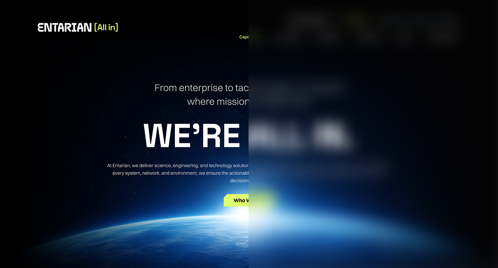
In defense and aerospace, credibility is currency—and your website is often the first place it’s measured. For an industry built on mission-critical execution, an outdated digital presence raises red flags.

Whether you’re pursuing a major contract, seeking partners, or hiring specialized talent, your website is the first tool for vetting.

Yet, too many DefenseTech brands treat digital as an afterthought.

As strategic communications leaders in this space, you already know the stakes: a digital presence that feels outdated, unclear, or misaligned won’t just undermine brand perception—it can introduce doubt. Your site needs to work as hard as your capture team, and reflect the precision, culture, and ambition behind your mission.

Stop making your buyers rely on sales, when they want to self-serve

According to McKinsey, 71% of decision-makers now prefer self-serve digital interactions during early discovery, especially in regulated sectors where vendor choices must be defended internally. And Forrester reports that 62% of B2B buyers finalize vendor shortlists based solely on digital content—often without ever contacting a sales rep.

When exploring potential vendors, the government wants clear evidence that your organization is serious, secure, and ready to execute. If your website doesn’t communicate that in the first 30 seconds, you’re already losing ground.

Alternatively, the most effective defense tech websites operate like well-designed control systems: clear, secure, functional, and responsive. Here’s what they get right:

UX best practices for Government audiences

To win over buyers, you need a site experience that says: “We’ve done this before. We’re built for your mission.”

Here are five UX best practices leading DefenseTech companies are adopting:

Journey mapping deep dive

In a typical project, we create journey maps for each key persona. These maps detail:

Your website as a window into culture and capability

Today’s defense acquisition teams aren’t just validating your technology—they’re assessing your team, your mindset, and your ability to deliver under pressure. Your website offers one of the clearest windows into that reality.

It’s where culture becomes visible. Where innovation shows up in how you organize information, present your story, and speak to the mission. And where capability is demonstrated—not through claims, but through structure, clarity, and proof.

A modern site should reflect not only what you solve, but how you operate—and why it matters.

Does your website turn simple research into a scavenger hunt?

Run this pulse check on your current digital presence:

If you hesitated more than once, your site might be doing your brand a disservice.

Grafik helps DefenseTech and National Security brands build websites that reflect readiness, support procurement validation, and align with how real buyers vet real partners.

Your solutions are mission-grade—your website should be, too. Let’s make it happen

Revenue beyond membership: rethinking website strategy for trade associations

For many trade associations, membership isn’t the only (or even primary) revenue driver.

Training, certification and accreditation, events, and resources can all serve as financial drivers for trades, and these revenue arms often operate like standalone businesses, even serving audiences who may never become members. 

But when trade associations fold their revenue generating programs into member-facing websites, they can be buried in the navigation and treated as secondary rather than the vital business drivers they are. This approach misses the opportunity to strategically draw in those non-member audiences. 

Associations that recognize this shift are beginning to rethink how their websites are structured, marketed, and measured. Grafik recently worked with Mental Health First Aid, a training program created by the National Council for Mental Wellbeing, to do just that. 

Start with the strategy

Trade association sites often need to convey membership information, support advocacy, and share news and resources. There are a lot of competing CTAs. And many association sites prioritize information over action.

But in creating a standalone website on your revenue driving program, you are able to craft a website strategy that hones in on a user experience that converts. That means a navigation that keeps your offerings prominent, focused and clear messaging about benefits, and a direct path to conversion. 

The site should speak to a wider variety of audiences, or personas, than the trade association itself—these could include prospective learners, event attendees, sponsors, corporate partners, and others. These audiences arrive with very different motivations than traditional members. A strong site strategy will consider the best way to drive conversion(s) for each of them, as well as create opportunities to nurture those not yet ready to buy.

Treat programs as products

One of the biggest strategic shifts associations must make is recognizing that programs like training and accreditation are not simply services. They are products. And products require positioning, clear value propositions and messaging tailored to specific audiences, and a user experience designed to guide visitors toward a decision.

Approaching programming as a set of products was key with MHFA, which offers mental health first aid training in a variety of ways—for individuals, teen programming, workplace training, etc.

Each of these training methods has its own page on the site and the user experience is heavily focused on driving audiences to the product that best meets their needs. 

Let the brand breathe

Programming and product-specific sites also offer stronger branding opportunities. When an association gives its offerings an identity beyond the association, as the National Council for Mental Wellbeing did with Mental Health First Aid, it becomes easier to sell those offerings to non-member audiences. 

Connective tissue such as logo lockups, color palettes, iconography or visual treatment, and other brand elements can help solidify the relationship between the two brands while allowing users to understand the product in its own context. 

Leave room to scale

While association memberships are often open to a finite number of individuals, their revenue producing offerings can continue to grow. Training catalogs multiply. Events become larger and more frequent. Accreditation programs develop reputations that extend across entire industries. When these initiatives scale, the website must support that growth through stronger search capabilities, clearer program structures, and deeper integration with marketing and CRM systems.

A standalone site allows room for that growth, as well as a more focused analysis of performance, which can help you continue to fine tune and generate more revenue. 
When training, accreditation, and events are treated as strategic growth engines—not program afterthoughts—your digital presence becomes a business platform, not just an information portal.

And that’s where real growth starts.

How to simplify the B2B customer journey through smart UX design

In B2B, complexity is often unavoidable—technical products, long sales cycles, multiple stakeholders. But complexity doesn’t have to mean confusion. The right user experience (UX) strategy can simplify how your audience engages with your brand online.

Great UX doesn’t just look good, it helps your customers understand who you are, what you do, and how you solve their problems. Through intuitive navigation, smart information architecture, and purposeful design, we reduce cognitive load and build user confidence.

Understanding the B2B journey

Unlike B2C, the B2B user journey is rarely linear. A single purchase decision may involve procurement officers, end users, legal teams, and senior leadership. Each has distinct goals and informational needs. A good UX strategy maps those needs across stages—awareness, consideration, and decision.

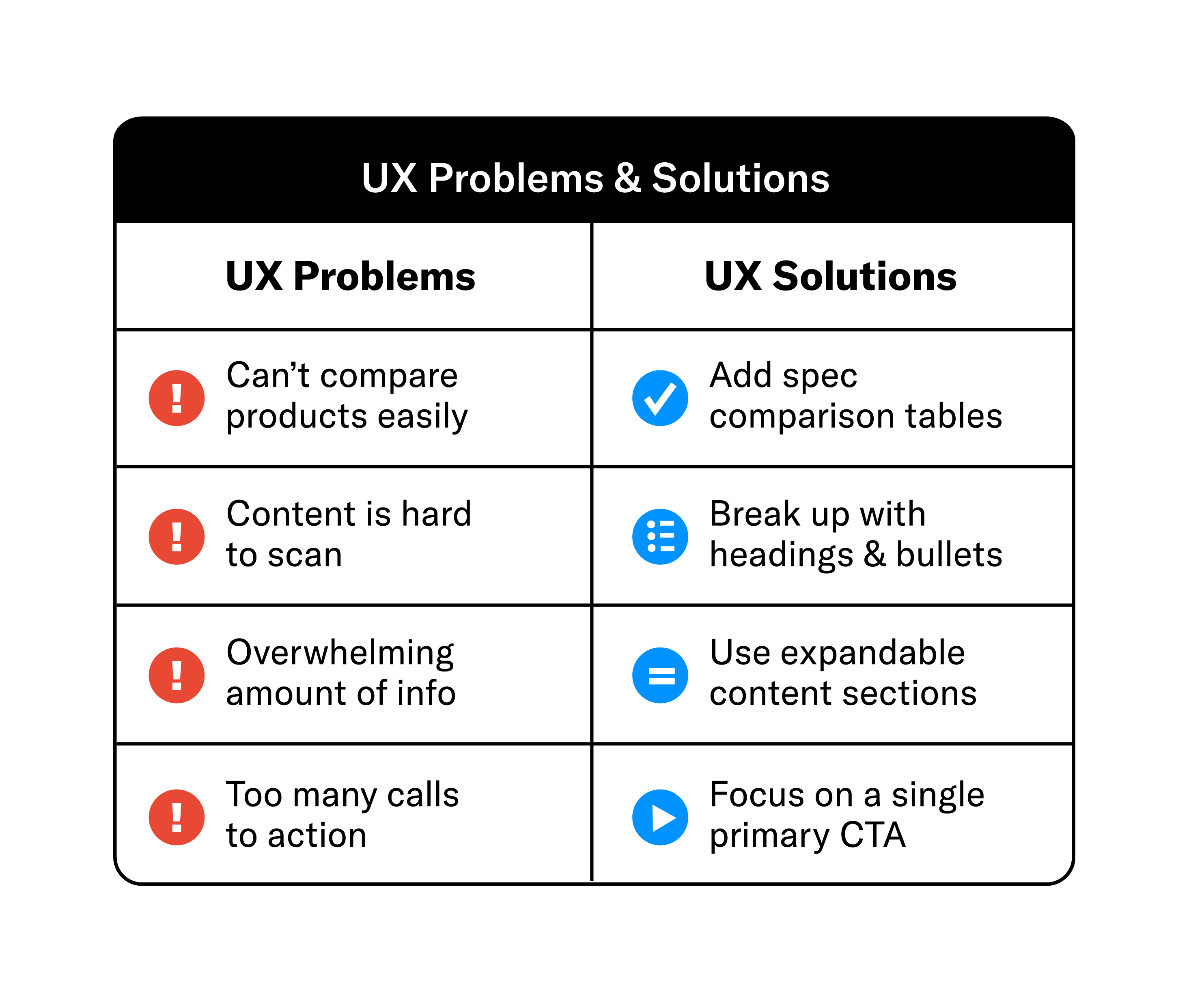
We often start with user journey mapping exercises. For instance, we might identify a pain point for procurement officers: difficulty comparing product specs across a catalog. For end users, it could be lack of how-to content or demos. We then shape UX solutions—comparison tables, expandable content modules, and rich media assets—to address these gaps.

UX Problems and Solutions chart

UX in action: a real-world example

We saw this challenge in our work with Aireon, whose platform delivers highly complex, global aviation capabilities to a wide range of stakeholders. The original experience made it difficult for users to quickly understand what Aireon does, how the technology works, and why it matters—especially for visitors evaluating the solution from different perspectives.

By mapping primary user journeys and simplifying the information architecture, we restructured the experience to prioritize clarity over volume. Using progressive disclosure, we surfaced essential concepts first, then allowed users to explore technical depth as needed. Navigation and calls to action were aligned with user intent, reducing friction and helping visitors move through the site with greater confidence—without oversimplifying the sophistication behind the technology.

UX best practices for B2B sites

Journey mapping deep dive

In a typical project, we create journey maps for each key persona. These maps detail:

We then align UX solutions to each step. For example, early-stage content might include product overviews and thought leadership, while late-stage users see technical specs and ROI calculators.

NAMI-persona

At Grafik, we bring clarity to complexity. Our UX work starts with stakeholder workshops and audience research, and ends with digital experiences that are intuitive, accessible, and conversion-focused. Because if users can’t navigate your site with ease, they won’t stay to learn what makes you different.

Strategic storytelling: crafting compelling online narratives for defense brands


Why storytelling matters in the defense sector

In the defense industry, trust and credibility aren’t optional—they’re everything. Whether you’re building advanced maritime platforms, developing AI-enabled ISR tools, or delivering logistics solutions to mission-critical operations, your digital presence must reflect the seriousness and sophistication of your work. But even in a space rooted in precision and discretion, there’s one powerful tool that often goes underutilized: storytelling.

Too often, the true value of a defense solution is buried deep—hidden behind technical specs, internal language, or assumptions that the audience already understands. Strategic storytelling brings that value to the surface. It connects the dots between what a company does and why it matters—not just functionally, but operationally, and even geopolitically.

Beyond specs: your website as a strategic narrative

When we say “storytelling” in a defense context, we don’t mean fluff or marketing spin. We mean a structured, authentic narrative that clearly articulates who you are, what you do, and why you’re trusted to do it. In a landscape filled with complex technologies and long sales cycles, clarity becomes a competitive advantage.

A defense company’s website isn’t just a repository of assets—it’s often the first (and sometimes only) opportunity to establish credibility with stakeholders who may never meet your team in person. It should project confidence, yes—but also humility and precision. The right narrative helps your audience understand the real-world impact of your innovations, and how they reduce risk, enable readiness, or advance mission outcomes.

We saw this in our work with ERT, a defense and technology firm operating in highly technical, mission-critical environments. While their capabilities were strong, their website didn’t clearly communicate the operational impact or trust behind the work. By shifting the narrative from internal language to outcomes—and structuring content around how stakeholders assess risk and readiness—we helped ERT surface their value with clarity and credibility.

Start with the audience, then build the message

We work with defense and technology companies to translate their mission into meaningful digital experiences. That starts with understanding the audience. A contracting officer may be scanning for certifications and contract vehicles. A program manager might be comparing capabilities. A partner could be validating your track record. A technical evaluator is likely weighing risks, not just features.

Each of these visitors is looking for something specific—and often, they don’t have time to hunt for it. Storytelling helps prioritize what matters most to each role and stage of the journey, turning scattered data points into a clear and compelling picture of value.

Lead with purpose, prove with outcomes

Too many websites lead with internal language or generic taglines. But purpose is what differentiates in a space where many capabilities sound the same on paper. Your brand story should clarify what you stand for, what challenges you solve, and who benefits from your work—whether that’s warfighters, allied partners, or government stakeholders.

This isn’t just about messaging—it’s about credibility. Back up your claims with real outcomes. Share metrics when possible. Highlight customer success stories. Use testimonials or after-action data to demonstrate that your solutions don’t just exist—they deliver, consistently, in the environments that matter most.

Align UX with your story structure

A strong narrative is only effective if users can follow it. That’s where UX design comes in. Calls to action should feel like natural next steps, not aggressive sales pitches. Navigation should reflect the logical flow of your audience’s questions. Visual hierarchy should guide visitors toward the proof points that matter most—without overwhelming them.

Design and storytelling work together to quietly build trust. A frictionless experience signals competence. Clean, modern design suggests attention to detail. And consistency across pages reflects operational discipline—something your audience deeply values.

Storytelling as a strategic asset

In defense, your value often lies beneath the surface. Your mission, your track record, your innovation—they all matter. But if they’re not communicated clearly and credibly online, you risk being overlooked by the very stakeholders you’re built to serve.

Strategic storytelling allows you to elevate what makes you different and essential. It brings forward the human, operational, and mission-driven side of your business in a way that builds confidence, not just clicks.

At Grafik, we specialize in helping defense brands surface what matters most. From homepage headlines to detailed case studies, we help you craft a website that reflects your value with precision, authenticity, and strategic clarity—because in this space, credibility starts with the first impression.

How UX design accelerates B2B tech sales

B2B tech, where sales cycles extend over months, your website’s UX isn’t just about usability; it’s a strategic sales enablement tool. A well-designed experience builds trust, shortens buyer timelines, and accelerates pipeline movement, especially in competitive markets like SaaS and cybersecurity.

Why UX matters more in long sales cycles

Enterprise buyers research and validate quietly, often before ever contacting sales. With up to 80% of the B2B buying journey happening online, your site must guide and reassure them from the first visit.

1. Clarity fuels conversion

Your product may be complex, but your site shouldn’t be. Clear navigation, intuitive architecture, and role-based content ensure visitors find what they need quickly. Confusing menus, vague CTAs, and fragmented content paths add friction where there should be momentum.

In our work with Udemy Business, we reorganized the site to align with enterprise learning leaders’ needs. By structuring UX around their decision journey, from discovery to ROI validation, we drove a 73% increase in organic traffic and meaningful engagement.

2. Credibility builds trust

UX is often your first (and longest) impression. In B2B, where enterprise deal sizes can reach six to seven figures, trust is everything. Strategic UX surfaces credibility elements like client logos, certifications, and testimonials, exactly where buyers need reassurance.

For cybersecurity leader Netcraft, we redesigned the site to foreground real-world use cases, partner validations, and service credibility. The new experience made technical offerings feel accessible and trustworthy to a range of buyer personas.

3. Role-based user journeys empower different stakeholders

Enterprise tech decisions rarely rest with one individual. Buying committees span technical leads, finance, operations, procurement, and end-users. UX that supports role-specific journeys helps each persona find what they need—on their own terms.

With POLITICO Pro, we designed an experience that serves both policy professionals evaluating platform capabilities and procurement teams validating business value. By aligning UX to the needs of multiple personas, we helped the brand drive deeper engagement and support decision-making across a diverse buyer group.

UX best practices for long B2B sales cycles

Whether you’re launching a new tech solution or targeting a new set of enterprise buyers, here are five UX principles we apply at Grafik to support complex B2B user journeys.

1. Role-based pathways

Use UX to serve multiple audiences, technical buyers, executive sponsors, and procurement teams, without overwhelming the interface. Navigation, tone, and content should align with each persona’s priorities.

2. Progressive disclosure

Not every visitor wants a deep technical dive right away. Structure content in snackable layers: surface benefits first, then offer expandable details, specs, and whitepapers. Give users control over their learning curve.

3. Conversion micro-goals

The final CTA (like “Request a Demo”) isn’t the only conversion that matters. Mid-funnel actions—ROI tools, case study downloads, pricing guides—support long-cycle lead nurture. Thoughtfully designed UX keeps prospects coming back and your brand top of mind throughout their decision journey.

4. Content as UX

Good UX and an effective content strategy go hand in hand. When educational assets–use cases, thought leadership, and client stories–are easily discoverable, your brand becomes a trusted advisor, not just a vendor.

5. Sales-aligned UX

UX should reflect your sales process. Collaborate with sales early to uncover common objections and tailor site architecture to address them. A UX that anticipates questions and removes friction builds momentum through the funnel.

Final word: UX is a B2B growth engine

In B2B tech, your website isn’t just a brochure; it’s the most critical asset in your marketing tool belt. Great UX doesn’t just make your site easier to use. It represents your brand, nurtures trust, accelerates lead qualification, and supports revenue generation.

Not sure if your site’s UX is helping or hurting your growth? You’re not alone. Check out this guide for signs it’s time for a change—or reach out and let’s assess it together.

Measuring what matters: key website metrics B2B companies should track (and what to do about them)

You launched your new site. Now what? For B2B companies, the real value of a website is how it performs over time. But not all metrics are created equal. Tracking the right ones—and knowing what to do with them—is key.

The importance of setting goals early

It starts with understanding your business objectives. Are you trying to:

The answers shape what you measure and how you interpret success.

Key metrics to watch

Metrics in context

A high bounce rate on a blog may be fine if visitors are reading a full article and leaving satisfied. A low conversion rate on a pricing page, however, could signal friction.

Sometimes, a low conversion rate isn’t about the offer—it’s about the experience. Complex or unintuitive forms can create friction that drives users away. Reviewing heatmaps and session recordings often reveals where visitors drop off or hesitate. In many cases, simplifying the number of steps or clarifying the language can significantly boost conversions.

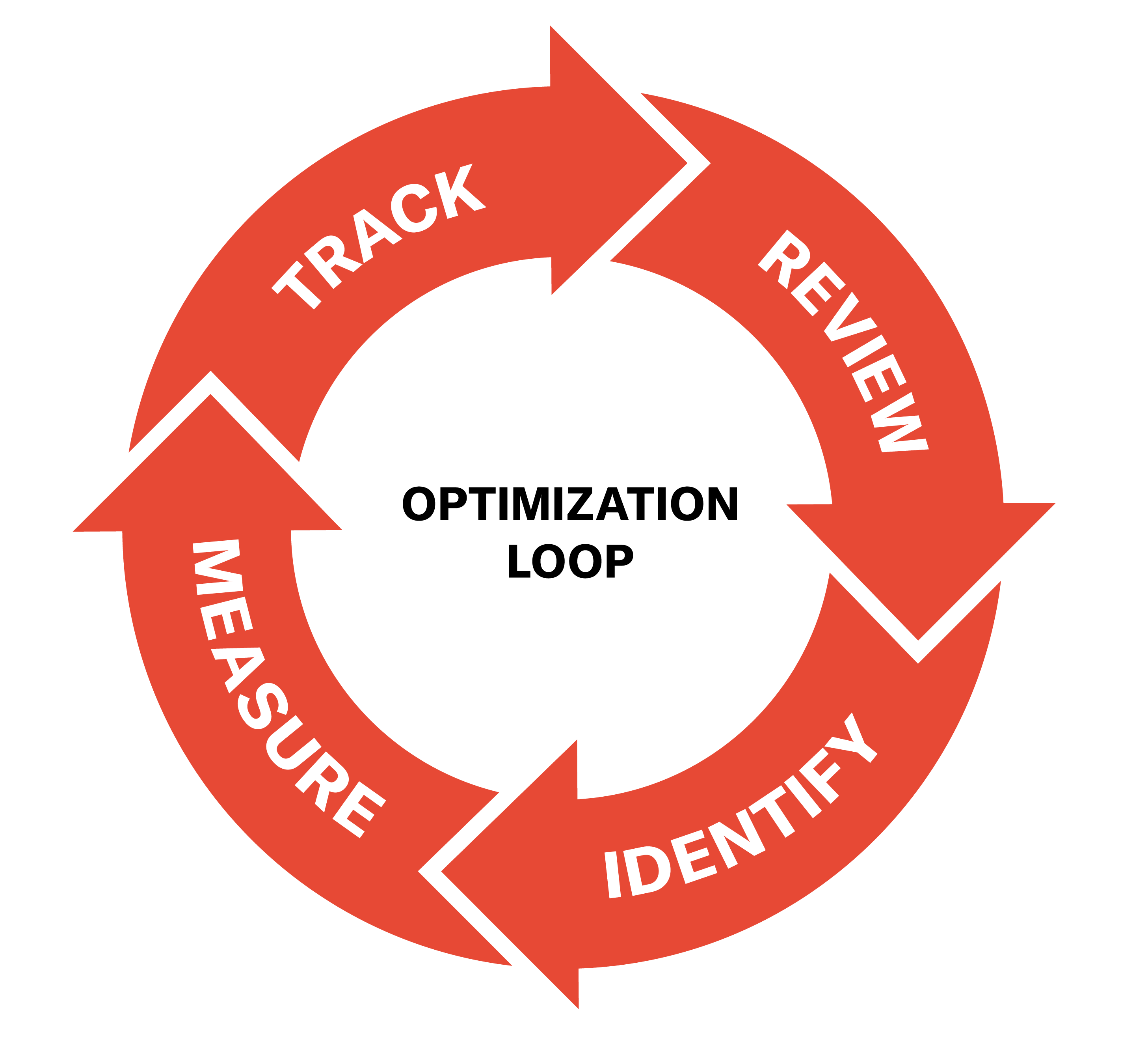
Setting up for ongoing optimization

Content optimization loop

Building a data-driven culture

Website performance should be part of a broader marketing and sales strategy. At Grafik, we help teams:

We also help clients create living dashboards that integrate with CRMs, automation platforms, and analytics tools—giving stakeholders a full view of digital health and business impact.

A website is not a one-time investment. It’s a living system. With the right metrics, you don’t just see what’s happening—you understand why, and what to do next.

Defining meaningful KPIs from the start is essential. Websites should be built with measurement in mind, with tracking systems in place to gather actionable insights and inform ongoing optimization. The most effective digital strategies treat the website as a living system—one that evolves with the business and is guided by data every step of the way.

Content with purpose: how strategic messaging and storytelling educate and convert B2B audiences

B2B buyers are sophisticated. They’re looking for partners, not just providers—and they do their homework. Your website content should do more than describe your services. It should educate, engage, and differentiate.

Why messaging matters in B2B

In B2B, purchases are high-stakes and high-value. Buyers need to feel confident, aligned, and informed before making a decision. That’s where strategic messaging comes in. Strong messaging helps cut through the noise, set the right tone, and ensure consistency across all your touchpoints—from sales decks to site copy.

We’ve seen it firsthand: One global logistics client came to us with fragmented messaging across business units. Each division told a different story, leading to confusion among prospects. We led a cross-functional messaging workshop to define core brand attributes, audience pain points, and a shared tone of voice. The result was a centralized messaging framework that aligned the entire organization.

Core elements of a strategic messaging framework

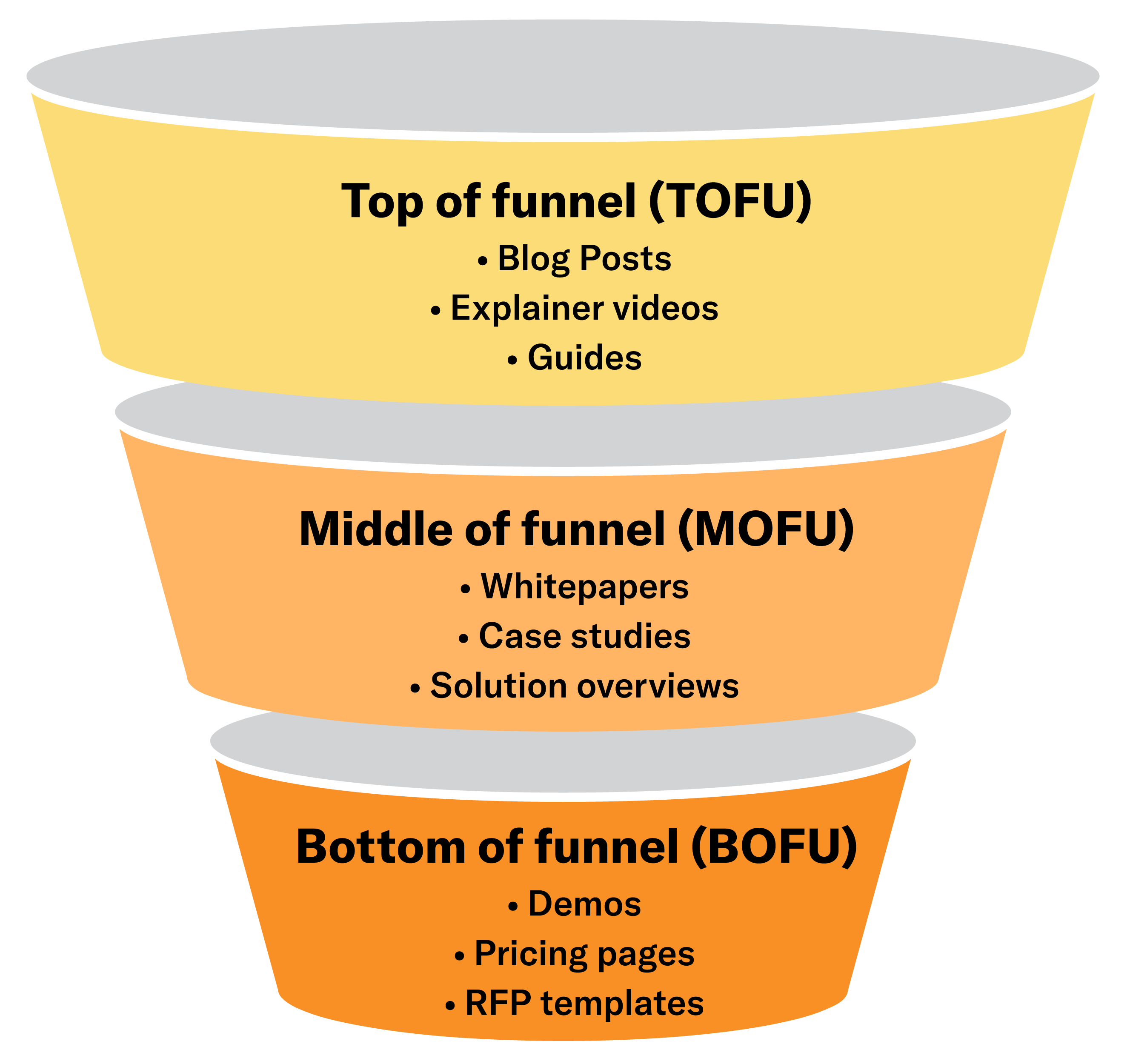
Mapping content to the funnel

Every piece of content should serve a purpose within the buyer’s journey:

For example, for a B2B SaaS firm, we created a content calendar aligned with each funnel stage. Blog posts tackled industry trends. Mid-funnel assets included detailed solution briefs with real-world use cases. At the bottom, we added conversion-driving content like ROI calculators and client testimonials.

website-content-funnel

Content formats that work

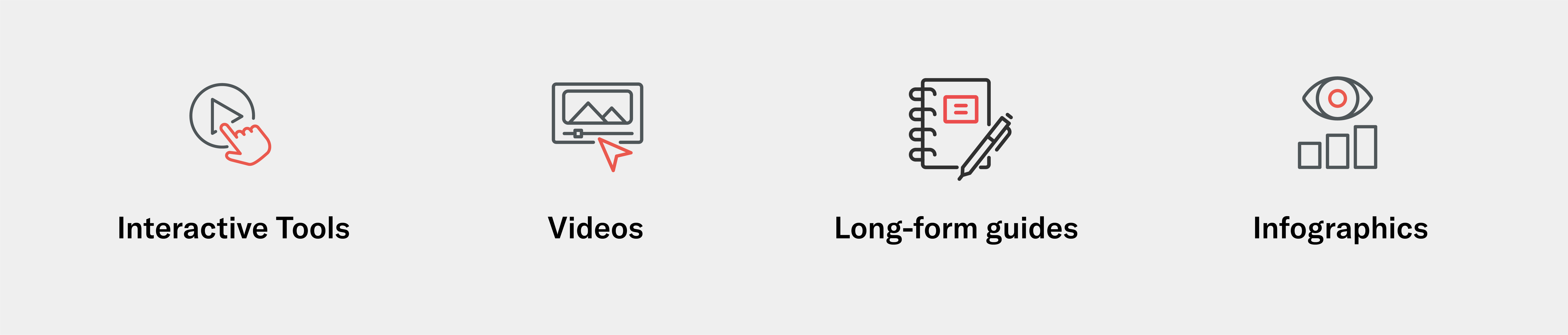
Different audiences engage with different types of content. Consider:

website-content-formats

Building a content engine

Creating strategic content at scale requires process. We often build out:

At Grafik, we help B2B brands find their voice and tell their story with purpose. Whether you’re launching a new site or refreshing an old one, we align your content strategy with your business objectives—so every word works harder.

SEO is not an afterthought: why B2B website visibility starts with strategic planning

In the B2B world, even the most impressive website won’t deliver results if it can’t be found. That’s why SEO can’t be sprinkled on after launch—it needs to be baked into your website strategy from the start. Effective B2B SEO goes far beyond keywords; it’s about technical site architecture, optimized content, thoughtful metadata, and a deep understanding of how your buyers search for solutions. When SEO is part of the recipe from day one, it boosts visibility, drives qualified traffic, and supports long-term business growth.

What makes B2B SEO different?

Unlike consumer SEO, which often targets broad queries with high volume, B2B SEO is about specificity and intent. A manufacturing firm isn’t trying to win the keyword “supply chain”—they’re targeting terms like “temperature-controlled logistics software.”

B2B SEO must account for:

Common pitfalls (and how to avoid them)

We often see:

One engineering firm we worked with had great content, but bloated navigation and duplicate page issues were killing their rankings. We restructured the architecture, consolidated overlapping content, and implemented schema across their product catalog. Within six months, they saw a 60% increase in organic traffic.

Integrating SEO throughout the website process

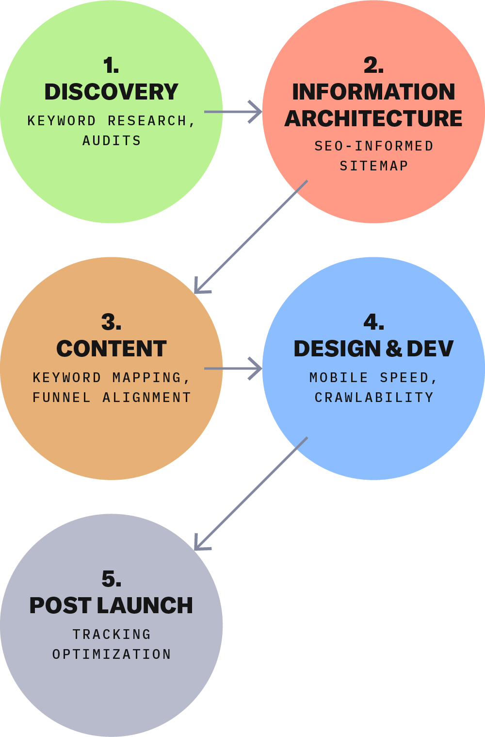
Our approach integrates SEO into every phase of the process:

Content clusters and internal linking

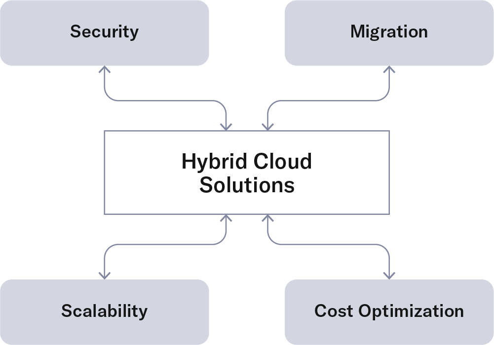
We use content clusters to build topical authority. For instance, a client in cloud infrastructure might have a pillar page on “Hybrid Cloud Solutions” surrounded by supporting content on security, migration, and scalability. Internal linking ties these pieces together, boosting time on site and SEO performance.

Tools and tech

A combination of advanced analytics and AI-powered insights actively inform our SEO strategies. These tools uncover keyword opportunities, analyze buyer behavior, and delve beyond surface-level data to craft strategies tailored to specific audiences and goals.

We leverage:

At Grafik, we integrate SEO strategy into every phase of website planning—from content audits to wireframes to CMS implementation. Because your site doesn’t just need to look great. It needs to perform, be found, and bring the right people to your digital doorstep.

Building a better B2B website: overcoming common challenges

Understanding your audiences: The foundation of website success

Every successful website starts with a sound strategic plan focused on understanding your audience. At Grafik, we emphasize developing detailed website personas and mapping out user journeys to ensure each type of user finds value in your site. Here’s how to get started:

Identify your audiences: Determine who visits your site and what motivates them to engage. This involves reviewing website analytics, interviewing stakeholders, and conducting surveys with customers.

Create website personas: Develop personas based on common content interests and desired actions. This helps tailor your content and design to meet their needs.

Map user journeys: For each persona, outline their journey through your site, considering:

  • Demographics
  • Potential barriers
  • Motivations
  • Valuable content areas
  • Key conversions and calls-to-action (CTAs)

By understanding these aspects, you can create a content strategy that delivers the right user experience, encouraging engagement and conversion.

NAMI-persona

Surfacing data to enhance engagement

Effective websites surface important content quickly and intuitively. For B2B clients and trade associations, timely data and infographics are particularly valuable. For example, for the Alliance for Automotive Innovation, we dynamically displayed economic data on automotive manufacturing and employment across the U.S., filtering by state and congressional district.

Investing in organic content to build authority

An optimized SEO strategy is crucial for reaching the right audiences. Here’s how to enhance your website’s authority and expand its reach:

  1. Detailed tagging and categorization: Structure content around focus areas, initiatives, and locations.
  2. Dynamic content: Use tagging to cross-promote site areas, ensuring relevant and updated content is easily found.
  3. Regular content creation: Develop a maintainable strategy for ongoing content creation, supporting the tagging structure.
  4. Site performance optimization: Improve search engine rankings with fast-loading content, optimized images, and embedded videos.
  5. Improved user engagement: Enhance findability and discoverability with simplified information architecture and relevant content cross-promotion.
  6. Digestible content: Use shorter content blocks, videos, and graphics to boost engagement.

Be intentional with calls to action and actively measure against KPIs

For example, at NephCure, understanding the advocacy audience through interviews and persona journeys allowed us to create key landing pages. These pages offer multiple ways for visitors to engage, such as volunteering, attending events, donating, and signing up for specific news and thought leadership. It’s important to establish KPIs that track how these CTAs perform over time and how you can continually improve content and optimize the user experience to optimize performance.

Complementing off-site efforts

To maximize your website’s impact, align it with off-site efforts like advertising and media campaigns. Create flexible page templates for efficient landing page development, and ensure calls-to-action are clear and measured against key performance indicators (KPIs).

By following these strategies, you can overcome common challenges and build a website that not only meets the needs of your audience but also drives meaningful engagement and conversions for your business.

The crucial role of user experience (UX) in B2B marketing

In the fast-paced digital world, it’s a battleground for the attention of potential clients. Among the competition, one key factor arises as a driver of success: User Experience (UX). It’s importance in B2B marketing can’t be emphasized enough.

What is User Experience (UX)?
User Experience (UX) is the experience a user has when interacting with a website. Within B2B marketing, it can encompass many factors, including usability, accessibility, performance, and visual presence. Creating a positive UX can ensure your users find value, satisfaction, and ease of use. A negative UX can lead to frustration and cause users to leave your website.

The importance of UX in B2B marketing
First impressions are everything in B2B. When a potential client enters your website, the experience can determine whether they stay, explore, or exit immediately. A thought through, strategically designed website can encourage users to engage further with your content or products. Statistics show that 94% of first impressions are design focused, increasing the need for an excellent UX.

A great UX can help accomplish the following:

Enhance client satisfaction
A seamless, easily navigable website should allow users to quickly find the information they are looking for and complete transactions effortlessly. This is particularly true for B2B technology brands, as your marketing website is just a preview into the type of user experience prospects can expect from your product. Clients that are happy with the experience they’ve received are likely to return and become brand advocates by providing positive reviews and referrals, an essential component of B2B marketing.

Decrease user bounce rates
If you’re not familiar with the term “Bounce Rate,” it is the percentage of visitors who leave your website after a short view. Most bounces are caused by having a poor UX. Improve your UX (and decrease bounces) by designing a clear navigation, speeding up load times, and publishing engaging content. A low bounce rate means your users are finding the content they are looking for, which can increase your conversions.

Boost your SEO
Many search engines like Google have algorithms that prioritize websites with an excellent UX in results, elevating those with  high mobile-friendliness, page speed, and user engagement. Putting the focus on UX will not only improve user satisfaction but can lead to higher visibility and enhance your SEO, increasing organic traffic.

Increase conversions
The main goal of B2B marketers is to convert visitors into clients. A strategically thought-out UX can highly increase conversion rates. Utilizing features such as a clear navigation, captivating CTA’s, and smooth checkout processes remove pain points, making it easier for the user to complete a task. Some research facilities have found that a better UX design could increase conversions up to 400%.

Create brand loyalty
User Experience isn’t just about making a sale; it’s about building an experience that creates brand loyalty. Users that have positive interactions with your branded website responsively are more likely to come back and stay as a loyal client. Your brand value can be differentiated from your competition by creating a consistent and enjoyable UX.

Here are a few ways you can effectively incorporate UX design into your broader marketing strategy:

User research
Understand your target audience’s needs, preferences, and pain points through surveys, interviews, and usability testing. It’s vital to test user behavior and make adjustments to the UX design from the data gathered.

Website optimization
Ensure your website is visually appealing, easy to navigate, and responsive across all devices.

Quality of content
Create engaging and relevant content that addresses users needs and increases interaction.

Simplify the process
Reduce many elements similar to sign-ups, checkouts, and customer support to help decrease friction and improve user experience.

Merging UX into your B2B marketing strategy is extremely important if you want to succeed in the digital world. It can help create a positive first impression, increase client satisfaction, and decrease your bounce rates, along with increasing SEO rankings, conversions and building loyal clients. Investing in your UX, you’ll find your B2B marketing will provide better results and profitability.

Are you meeting web accessibility standards?

Part 1: What is website accessibility?

Did you know that a staggering 12+% of the US population has a disability? When you consider that many marketers are striving to increase visitor traffic by mere percentage points, 12% is a big number. So how can you ensure that disabled audiences can easily use your site? Web accessibility. Web accessibility guidelines take existing technologies into account to ensure that your website provides equal opportunities for all people to digest content and use the site as intended. 

Web accessibility has become an increasingly important guideline for website building and optimization, especially in the past few years as lawsuits involving ADA compliance have skyrocketed. In addition to the World Wide Web Consortium (an international community that develops web standards) the Department of Health & Human Services has rolled out its own accessibility standards. There are several quantifiable, measurable requirements outlined (W3C includes the WCAG 2.1 for website developers to reference; the US government includes 508, which adopted the WCAG 2.0 success criteria at 3 different levels). 

A good way to think about website accessibility is to organize it into four different categories:

– Visual accessibility

– Auditory accessibility

– Mobility (motor) accessibility 

– Cognitive (intellectual) accessibility

Visual accessibility refers to audiences with blindness, low vision, or color-blindness. Some ways to be mindful of this audience is to ensure your website:

– Includes a screen reader that can convert your text into speech

– Uses image alt tags (alternative image text provides word descriptions of the images on the page that a screen reader can read out loud)

– Is designed with enough color contrast to allow for easy readability

– Allows for zoom functionality (screen magnification)  

– Allows pop-up animations to be blocked, redirected, stopped, paused, or hidden

Auditory accessibility refers to audiences with hard-of-hearing or deafness. Some ways to be mindful of this audience are to ensure your website:

– Includes closed captioning or subtitles within your audio and video files

– Works with screen readers and voice browsers 

– Provides volume control settings that are separate from the visitor’s overall system settings if your website has audio content available

Mobility accessibility refers to audiences who cannot use a mouse, have a slow response time, or limited motor control. Some ways to be mindful of this audience are to ensure your website:

– Allows keyboard shortcuts (so, instead of a mouse, a user can use the tab, arrow keys, or enter keys to navigate through your site)

– Includes “Skip navigation” links (if your website has a mega menu, this can be handy for users that want to go to a different area of your navigation)

Cognitive accessibility refers to audiences with learning disabilities, difficulty remembering, or focusing on large amounts of information. Some ways to be mindful of this audience are to ensure your website:

– Avoids color palettes and on-screen functionality known to cause seizures for those with certain disorders

– Avoids timeouts or provides warnings for users who may need more time (you may encounter this on your banking websites or other secure sites with shopping carts)

– Content is written in an easily understandable way without errors and mistakes

– Search functionality allows users to quickly search for web pages by keyword or by using Control F to search for words or phrases on the page

– Offers a site map to guide a user into understanding the organization of the site

Accessibility is certainly not confined to just the above, and these best practices and features will also help other visitors to your website. While there are a lot of nuances involved in building a 508 compliant website, Grafik works to practice at least WCAG 2.1 compliance at a Level A for all of our website builds.

Grafik
Privacy Overview

This website uses cookies so that we can provide you with the best user experience possible. Cookie information is stored in your browser and performs functions such as recognising you when you return to our website and helping our team to understand which sections of the website you find most interesting and useful.