
Over the years, the homepage hero has become the life-support system of the modern website. It carries the headline, communicates the value proposition, introduces the brand, and directs visitors toward their next step—all within a few seconds.
That’s a lot of responsibility for one section.
First impressions matter. A strong hero can create interest, establish credibility, and move a potential customer closer to a decision. A weak one can leave visitors confused, indifferent, or reaching for the back button. So how do we ensure that this first impression provides meaningful support without forcing it to carry the entire experience?
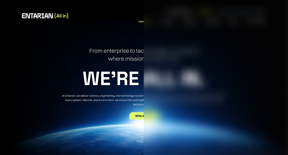
Checkout the Entarian Case Study | Live Website
Start with clarity
A visitor shouldn’t have to decipher what the company does or why it matters. Clever language can add personality, but it shouldn’t come at the expense of understanding. The strongest heroes communicate one focused idea: what this is, who it’s for, and why someone should care.
Clarity doesn’t mean stripping away creativity.
It gives creativity a purpose.
Give people something to experience
A hero can do more than display a headline and a button. It can demonstrate a product, respond to a visitor’s input, introduce a story, or create a small moment of discovery. Interaction should reinforce the message rather than compete with it. Motion, sound, typography, and responsive elements are most effective when they help visitors understand or feel something—not when they exist simply to make the page look impressive.
The goal is not to add interaction everywhere. It is to identify the one meaningful action that can turn a passive first impression into an active experience.
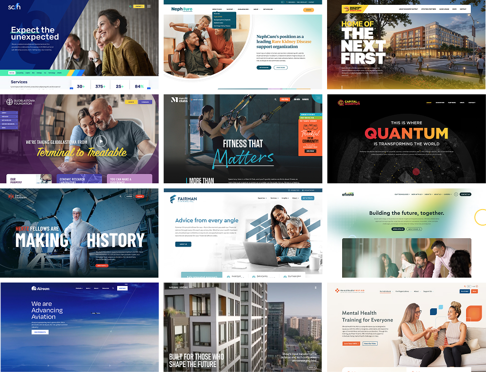
View Our Case Studies
Create a clear next step
Every hero makes an implicit promise: keep going, and you’ll find something worthwhile.
The next action should feel like a natural continuation of the opening message. That may be exploring the product, viewing the work, starting a conversation, or simply scrolling into the story. Calls to action work best when they are specific, relevant, and connected to what the visitor came to accomplish.
Let the rest of the website do its job
A homepage hero should open the conversation, not finish it.
Trust, evidence, details, differentiation, and conversion do not all need to fit above the fold. Trying to communicate everything immediately creates crowded layouts, competing messages, and unfocused experiences. The sections that follow should develop the idea introduced by the hero and give visitors reasons to continue.
This is how a strong opening becomes a meaningful journey.
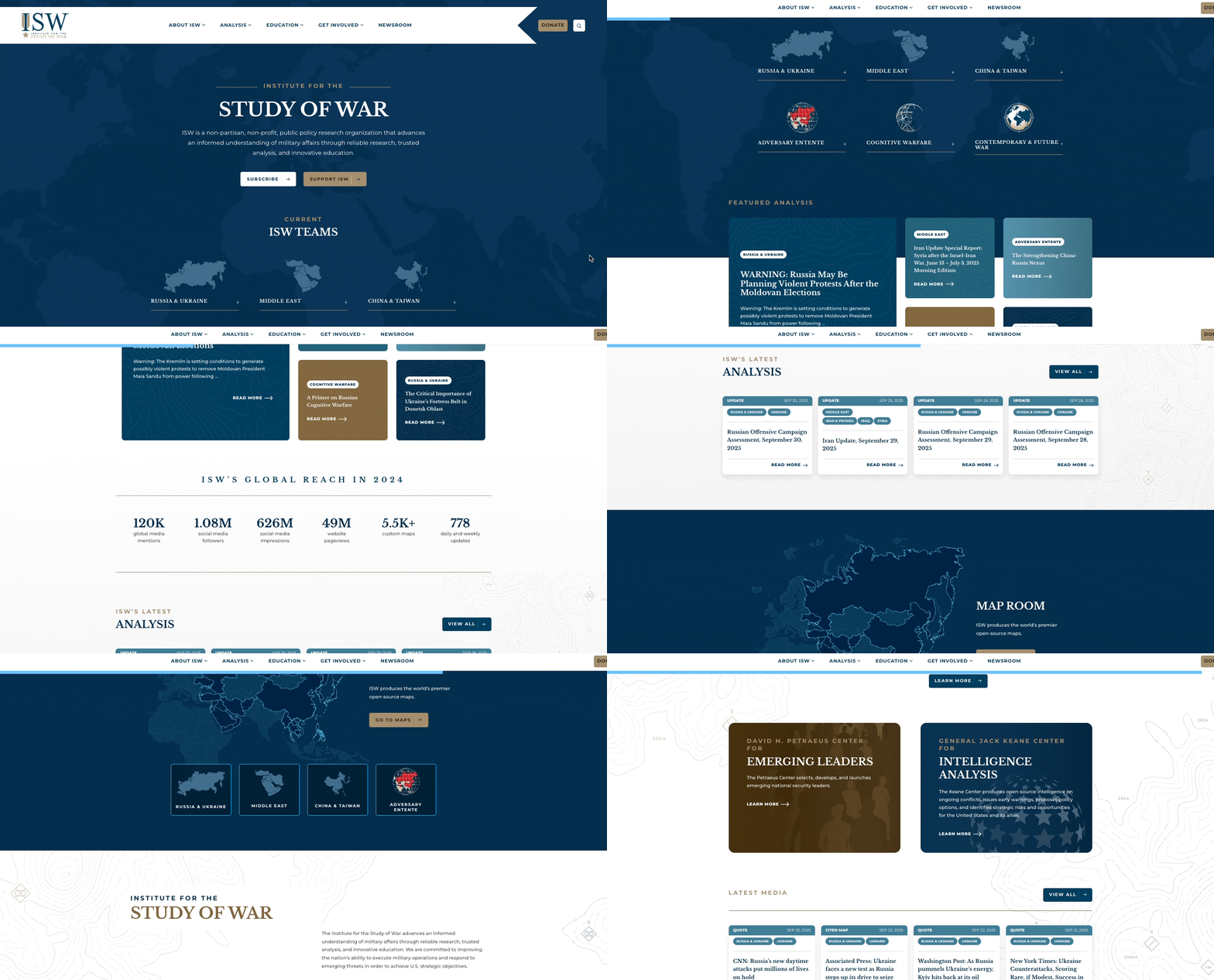
Checkout Institute for the Study of War | Live Website
Make the First Impression Last
A compelling first impression can capture attention, but the rest of the experience must earn it. If the hero promises innovation while the website feels generic, the promise collapses. If it promotes simplicity while the journey is frustrating, the message loses credibility. The visual design, interaction, content, performance, and accessibility must all support the same story.
The homepage hero doesn’t need to be eliminated, and it doesn’t need to become a spectacle. The hero should open the experience—not become a crutch for everything that follows.
So, the next time you are thinking about, “What should we put in the hero?” ask a better question: