Does a logo have to change? A look at the Grafik logo.

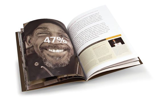
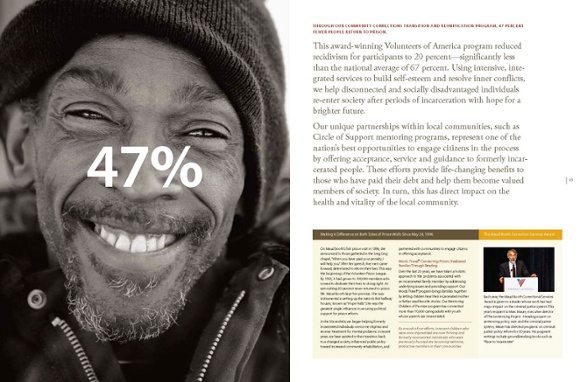
We have been working with a very successful business that has been around for about 30 years. As part of a strategic plan we recommended that the company revisit their logo. And some very interesting questions were raised. How critical is a logo as part of a brand? The company has been successful as a mom and pop organization, has never done marketing, and wants to increased visibility.  Will upgrading their logo add revenue or effect their bottom  line positively?  In this case, the company has a huge public facing infrastructure that would have to be changed; unlike some companies that would only have to revisit marketing materials and corporate stationary if its logo changed, this company could have as much as a $3-5  million price tag linked to changing a mark. Any logo change results in retooling a fleet of trucks, issuing new uniforms, new crates and new boxes in addition to building signage, business papers and marketing materials. Not an insignificant change.

Grafik Logo 1

It got me to thinking- how much can a logo really change things? My overall philosophy has been and continues to be that a logo is only a small part of a brand’s identity. It is  signature or a punctuation mark- it is never the whole story. I often counsel clients- especially new start ups- not to spend too much time and money on logos unless there is a budget to fully support the mark. By that I mean a sum of money that is large enough to imprint a new logo on the viewers’ minds. Normally  a logo becomes a strong foundation to a much larger brand exercise. And as many times as not we may only update a mark rather than create a new one if we feel that its contribution is not significant. In this case, the mark is seminal to the brand and very visible, and the current mark is somewhat problematic.

I started to look inward at our own mark to see if Grafik’s logo, untouched, could have carried us to where we are today. The flat out answer is “No”- but then again- we are playing in a visual space, so the way we portray our organization has ramifications.

Our first logo- created in the mid-seventies was created by a former partner, Alex Berry. The seventies were characterized by an abundance of warm colors and a love affair with san serif type faces- both apparent in this early version of the Grafik stationary. Sidenote- we thought we were being very hip by always using the logo rather large ( horsey now that I look at it) and always vertically. Our presentation materials were non-existent, and as a start up we created our identity on the fly.

Grafik Logo 2

After about 6 years we knew we needed a refresh. The company was migrating from a small boutique design firm of three or four people to a group of about 8-10 designers. We felt compelled to redesign the mark to look more “professional”. While this is a bad scan from a really old piece of stationary- this was before computers- we went for a much more conservative look.Typical of the time- the mid seventies- we opted for a soft moss green and a warm brown- subdued and subtle. Everything about the new look was restrained. We still really only viewed our brand as a logo and the way it was applied to stationary and business cards and did not really understand that it had to be used consistently. Along the way, the foundations of our brand, strong thinking, creative excellence and great client service were starting to be formed. I’m not sure that at that point we even understood who we really were- but we started to understand who we wanted to be.

Grafik Logo 3

By the 80’s I knew I needed to make a bold move. Our company was growing, our reputation was spreading and with the advent of the computer, our business model was evolving. I threw out a number of ideas to some of my creative staff- and decided we would have an internal competition to redesign the new look. I fully expected that one of the art directors would clinch a new look and feel. Low and behold, Dave Collins- at the time one of our youngest designers and now one of our partners, came in with the winning logo- a complete departure from where we had been.  It had the swagger that our studio needed- a fresh new look and feel that symbolized  a company on the move. Bold, yet restrained, we moved all of our materials to red and black- from our proposals, our pitch books to our stationary. For the first time we were getting compliments on the packaging of our proposals and on the quality of our communications. And for the first time we were starting to understand how a brand can really extend its reach.

But nothing ever stays the same. Dave’s logo carried us for about 5-6  years and in that time Grafik was growing from a design firm that had a good local reputation to a firm that had a solid reputation for branding intitiatives regionally and to some extent nationally. In the mid 90’s we realized that our good old red and black logo was dated and we went for a more refined elegant look. We were working with a lot of fashion and luxury clients and it was important to have a contemporary identity. Again we looked to one of our younger designers, Jonathan Amen, to give us a mark that had a relationship to our existing logo.

Jonathan not only revisited our mark, but he pushed us to look at an entirely new color palette and a new family of fonts. Gone was red and black as the dominant color palette. In- a soft green, an orange, a light blue and a switch from coated papers to uncoated papers. The new logo was reinforced with a series of ultra light circles that was a more sophisticated treatment than the heavier logo from the 80s. Our presentations became increasingly sophisticated but one thing was lacking. While the mark produced beautifully on paper, embossed or stamped, it was not as successful on the web. As more and more of our work became interactive we realized that we needed to capitalize on our web presence and that our current logo had limitations.

A combination of designers including Mike Mateos, Ivan Hooker and Gregg Glaviano  joined to create a new mark.They kept aspects of the original “G” created by Dave Collins, and transitioned the color of the mark to a more orange-red. The new “G”, while evocative of its predecessors, stands on its own and marks the transition of Grafik from design firm to branding agency. Our logo is an accurate depiction of the Grafik brand that still values intelligence, creative and service excellence. This time, with 20 years of branding under our belt we understood the importance of brand consistency and so we changed everything from the website, to email signatures and business templates to the interior of our offices. We launched the new logo with an online video and built internal consensus by making the logo change the focus of our annual company t-shirt.

Grafik Logo 5

Back to the original question. Could Grafik have grown as much if we had kept the original logo? In a profession that is judged in part by style and execution, it would have been hard to use a mark created in the late 70s to symbolize the organization we have become today. Looking at successful brands there are very few that have not had to adapt to new trends, new technologies, new ways of presenting themselves. A mark that might have worked a dozen of years ago may lack the energy, sophistication or professionalism to carry the company forward. Now we even have to consider the mark’s proportions to be successful on a mobile device.

So back to the dilemma faced by my current client. The question that I posed to him was not if the old logo matched to goals and positioning that we set forth for his company today. The question posed was would the logo take the company where it wanted to be 5, 10, 20 years from now. The answer was no. It was a hard answer given the costs associated with a change. Nevertheless, it was the right answer.

Grafik selected to create new visual identity for the National Endowment for the Humanities

The National Endowment for the Humanities (NEH) recently selected Grafik to develop their new identity to include logo, “look and feel,” and a new graphic and visual standards manual in order to support their mission of serving and strengthening our country through the conveyance of our history through the promotion and support of the humanities.  Grafik is extremely pleased to have been selected for such important work.

“We have a long history and interest in supporting the humanities at Grafik, and we find working with this client particularly exciting,” says Gregg Glaviano, Partner and Creative Director for the account.  “We believe this will be the beginning of a long partnership with the NEH.”

On creativity

The wonderful thing about the web is the ability to connect with people you would never know existed. People whose paths would never cross, whose art would never be seen, whose thoughts would go unheard. And in my journeys I have stumbled upon sites that I would never want to see again, and sites that are rich with ideas.

Rebel's Manifesto

In my last foray I happened upon a wonderful blog on art and creativity called wishjar   http://www.kerismith.com/blog/ – a wonderful blog on illustration, musings on being an artist, and generally the questions that surround any creative person. If you do not feel like reading a blog just check out her wonderful photos and art on http://www.flickr.com/photos/kerismith/. Here is her wonderful manifesto:

Grafik Marketing Communications receives 2009 Best of Business Award

Grafik Marketing Communications has been selected for the 2009 Best of Business Award in the Graphic Arts and related design category by the Small Business Commerce Association (SBCA). The Small Business Commerce Association (SBCA) announced that Grafik Marketing Communications has been selected for the 2009 Best of Business Award in the Graphic Arts and related design category. The SBCA 2009 Award Program recognizes the top 5% of small businesses throughout the country. Using statistical research and consumer feedback, the SBCA identifies companies that they believe have demonstrated what makes small businesses a vital part of the American economy. The selection committee chooses the award winners from nominees based off statistical research and also information taken from monthly surveys administered by the SBCA, a review of consumer rankings, and other consumer reports. Award winners are a valuable asset to their community and exemplify what makes small businesses great.

About Small Business Commerce Association (SBCA) The  Small Business Commerce Association (SBCA) is a San Francisco-based organization. The SBCA is a private sector entity that aims to provide tactical guidance with many day-to-day issues that small business owners face. In addition to their main goal of providing a central repository of small business operational advice, they use consumer feedback to identify companies that exemplify what makes small business a vital part of the American economy.

Logo logistics

I recently received a direct mailer inviting me to a conference. And quickly thumbing through the piece I was struck by the very last page. It was the obligatory list of sponsors… rows upon rows of logos- one more invisible than the next. In this case, it’s a wonderful way to illustrate the importance of having a logo that will stand out from the crowd. Clearly the presenting sponsors and benefactors are somewhat more visible than those in the Diamond category and below—and they have paid a pretty penny to have that prominence. It’s interesting to see how the marks fare when they are grouped with other logos. For my money—Shell is probably one of the best examples. A logo so strong that it does not need to use up any space with their name since it enjoys tremendous brand recognition.

Sponsorship logosThe marks in this grouping can be divided into a number of subsets:

Type only marks:
• Energy Future Holdings, whose name is not well-known, whose typeface is completely lack luster, and looks like little thought has been given to any brand personality at all.
• ExxonMobil– a mark that holds its own by virtue of advertising but would lose stature if it was not a name brand
• Accenture– a logo that would probably have gotten lost if it was scaled down and places in the President’s circle.
• Hollister– a mark that is at least easy to read among those in the President’s circle.

Marks that are strong and recognizable by virtue of their advertising spend:
• Verizon– a lack luster mark that loses space with the V above the name
• United– a logo designed by the master Saul Bass
• UPS– logo originally designed by master Paul Rand and redesigned by Futurebrand
• Chevron
• Bank of America

There are logos that have recently changed their mark—some successfully and some not so successfully

• Kraft- looks like an splatter of who knows what—paired with a most bland typeface.
• Altria- which looks dated even though it was unveiled when Phillip Morris changed its name.
• Pepsico- which looks strikingly similar to the at&t mark.
• Bank of America—which was redesigned in 2006.
• And my personal favorite: AT&T which has made a career out of changing logos—the latest a take-off on the Cingular mark.

All of these logos have been designed by professionals—from Saul Bass to BrandUnion. But, it is when we get down the food chain that you start to see the lack of design experience.  All of the following logos are virtually unreadable, and hard to distinguish. Take for example WBEC (Womens Business Economic Council). One needs more than perfect eyesight to read what is under this un-distinguishable set of letters. Or ASAP—a mark that almost disappears due to the gold color of the letters. UP? Looks like a combination of every used design trick.  And APlus—also impossible to read.

I am quite sure that many of these marks function well in isolation—on a letterhead or a business card. But so many times marks are combined into sponsorship lists, strategic partnerships or the like. And this is where a truly strong logo shines. UPS, for instance, designed by one of the great masters, Paul Rand, still stands up after decades—even if it has been modernized. And like Shell, it would stand up even if it was surrounded by a dozen other marks. Compare UPS and Energy Future Holdings. Or look at how ASAP holds up to Verizon—essentially the same design concept. Even a giant like Alcatel-Lucent has a mark that is not improved by its 3 dimensional button logo.

Logos are not easy things to design. They can not be done in a week, they can not be done in the absence of a strong brand study, and they always need to be seen in context. They are signatures of a brand—not the whole letter—but they are signatures that must be treated carefully. The guidance I give to all my clients and staff: “How does it look when it is surrounded by competitors’ logos? How does it look if all the marks are constrained to the same height or width? Is it readable when it is only 1 inch wide of 1/2 inch high?

Grafik exposes AIGA 50 online.

When the DC chapter of the American Institute for Graphic Arts (AIGA) decided to take their 11th AIGA 50 competition online, they reached out to board member and Grafik Senior Designer, Mila Arrisueno, who saw the potential to create something outstanding (Go Mila!). Mila immediately brought the opportunity to Grafik, and assembled a team of designers to work night and day to launch. In the two-month time frame, Grafik combined with the AIGA programing team to concept, design and develop an entire website and call for entry materials.

AIGA 50 is a biennial juried exhibition showcasing 50 of the strongest examples of design produced in this region over the last two years. For the last 20 years, entries have been submitted via snail mail. And the time between submission and the gala could be anywhere from six to eight months. This year, however, AIGA DC wanted to change all that. With a new goal to demonstrate the significance of design in all aspects of our personal and professional lives, the organization was determined to take AIGA 50 online, and use social media to create a vital dialogue. The Grafik team knew it would be a challenge, but they were totally up for it.

AIGA 50 website

AIGA 50 website

“For the designers, bringing the show online is an opportunity to fully expose their creative inner selves, showing everyone what they’re made of,” says Gregg Glaviano, Grafik Partner, and Creative Director. “With the added functionality of allowing the public to comment on the gallery of work, it  also exposes entrants to praise, questions and more. This creates a live conversation between designers and the general public — elevating and exposing the design community to the greater community at large. The gallery will offer a chance for the community to see and comment on all the work once the judges have made their selections. With the blog, twitter and flickr feeds,viewers will have access to the entire process. Finally, after the show, a winners’ gallery will feature more images and greater insight than has ever been offered in the past. All in all it’s sure to be the most revealing show to date.”

Credits to the entire Grafik team: Gregg Glaviano, Mila Arrisueno, Sharif Elshinnawi,
Alex Diaz, Arthur Hsu, Heath Dwiggins, David Collins, Hal Swetnam, Johnny Vitorovich
and David Jolda.

Volunteers of America’s 2008 annual report receives Excellence Award

We’re proud to announce the Volunteers of America 2008 Annual Report received an Excellence Award from the 2009 American Graphic Design Awards competition. One of the largest and broadest competitions honoring all forms of electronic, print, motion and interactive design. Thanks go to Mila, our production team, Meredith Light, and especially our client for trusting us to tell their story.

Volunteers of America Annual Report cover

Volunteers of America Annual Report inside

Photography makes a world of difference

Man smiling 47%

In a perfect world, there would be no such thing as budgets. But unfortunately there are, especially in these tough economic times. And more often than not, there is rarely any money set aside for photography. When working with a small photography budget, it’s hard not find myself limited to using stock photography, which is often overused and generic. But this sometimes drives us to think outside the box when necessary.

This past year, I worked with Volunteers of America—a national, faith-based nonprofit that provides local human service programs, such as housing and healthcare, to over 2 million Americans—on their annual report. And budget limitations are a definite reality for nonprofit and charitable organizations. But by really digging around and discovering what resources the client had to pull from, we managed to get a hold of some donated photography. I was ecstatic to discover that these were captivating close in portraits of VOA beneficiaries. And I was even more ecstatic to incorporate them into our designs which in turn help tell VOA’s story in a much more engaging and effective manner. We always intended to show real VOA people and stories in order to build the credibility of the organization especially in an economy where people are apprehensive about donating their money.

Woman sitting on bedMan sitting on chair with cane

Fortunately we were really lucky to have been donated theses images and I know for a fact that I would of not got the same effect by purchasing stock images on-line. But sometimes people forget that working with a photographer can give you the opportunity to negotiate the pricing if needed especially if it’s for a good cause. And many times, you can end up getting longer usage rights. Ultimately each project has different needs, but when necessary, I find it is important to always try and convey to clients how investing in quality photography or even illustration can be a crucial part of their storytelling and identity. It not only elevates the visual caliber of their brand but it helps their company really stand out from the rest of them.

Photography is a worthy investment: once you get a good photo, it’s worth its weight in gold.

“What will be.”

So, this is like the 8th draft of me writing this. And every time, 2 paragraphs in, I realize that all I’m doing is writing about how great Honda is. Stop, backspace backspace, delete delete. I’m supposed to be talking about my design for the 2009 “Honda in America” brochure, about MY contribution, MY concept. And, inevitably, 2 paragraphs later, Honda Honda Honda.

But then I thought, maybe that’s appropriate. That really is the concept for their 50th anniversary brochure. Why do the talking when Honda really speaks for themselves.

“Think Simple.”

Since I first started at Grafik 4 years ago, I’ve been designing this brochure. Until this year, it has been a strictly informational piece, relying on content and photography to convey its message rather than concept. However, this year was different. It’s the anniversary of Honda’s first store front in America, a motorcycle dealership in California that opened in 1959. 50 years later, Honda’s employing 28,000 Americans in all 50 states and has a capital investment of $12.1 billion dollars. If you are driving a Honda or Acura that you bought here, there is a 76% chance that it was made in North America (see, I’m doing it again, talking about Honda…).

Honda In America Investment Map

“More of a good thing.”

I started looking at Honda’s vintage ads. Tons of them. And there it was. Everything that was outlined in the neat charts and graphs, all the bullets and captions of this content heavy brochure, was exactly the same. For 50 years, Honda’s advertising and messaging proves that all the copy in that brochure is true. So why should I do all the talking? Let the power of their message speak for itself.

So I found a vintage ad who’s headline worked for each section. “New openings from Honda” talking about creating manufacturing facilities across the country. “It comes with a conscience”, 1970s ad headline, now serving as the headline for the environment and energy section. Apparently, Honda was green when green was still just a color. “Rare Accord” to discuss the relationship Honda has with it’s suppliers. Honda’s involvement in community programs: “One good turn deserves another.” I mean, this is easy people! Next one!

The brochure really just rolled itself out. I’d love to take the credit. Okay, sure, I did do all the research, find the ads, pair them up with each section, make the brochure visually interesting, balancing copy with concept. Let me tell you, when a client sees white space on a page, for them it’s an opportunity to fill it w/ more information. So I was a gatekeeper, fiercely protecting the CONCEPT, protecting the page so that the power of their message wouldn’t be fighting for attention, but not muffling or diminishing the important information that needed to be conveyed.

“Take one out and open it up.”

I must say, I’m very proud of how this brochure turned out. I pulled a few jpegs of each spread to show the design, but, like anything conceptual, you really need to pick it up and look through, page by page, and see for yourself.

And, by the way, I have a 2001 Civic Coupe, which I love, and now, after designing this brochure, can say for sure that I am very proud to own a Honda.

50 years Honda in America Post

Just call a designer

Sometimes there are so many ways to belittle our profession—as graphic designers. It never fails to amaze me how the elements we consider and study—like typefaces, kerning, are thought of as small insignificant details.

Consider the recent fray over the Twin Towers memorial. www.nytimes.com/2009/03/24/nyregion/24names.html They have to display 2,982 names in the memorial. They have gone through dozens of typefaces, and have called it a painstaking process—where they finally settled on Option Y—Optima.  The architects have had to look at lots and lots of options and have done their due diligence in terms of testing the type faces on different surfaces, under water, with water flowing over it, etc.

Twin Towers memorial font, graphic designers

touching the Twin Towers memorial, graphic designers

And it is no wonder they had to go to so many different options. Imagine how many options they could have gone with if they had worked with someone specialized in studying fonts. Now the commission has not skimped at all. You have renowned architect Michael Arad leading the charge, Davis Brody architects, and world-renowned landscape architect, Peter Walker (one of my former professors). So where are are graphic designers in this lineup? Why is it that every architect fancies themself a type designer as well? The fault lies not with architects or urban planners, rather it lies with the fact that as a profession we have not educated the public on what we do, the training we have, and that the small details do indeed matter.

Optima may be a very fine choice—and is certainly a classic face, but an opportunity was passed up to design a memorial that has a contemporary feel to its choice or fonts and it was missed. And our profession was denied an opportunity to do what we do best.

The crisis of credit

Finally a clear explanation of the credit crisis that I can understand. More than anything, it demonstrates the power of design to communicate complex ideas. After months of reviewing articles in Investment News, Advisors Perspectives, and of course WSJ, finally a designer has been able to illuminate what so many other have failed to. Makes me proud of my profession.

Logo tournament

So how fitting is it that the best designer on Logotournment.com is called Carrion.

I was on Facebook and low and behold what do I see:

So I click on to see what this is all about and all I can say is WOW. In a few hours you can get essentially free work from around the world. A world-class design bake-off that allows new businesses to pay $250 to have hours and hours and hours of work. AND If you want you can set the amount you will pay for a logo. Looking online at the prize money-the top ever paid is $700. WOW! What a fortune. And it gets better, In addition to working for a pittance, being pitted against your fellow professionals—I use that word loosely—you get to pay 15% of your commission to logotournament.com. Fine print—if there are less than 30 submissions, the contest can be canceled.

If you venture into the site you can read half-inane posts from design wannabes all explaining how they are not being exploited and not harming our industry. And most arguments have more holes than swiss cheese. Spec work is spec work. Plain and simple. Exploitation is exploitation.

Ironically if you actually track down the owner of this site, Quinn Ventures—you will see an absolutely lovely logo with absolutely no information about the company whatsoever. Makes you kind or wonder…. And I wonder how much they paid the designer for that logo? Zip.

Grafik
Privacy Overview

This website uses cookies so that we can provide you with the best user experience possible. Cookie information is stored in your browser and performs functions such as recognising you when you return to our website and helping our team to understand which sections of the website you find most interesting and useful.