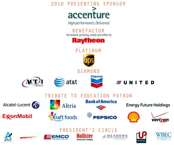
I recently received a direct mailer inviting me to a conference. And quickly thumbing through the piece I was struck by the very last page. It was the obligatory list of sponsors… rows upon rows of logos- one more invisible than the next. In this case, it’s a wonderful way to illustrate the importance of having a logo that will stand out from the crowd. Clearly the presenting sponsors and benefactors are somewhat more visible than those in the Diamond category and below—and they have paid a pretty penny to have that prominence. It’s interesting to see how the marks fare when they are grouped with other logos. For my money—Shell is probably one of the best examples. A logo so strong that it does not need to use up any space with their name since it enjoys tremendous brand recognition.
 The marks in this grouping can be divided into a number of subsets:
Type only marks:
• Energy Future Holdings, whose name is not well-known, whose typeface is completely lack luster, and looks like little thought has been given to any brand personality at all.
• ExxonMobil– a mark that holds its own by virtue of advertising but would lose stature if it was not a name brand
• Accenture– a logo that would probably have gotten lost if it was scaled down and places in the President’s circle.
• Hollister– a mark that is at least easy to read among those in the President’s circle.
Marks that are strong and recognizable by virtue of their advertising spend:
• Verizon– a lack luster mark that loses space with the V above the name
• United– a logo designed by the master Saul Bass
• UPS– logo originally designed by master Paul Rand and redesigned by Futurebrand
• Chevron
• Bank of America
There are logos that have recently changed their mark—some successfully and some not so successfully
• Kraft- looks like an splatter of who knows what—paired with a most bland typeface.
• Altria- which looks dated even though it was unveiled when Phillip Morris changed its name.
• Pepsico- which looks strikingly similar to the at&t mark.
• Bank of America—which was redesigned in 2006.
• And my personal favorite: AT&T which has made a career out of changing logos—the latest a take-off on the Cingular mark.
All of these logos have been designed by professionals—from Saul Bass to BrandUnion. But, it is when we get down the food chain that you start to see the lack of design experience. All of the following logos are virtually unreadable, and hard to distinguish. Take for example WBEC (Womens Business Economic Council). One needs more than perfect eyesight to read what is under this un-distinguishable set of letters. Or ASAP—a mark that almost disappears due to the gold color of the letters. UP? Looks like a combination of every used design trick. And APlus—also impossible to read.
I am quite sure that many of these marks function well in isolation—on a letterhead or a business card. But so many times marks are combined into sponsorship lists, strategic partnerships or the like. And this is where a truly strong logo shines. UPS, for instance, designed by one of the great masters, Paul Rand, still stands up after decades—even if it has been modernized. And like Shell, it would stand up even if it was surrounded by a dozen other marks. Compare UPS and Energy Future Holdings. Or look at how ASAP holds up to Verizon—essentially the same design concept. Even a giant like Alcatel-Lucent has a mark that is not improved by its 3 dimensional button logo.
Logos are not easy things to design. They can not be done in a week, they can not be done in the absence of a strong brand study, and they always need to be seen in context. They are signatures of a brand—not the whole letter—but they are signatures that must be treated carefully. The guidance I give to all my clients and staff: “How does it look when it is surrounded by competitors’ logos? How does it look if all the marks are constrained to the same height or width? Is it readable when it is only 1 inch wide of 1/2 inch high?


