Sometimes there are so many ways to belittle our profession—as graphic designers. It never fails to amaze me how the elements we consider and study—like typefaces, kerning, are thought of as small insignificant details.
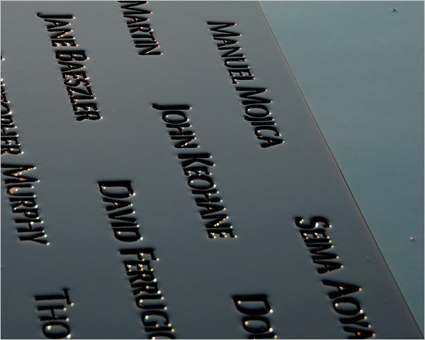
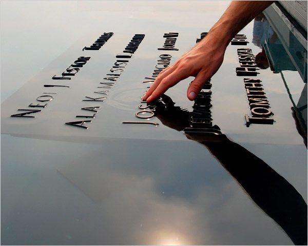
Consider the recent fray over the Twin Towers memorial. www.nytimes.com/2009/03/24/nyregion/24names.html They have to display 2,982 names in the memorial. They have gone through dozens of typefaces, and have called it a painstaking process—where they finally settled on Option Y—Optima. The architects have had to look at lots and lots of options and have done their due diligence in terms of testing the type faces on different surfaces, under water, with water flowing over it, etc.


And it is no wonder they had to go to so many different options. Imagine how many options they could have gone with if they had worked with someone specialized in studying fonts. Now the commission has not skimped at all. You have renowned architect Michael Arad leading the charge, Davis Brody architects, and world-renowned landscape architect, Peter Walker (one of my former professors). So where are are graphic designers in this lineup? Why is it that every architect fancies themself a type designer as well? The fault lies not with architects or urban planners, rather it lies with the fact that as a profession we have not educated the public on what we do, the training we have, and that the small details do indeed matter.
Optima may be a very fine choice—and is certainly a classic face, but an opportunity was passed up to design a memorial that has a contemporary feel to its choice or fonts and it was missed. And our profession was denied an opportunity to do what we do best.