SGF receives hundreds of thousands of website visitors every month, all coming to their site for different reasons. Whether site visitors are interested in learning more about fertility, evaluating treatment options, looking to extend fertility, or curious about donating eggs and helping someone else along the fertility journey, the website needed to address all of these areas of interest while quickly surfacing the relevant information to the right audience. No easy task.
Shady Grove Fertility
Paving the path to parenthood
Shady Grove Fertility (SGF), a national leader helping couples and individuals from all over the world start and build families, wanted to celebrate the milestone of 30 years in business and 100,000 babies born with a newly designed website. After engaging Grafik to develop an award-winning campaign in 2019 that introduced Shady Grove to the New York market, SGF asked Grafik to bring a fresh and modern look and feel to the site and provide their patients with a more intuitive user experience.
Our first step was to develop user journeys based on the personas we developed for the 2019 campaign in order to fully understand and serve these audience segments. The key insight that our journeys revealed was that while SGF has extensive information and resources across the entire fertility spectrum, users felt overwhelmed by the sheer amount of content provided during an already stressful time in their lives. The new site needed to make tasks easy to complete while allowing users to find deeper content at their convenience. This solidified the goal of our redesign: surface content in a digestible and intuitive manner. To accomplish this we focused our efforts around three organizing principles: simplify navigation, improve the discoverability of content, and adopt a modern mobile UX.
Simplifying navigation
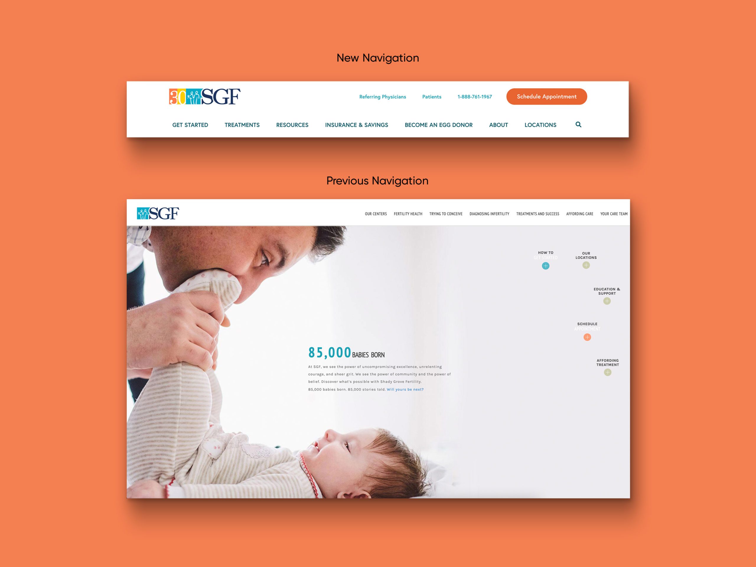
Our priority was to reduce the number of organizational groupings, limit content featured in drop-downs, and bring more visibility to strategically valuable content in the navigation. Through a card sorting exercise with existing patients, prospective patients, and SGF employees, we were able to identify key efficiencies and commonalities in labels and cut the number of pages visible from the main navigation in half.

Improving discoverability
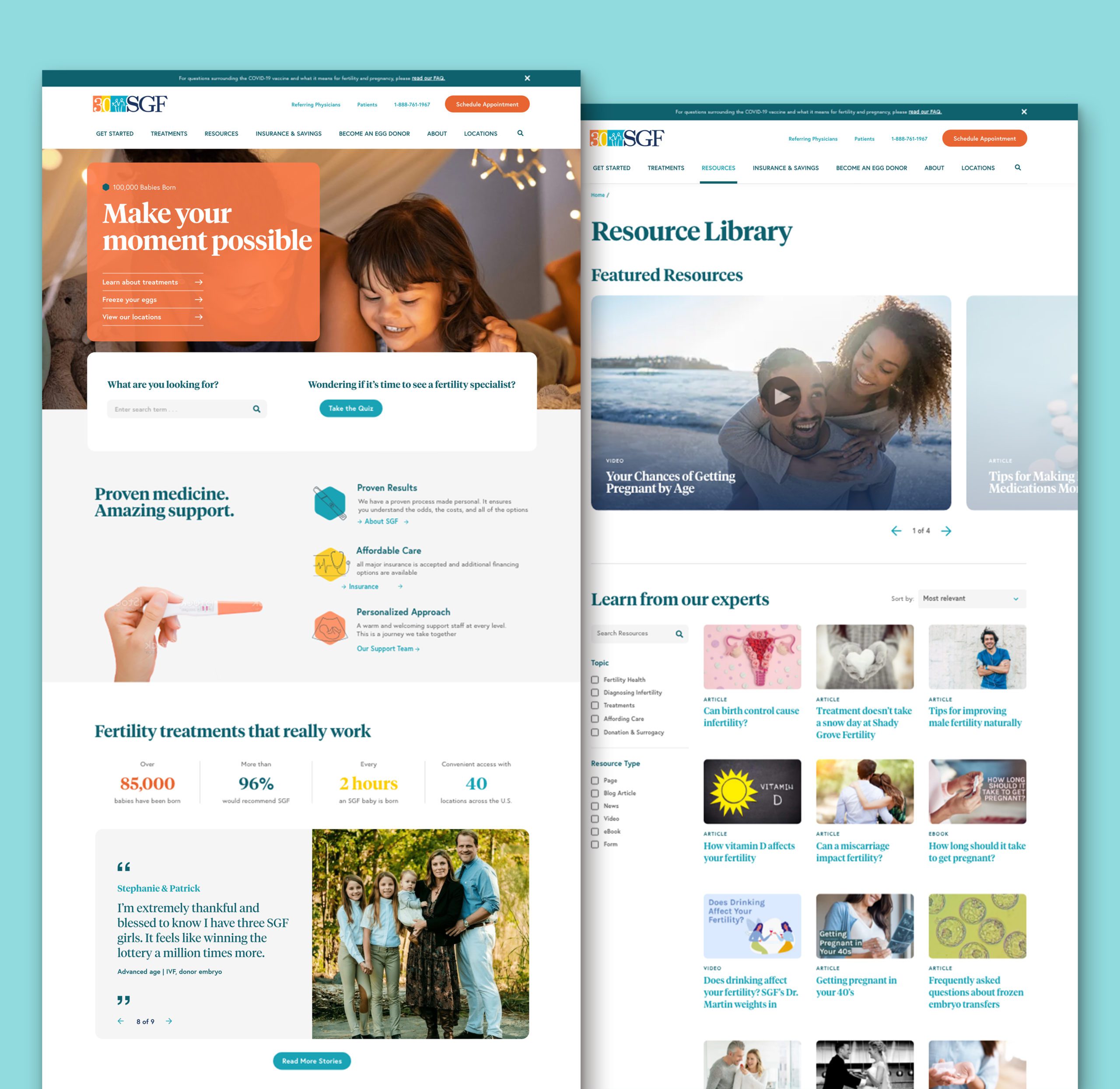
SGF’s robust blog was successful in driving new site visitors, but it was not effective in driving meaningful engagement beyond one read. To more closely integrate blog content and website content, we developed visually compelling featured article modules throughout the site and migrated the website to WordPress, transferring the extensive blog that previously existed as its own subdomain to the main site.

Adopting modern mobile UX
The fertility treatment industry, in general, is largely mobile-first as patients often use apps to track their fertility. Adopting a familiar navigation pattern and making content more snackable, with icons, bullets, spacing and updated design elements was key for the new site. The new design conveys a clean and light experience with dynamic and static content that is easily scannable.

A multi-purpose site
With the launch of shadygrovefertility.com, we saw a 13% decrease in bounces, an 18% increase in the number of pages per session, a 29% increase in visit duration, and a 62% increase in goal conversation rates! As SGF continues to expand and reach major milestones, the new site allows patients to access information, make connections, and find reassurance quickly and intuitively.


