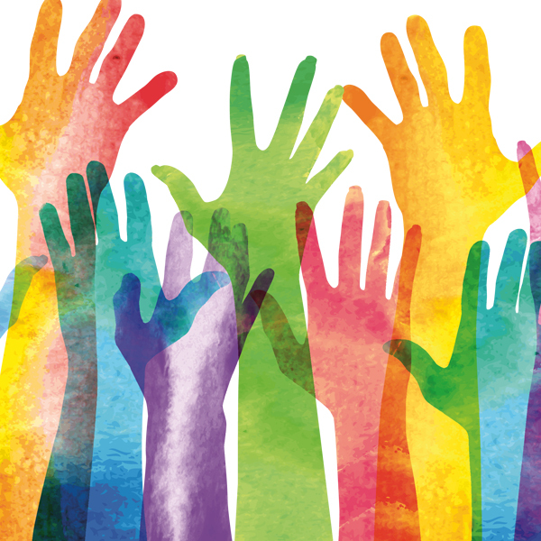
As designers, we are taught that our color recommendations and choices influence our client audiences, their interactions with interfaces, how brands resonate with individuals, stand out from their competitors, and more. Color consulting is a big business supported by research psychologists, anthropologists, social scientists, etc. Ask the Pantone Color Institute whose work, according to their website, is focused on “the business of color”.
I’ve neither participated in focus group testing regarding color nor dug too deeply into the research I’ve read about the power of color regarding branding or as it relates to social change. I can say this—color can help tell your brand’s story, help distinguish your brand from the competition, and influence your brand’s personality.
Now, if we all followed the same rules about color psychology findings nearly everything created would be blue. Why? The research says blue is trusted, calming, secure, authoritative, I could go on. In essence—man’s favorite color. So, no wonder nearly every healthcare company uses blue. But, if everyone begins to believe blue is synonymous with healthcare, how will the next new healthcare company distinguish itself? As humans, we all too often make the leap from the emotional attribute to something synonymous with the business area of focus. “Blue is healthcare,” one client recently declared…all I know is we must be blue.” But, if you want to rethink something as new or distinguish it as a new entry into a crowded competitive landscape I’d ask, are you willing to let go of these preconceived rules?
I just went to see the documentary, Summer of Soul (along with my husband and 8 other socially distanced audience members in a newly reopened movie theater in Palms Springs). The movie, as Wesley Morris of the New York Times describes is, “footage from the 1969 edition of Harlem Cultural Festival footage that Ahmir Thompson, better known as Questlove, has rescued and assembled into nearly two hours of outrageous poignancy.” By “rescued” he is referring to the fact that the footage was never picked up by a network and thus—nearly lost.
The movie described the period of the late ’60s-’70s as one defined by a series of tragic assassinations of our leaders post the Vietnam War. It was a period of our history filled with a common distrust in our governing system resulting in riots, and a desire by many not to conform. There’s a section of the movie that elaborated on something you may have heard before—how we came to attribute white as good, pure, enlightened, and black as evil, foreboding, corrupt. It suggests that our society appropriated these terms as a result of centuries of cultural dissonance for our own purposes. Similarly in branding, we often appropriate meaning to colors due to what we’ve learned to associate a color with. Is this for the sake of convenience, or lack of imagination?
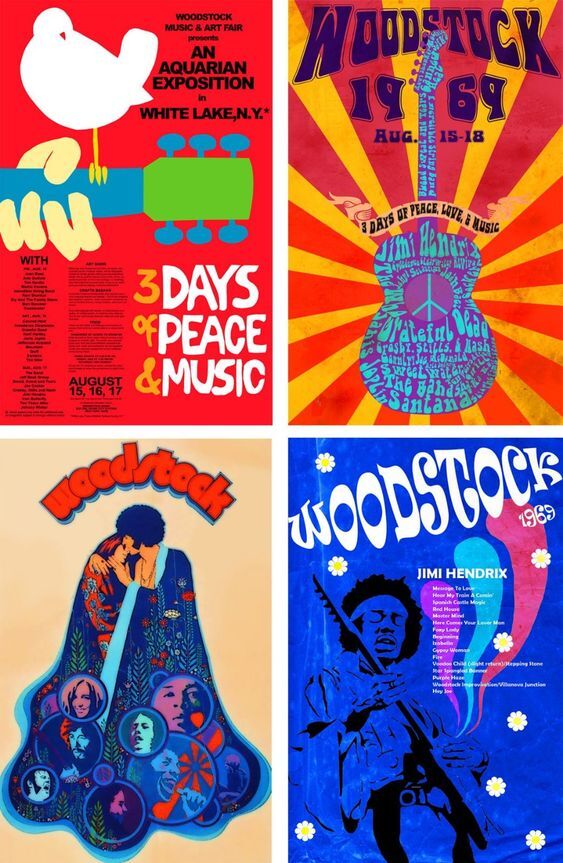
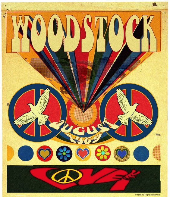
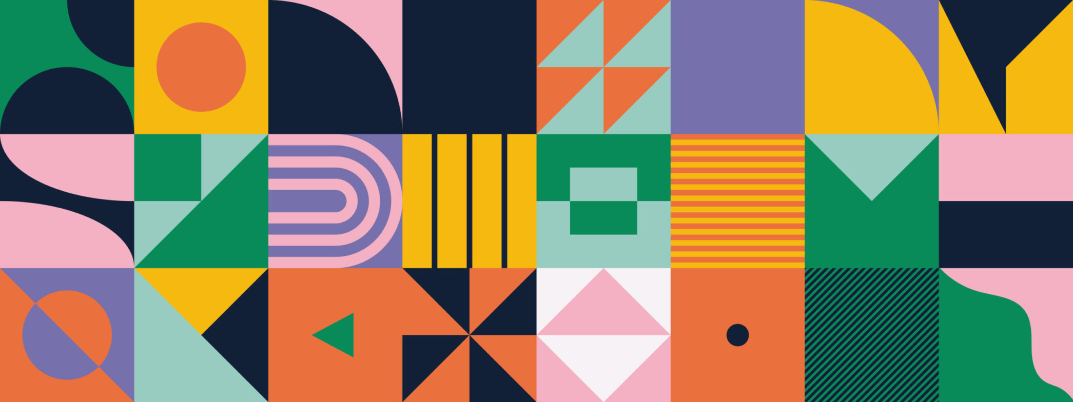
What emerged from the anger and despair of the late 60-70s was clothing, music, design, and associated colors intended to redefine, rebel, or share a new dawning. African dashiki prints and burnt-orange sunrise motifs emerged out of the darkness. Psychedelics and tie-died art inspired the drug experimentation of the period also marked the nonconformist spirit of this period. The Fifth Dimension’s song, “The Age of Aquarius” at one point topped music charts. Typography inspired by the organic forms of the Art Nouveau movement reemerged in stark contrast from Helvetica—a font Ellen Lupton, curator of contemporary design at the Cooper-Hewitt, Smithsonian Design Museum in New York once said, “was embraced because of its “lack of personality… Helvetica met our craving for corporate vanilla.” In many ways, color was bold and significant of a new age or a rebirth and a connection to nature. One might say the Art Nouveau fonts that emerged were essentially created as a middle-finger reaction to the conventional norms of the time.
So if you can’t tell by now, I loved this movie. It’s a buried piece of our country’s history that’s been carefully unearthed. Why am I blogging about it here? It’s a telling glimpse at how music, fashion, and design are interrelated and reflective of our national mood. Because in the wake of Black Lives Matter combined with emerging from the pandemic I can’t help thinking, what’s next for design? And, because I just can’t imagine we’ll be wearing gray athleisure wear and elastic waistbands for years to come.