Looking for the perfect name?

We’ve been doing a lot of naming over the past few months—enough to keep several of us up at night. It’s a pretty tricky business, after all. It always has been. And while many organizations are determined to develop options internally, naming is not for the faint of heart. Without a clear strategic approach, it can quickly become unfocused and unmanageable.

Of course, as naming experts, we would always recommend having an objective partner to support the effort. But because you may insist on working without a net, here are a few questions to consider. If you can answer yes to all four, then your new name may be a winner.

1. Does the name fit your brand?

Choosing a name that has clear and creative association with your company is pretty essential. Think about some of your favorite brands—what they offer, what they stand for—and you realize just how perfectly the name fits.

Amazon, the world’s largest online retailer, is named after the world’s most voluminous river. A leading manufacturer of construction equipment got its name when a photographer mentioned how much he thought their tractors looked like giant caterpillars. And when two ex-Apple execs created a company focused on personalizing humdrum home products like thermostats, they opted for a warm and fuzzy name. They called it Nest.

These are smart names because they’re sticky. They help to convey the value, the uniqueness, or the intention of the brand. Be sure to keep this in mind as you develop options. The right name will be the one that makes it easier for anyone to understand why your company is different.

2. Does it fit your audience?

Make it easy for future brand loyalists to adopt your name. If you want them to fall in love with your brand (or your product), you need to be lovable. Plenty of businesses forget this, and wind up making costly mistakes. Enthusiasm may already have been waning for Palm, for example, but naming its new webOS phone, Pixi, certainly didn’t help matters. How many executives do you know that want to carry a Pixi?

Founders of the hip new clothing store, Hot Mama, believed women would love the name but they quickly learned that most shoppers thought they only sold maternity dresses.

Fact is, it’s pretty easy to become very excited about a name, and without an objective voice in the room, it can be hard to make the right decision. Dan and Chip Heath reported in Fast Company that there were many at Intel who though ProChip was a better name than Pentium, and some at P&G who preferred EZmop to Swiffer. Fortunately, sounder minds prevailed.

The key here is to be thoughtful and very strategic when you’re choosing a name. It’s important to listen to your gut, but be sure your head is in full agreement.

3. Will it still be the right name in five or ten years?

Today, you’re selling one thing only—focus is the name of the game, after all. But what happens when your business takes off and you want to expand? Will your name make it more difficult for people to understand your focus or your value?

Digital lifestyle publisher, Glam Media realized their focus on women meant they were ignoring 49% of the potential audience. When they reworked their business model, a name change was critical. Today, Mode Media is reaching a significant number of men. More recently, New Zealand’s biggest communications company, which was simply called Telecom, determined that name had nothing at all to do with the digital technology services it was now offering. Starting in August, it will be known as Spark.

There may be plenty of good reasons—strategic and financial—to go through a name change somewhere down the road, but typically, that’s a very expensive proposition. The only exception to that may be for those who realize their mistake early on. In 1997, few people had ever heard of a search engine called BackRub, so it was a relatively easy (and cheap) decision to change the name to Google.

In short, it’s best to take a little extra time up front to consider where you want your company, or product, to go. Having those conversations now will help you choose the name that lasts.

4. Is the name really unique to your category?

While it’s obvious to all of us that Dove Soap and Dove Chocolate are two entirely different companies, the difference between hotels named Hyatt and Haiyatt is not as clear-cut. Confusion between your new name and a well-established brand may be intentional on your part, or purely coincidental, but either way, it will cost you. After investing considerable time and budget to build equity in their names, most brands are quick to go after copycats—even before there’s a chance for confusion.

Swatch, for example, has been very outspoken about their trademark on iSwatch, and just how similar the name is to Apple’s proposed iWatch. There have been rumors that the two companies are now working closely together, but that partnership might not have formed without Swatch’s aggressive stance.

And what about names that aren’t quite so similar? With trademarks, it’s always better to stay clear of any names that sound like other players in your industry. Last year, a Florida judge granted an injunction against FIT U healthclubs because the name and business model was so similar to rival, YouFit. And more recently, the folks at Mission Burrito lost a lawsuit with Mission brand tortillas.

The lesson here is a simple one: Do your homework, search the market, and vet your name with a good trademark attorney.

Remember, if you can check all four boxes, then you’re on the right track. If you need a little help—a partner to get you on strategy, keep you focused, and drive you to the best option—you know where to find us.


Rebranding a startup for market entry

Working with a startup is always an exciting exercise and our collaboration with Carsquare, an automobile meta-search engine, was no exception. Carsquare, like many startups, was founded in the proverbial “garage”. They focused all of their initial resources on software development, and once the company received their initial round of venture funding, they recruited Grafik to create a consumer-facing brand.

Over the past five months the Grafik team has worked with the founders’ to ensure their innovative thinking transforms the market. The mantra we developed, ‘Search them all. Find the one.’, encapsulates the product’s dual strengths, a uniquely robust platform and a customized user experience. By incorporating a magnifying glass into the logo, we reinforce the notion that—in one place—consumers can now see cars from all of the top automotive sites, access reviews and advice, and save the results of their searches.

Since Carsquare is a meta-search engine, brand experience is directly intertwined with the website’s functionality. Our designers created a simple and seamless user experience that features new capabilities including garage bays to save search results, articles and videos about the car buying process and comment sections. While implementing the latest tools we equipped them, and the entire site, for search engine optimization and search engine marketing.

To turn the brand experience into a reality we crafted a digital marketing strategy, and with a limited budget we maximized our return on investment by deciphering which targeting methods were most effective at reaching people in the car buying process. We also aligned the brand across social media platforms.

Already, our strategy has led Carsquare to exceed monthly goals and has positioned this startup as one to watch. Continue to follow Carsquare as it disrupts the status quo and accelerates down a new road in the automotive search market.

Branding loss and hope

As brand strategists, we feel a heavy responsibility to unearth—and then communicate—the essence of a product and service. And as we go through the process, what emerges from a myriad of choices is a feeling captured in images and words and colors and a specific tone. Our canvases are typically the web and all that can be poured into it—videos and infographics and text for sites, abbreviated versions of same for social media and its accompanying invitation to respond and re-post—ephemeral physical locations like trade show booths and sales offices; outdoor signage; broadcast; and traditional print collateral.

But what if all that were also bound up in a permanent physical space? What if we added architecture to the mix? And what if the “product” was how we see ourselves as a country and how we memorialize—as we must—a truly gruesome event?

Reading Adam Gopnik’s New Yorker piece “Stones and Bones: Visiting the 911 Memorial and Museum”, I was struck both by how difficult and how familiar was the task he described. It is no accident that it was published in the issue that dropped 4th of July week; it is about how we think of ourselves as a nation, how we write our history, and yes, how we brand ourselves. Mr. Gopnik’s deconstruction of all the elements is impressive; his writing superb. Here’s a link: http://www.newyorker.com/reporting/2014/07/07/140707fa_fact_gopnik.

Brand evolution in the era of the enlightened consumer

Evolving a brand is not always a simple undertaking. It’s not just navigating clients through the process. Regardless of the project, brand marketers are becoming increasingly astute at understanding what I call “The Enlightened Consumer.” This consumer is exceedingly conscious of marketing and takes their relationships with brands very personally.

As these relationships become more complex, so do the ways in which we bring brand experiences to our audiences. Keeping in mind that the Enlightened Consumer (EC) is on a journey with your brand, what do you want them to say to you and to each other? How do you want them to feel and how do you retain and grow consumer bases as brands evolve?

A few things to consider:

1) Delivery: The EC appreciates thoughtfulness in the media choices and timing of brand rollouts. Also, ECs today (especially Millennials, but increasingly all ECs) demand unique content across their desired social media platforms and often view several social media sites simultaneously via dashboard apps. What works on one network simply may not on another.

2) When to Change and How Often: The EC recognizes even the smallest brand shifts, so be careful how frequently colors, logos, and messaging are updated. Also, be aware of when a refresh may be in order. Is there news to communicate? A merger or acquisition? Is there a need to further emphasize a parent brand over an extension? Then the time may be right.

3) Impact and the Anticipated Result: In modifying a brand, very clear expectations should be established for what happens after a new identity is revealed. Sometimes, the EC likes a big entertaining rollout and sometimes the EC just wants a deeper understanding of what’s happening with your brand. Having an eye on the endgame and what you need to accomplish is key in the relationship. Otherwise, the EC is left saying, “now what?”

4) Effectiveness: Always make sure the change is for the better (or else it’s not an evolution)! Establish metrics for success and don’t be afraid to test pre-, mid-, and post-development to make sure you’re on the mark.

Being mindful of the EC as you enter a rebrand can dramatically impact the successful launch of a new brand and ensure you retain your current consumers as you move forward.

Microsoft, brand, and a new CEO

A new brand study by Forrester Research seen in the January 8 issue of Computerworld,  reports that Microsoft has recently come out on top in a poll of ten consumer technology firms. They are followed closely by Apple, Sony, and Samsung. This ranking surprised even the Forrester analysts who assumed Apple would be on top. With the struggles since Jobs’ death, and the perception that Apple is lagging behind Samsung in the innovation game, Microsoft was able to jump over its nemesis.

Forrester surveyed 4,500 adults in August 2013 and attributed Microsoft’s number one position to a higher score in what consumers deem to be essential to their everyday lives; Windows and Office are so much a part of the workspace allowing Microsoft to best Apple in this one critical category. Forrester states that Microsoft possesses “utilitarian essentiality, not the kind of emotional essentiality that Apple relies on.” This may have to do with a new strategic direction Microsoft has taken as part of a major restructuring of the company last year. Rather than continuing to predominantly support its products’ brands, they launched a campaign “One Microsoft” last year, “rallying behind a single strategy as one company—not a collection of divisional strategies.” With the departure of Steve Ballmer imminent, it will be interesting to follow if Microsoft’s CEO search choices reinforce their new brand position.

Microsoft has been looking for a new CEO ever since Steve Ballmer announced four months ago that he would retire in 2014. According to a report in the Motley Fool, the company has interviewed over 100 candidates, and while it had courted Ford CEO, Alan Mulally, he has recently taken his name out of consideration. This, according to a report on NPR’s  All Tech Considered, is a major blow to the search team that has been looking for a more strategic, polished CEO to reflect where Microsoft is headed as a company rather than promoting a technologist from within its ranks. (By the way, for an amusing diversion, check out the polling at nextmicrosoftceo.com or place a bet on any of the offshore gambling houses that are making odds on who the next CEO will be.)

Black and white photo of Steve Ballmer

Every CEO should be the prime embodiment of the company brand. Successful CEOs like Bill Gates and Microsoft, or Steve Jobs and Apple, were able to make their own personas indistinguishable from their company’s brand, so much so, that the Microsoft brand was viewed as a technology brand with a strong overlay of “geek” compared to the ultra-hip design-focused aura of Apple (think Steve Jobs in a black turtleneck). These two charismatic leaders were the ultimate brand creators/ambassadors. So what happens when a company has to change CEOs? How does the loss of a visible CEO affect a brand? We have seen a drop in the Apple faithful with Tim Cook at the helm, and while Steve Ballmer made strides at Microsoft, he is no Bill Gates. Those CEOs who deign to act as brand ambassadors risk comments like those from Forrester analyst, Celia Stokes, “Brand is something Samsung should be thinking about, too. I am hard pressed to know what the Samsung brand actually stands for.”

With Microsoft failing in the tablet and the mobile phone space, and increasingly losing ground to alternative forms of computing, the company needs to regain a leadership position in the technology space. As this report noted, “…they’ve been missing a lot of the creative and innovative aspects that Microsoft has really kind of dominated at in the past. And they’ve become kind of a fast follower in the space.” Going down the same old path, promoting a CEO from within may not yield the kind of leader needed to change the course of this the tech giant.

Financial planning: why customer experience matters

I counsel a lot of financial services clients, and in that regard I have to keep up on the various trades, InvestmentNews, Private Wealth on practice management, the movement to and fro of warehouse brokers to RIAs, and the occasional marketing column.

As I was reading my copy of ThinkAdvisor, I came upon a wonderful article by Michael Kitces that discusses why meeting with financial planners is compared to “a blend of a dental exam, a math class, and marriage therapy.” It contrasts the experience a person will have in a Build-A-Bear workshop to that of meeting with a financial planner. And while this article is especially germane to the world of financial planning, it makes excellent points for any service industry and merits a read.

1. Some of the key points that Kitces makes is that meeting with a financial planner should be a client-centric experience, and instead it becomes advisor-centric. Clients are asked to come prepared by organizing all of their assets—this is often one of the hardest parts of the exercise—collecting and sorting through papers, financial statements and investments. Kitces asks why the organizing process is not made part and parcel of the advisor’s service model. It makes an advisor a hero to assist in this thankless task, and probably helps get reluctant clients through the door. I think of so many service professionals that could heed this advice—to examine a new clients’ anxiety and see how best to relieve it. Forcing a client through a difficult process without considering their needs is unnecessary.

2. The delivery mechanism for client requests has to be thought through more, and using technology could help ease the burden. Instead of sending duplicate mounds of printed materials every time a request is made, advisors could use technology to do virtual meetings with clients using Skype, FaceTime or Google Talk. This would allow a client to explore different scenarios with a virtual advisor, and would save multiple trees in the process. One of the recurring complaints I often hear when interviewing advisory clients is that they are overwhelmed by the amount of material to read and wish they were not sent so much.

3. The client experience matters. This is true of every service brand. When you are selling advice, the delivery of that advice is critical. And the client experience is shaped by a whole host of things—from providing free parking coupons and good coffee to delivering advice in a professional compelling manner. How many advisors present illegible charts, confusing graphics, or jargon-laden sermons instead of finding ways to engage listeners on their level? And how many advisors fail to respond to requests on a timely basis or are not proactive in contacting existing clients? The client experience is becoming increasingly important in financial services and Kitces puts it eloquently, “The simple reality is that customized, individualized personal financial advice delivered by a professional with extensive education and experience just isn’t much of a differentiator anymore, but having a fantastic client experience is. Although we’re likely a long way from financial planning services becoming fully commoditized, there is nonetheless a rising challenge to maintain differentiation.”

Kitces inherently understands that brand building in the professional services arena can not ignore service as perhaps the key component. While marketing can elevate a brand, and can to some extent reposition it, an excellent customer experience will make a brand memorable.

Rebranding the Redskins

Ok, let’s just take it for granted that I find the Redskins name odious. I think that Bob Costas put it best during last Sunday’s game between Dallas and our home team. So I am not going to talk about that here.

Now what really really has my blood boiling is the logo design contest that is being run by the “San Francisco design firm” 99designs. First of all, 99designs is not a design firm—they are an aggregator that run logo contests where freelance designers can enter designs with the hope that one of their designs will be chosen and they will be paid the princely sum of $200–$2,000. In fact on their homepage, they crow about the fact that for just $714 they received 1,887 designs from 347 designers for the Redskins logo. So much is wrong with this statement that I do not know where to begin. I should be clear from the start that the Redskins organization did not start or sanction this contest. No, designers are doing a great job of shooting themselves in the foot.

1. Let’s start with the fact that Dan Snyder runs one of the most profitable football franchises in the nation. According to the Forbes list of NFL team valuations, it is valued at $1.7 billion as of August 2013. One hopes that should he decide to change the name and therefore the logo, he will not stoop to putting this through a contest. And let’s also remember that he will rake in millions of dollars from merchandising the mark. Should designers give him a logo at a cut rate? You decide.

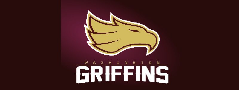
2. In the logo contest sponsored by 99designs, the winning names were one of the  following: Washington Warriors, the Washington Renegades and the Washington Griffins.

• The Washington Warriors designed by Mixaurus is a very fitting name for the football team in the U.S. Capital. Really? And how do you think that name will play overseas? Think the State Department or the Defense Department will like that one? And does anyone else find that this reminds them of the Pentagon’s 911 memorial logo?

Washington Warriors Logo

• The Washington Renegades. Do you suppose that is referring to the Tea Party elements in the recent budget negotiations?

Washington Renegades Logo

• The Griffins?! Really?! Well, I guess it goes along with the Wizard theme

Washington Griffins Logo

3. The creative brief given to the hordes of designers that entered is a great example of why you should never ever go to an organization that cares less about delivering up a quality brand, and more about generating buzz. “The Washington Redskins are a professional American football team based in Washington, D.C. They’ve won 5 NFL Championships, 13 NFL divisional titles, and 6 NFL Conference Championships – so they’re kind of a big deal. ….Our goal with this contest is to rebrand the franchise based on three different name suggestions with a logo that’s a little more PC. And to have fun with it!” Not sure about 99, but normally there is a stringent creative brief, and having “fun with it” is fine as long it is on the mark!

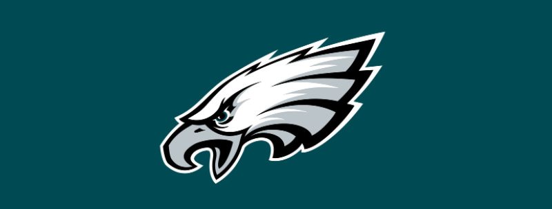
4. 99design’s image suggestions direct the designers to try to use an American infantry soldier with a GI combat helmet, a curly R for the Renegades (go figure that one out!) and a part eagle, part lion for the Griffins…and looking at the marks submitted, I guess the designers have no idea of the rivalry with the Philadelphia Eagles. More important, there  is little consideration on what might sell, what might inspire fans, and what might offend various constituencies. Having a white man in a helmet….I don’t think so.

Washington Warriors Logo Alternative

5. If you think that a brand is created only by a logo, well, you know even less about logos than these designers know about football. The Forbes list has valued the Redskins brand at $145 M. And you can bet that lots of those zeroes come from merchandise. I simply can not see fans shelling out lots of bucks for a curlicued R.

6. So many of the comments on the 99design site ask if it is possible to play around with the colors. Lindajo asks, “So if they aren’t the ‘Redskins’ anymore, can the colors be purple and gold or orange and blue or whatever?” Obviously Lindajo has never rooted for a college or NFL team, but colors are kind of sacred. Can you imagine Ohio State changing their logo and colors to brown and orange? How about if we make the Eagles pink and purple to mix things up?! Not!

Philadelphia Eagles Logo

When design organizations, freelancers, or crowd sourcing logo sites do not follow a coherent process, they end up with third-rate work, no strategy, and a poor outcome. Brands are carefully orchestrated, and sports brands have an often irrationally fervent fan base…which is why we are in such a pickle over the name Redskins. If this was not a sports team, if it was the name of a clothing brand, I dare say the name change would have been made a long time ago.

The power of together

It’s a simple idea—and it works because it’s so well executed. Petco, one of the country’s largest specialty retailers for pet foods, supplies and services, is launching a $15 million marketing campaign this week with a new tagline that beautifully articulates the organization’s brand focus. “The Power of Together” is defined in a new TV spot that explores our relationships with our pets. And in the opinion of a brand strategist with two canine kids, Petco nailed it.

The spot reminds us why we love our pets and how they enrich our lives. Brilliantly produced, it leverages the look of home video, so every vignette feels genuine and intimate. Every moment reflects our experiences as pet owners. And the simple voice-over underscores how we feel about our animals.

This direction is a marked departure from Petco’s previous tagline, “Where The Pets Go,” which lacked any emotion, and added zero value. Even the subsequent revision to “Where The Healthy Pets Go” was doomed because there was never any clear demonstration of how shopping at Petco was a healthier decision for your pet. Advertising never addressed it thoughtfully, and in-store programs like WholePets (complete care for your pet’s health) were never well-promoted.

Petco Logo

If this new spot is any indication of how Petco intends to proceed, I believe the brand will emerge a clear winner over the competition, and a go-to resource for pet owners.

So cheers to Petco. Now that you’ve found your focus, here’s hoping this new corporate mantra informs how you market, how you sell, and how customers experience Petco online and in-store.

ThinkAdvisor rebrand

As a strategist operating in the world of financial services, it is not unusual for me to look at the delivered content of three or four financial sites a day—most of them full of interesting information, but not very easy on the eye. I can usually navigate around them without difficulty, but none of them would win awards for online acumen or branding know-how. So, I was particularly pleased and surprised to see that one of my daily sites, AdvisorOne.com changed its brand, name, positioning line, logo, and site to ThinkAdvisor.com. A notice at the top of the home page clearly establishes the purpose of the site: “a complete professional development and thought leadership destination for financial advisors.” Editorial Director of Summit Business Media Jamie Green states:  “ThinkAdvisor.com is more than just a new name. Advisors are busy, but they’re also very thoughtful people. ThinkAdvisor.com goes beyond a news focus to a complete professional development and thought leadership destination, with tools and resources to help them succeed in running their businesses and serving their clients.”

Think Advisor

I think the new name and logo are huge improvements. AdvisorOne had no attitude or presence and the old logo cried out for a redesign. The simple, type-only logo is strong and elegant, and reinforces the mission of the online publication by bolding the word, “Think.”

AdvisorOne on Ipad

While the new site will probably not win any digital design awards, it presents information in a clear way, and allows one to sort resources which are helpful. More consideration should have been given to the treatment of the material below the fold. Scrolling down, there are categories of information that seem to be strung together with little thought or logic. The new site is responsive so it scales to whatever size screen it is viewed on—from a smartphone to tablet to a full size monitor. And it is clear that some viewing ratios look better and more logical than others. The publishers have thoughtfully provided an introduction  to the new site and where to find favorite features. And the daily and weekly digests are clear and easy to scan.

Think Advisor on Iphone

The new brand refresh sets a higher standard for financial pubs. RIABiz, Financial Advisor, and the like: It’s time to look at your own brands and see if they pass muster.

Nike, don’t cut and run.

I am no fan of Lance Armstrong. I hate the fact that he instilled so much hope among cyclists and cancer patients, and then betrayed their trust by continually lying about doping charges.

I am, however, a fan of Nike—one of the smartest brands I know. The company has created a brand that is about so much more than selling sneakers and athletic apparel. It’s a brand synonymous with persevering to do one’s best—it is a brand that is about being at the top of the game and excelling.

So it was with a mixture of sadness and understanding that I read that Nike is pulling the plug on the Livestrong sportswear line. I understand that Nike wants to distance itself from the Lance debacle, but in doing so, they are dismissing the tens of thousands of cancer patients that were helped by the Livestrong Foundation.

The Livestrong Foundation has had a long and successful partnership with Nike. Since 1996 the Foundation has sold over 80 million yellow “Live Strong” wristbands, keeping 77 cents for each one sold. Successful? You do the math. Their theme of empowerment has positioned  the duo, Livestrong and Nike, in a good light—yet the dissolution of the partnership seems punitive to an organization that has been distancing itself from Armstrong over the years. CEO Doug Ullman stated in an Inc. article: “We were so fortunate to have created and developed Livestrong through months and months of focus groups with cancer survivors. They were the ones that really came up with and developed the brand initially in 2002. The whole idea of [Livestrong] had nothing to do with Lance’s name. It was literally survivors saying, ‘That’s what I aspire to do. I want to live strong after my cancer.'” A CNN report quotes  Stacy Palmer, the editor of The Chronicle of Philanthropy as saying, “The organization has done a lot to separate itself from Lance’s image over the years. As a result, many people identify it as a cancer organization, which is why it’s not already crumbling.”

Livestrong Wristband
Nike developed the yellow Livestrong wristband in 2004 to raise money and awareness for the Livestrong Foundation, which provides support for people affected by cancer.

As one of the best examples of cause-related marketing, the Livestrong brand has adopted classic branding strategies that have catapulted it over many disease-related organizations. Their naming convention, with the one exception of the Ride for the Roses, consistently places Livestrong into every event: Team Livestrong, Livestrong Care Plan, Livestrong Summit, and Livestrong Young Adult Alliance to name a few. Their signature yellow and black color palette is widely recognized, and from their very inception—with a little help from Nike—they were masters in attracting high visibility.

I can understand that Nike is making this decision based on numbers. Apparently the public is running away from the Livestrong brand and voting with their footsteps. But why throw the baby out with the bathwater? Distance your brand from Lance Armstrong, but keep your support for an organization that embodies all of the brand attributes that are accredited to Nike. Both organizations have taught that there are rewards for persevering against the odds. Now is not the time for Nike to run for cover. It’s the time to step up to the plate and stand your ground. After all, isn’t that what Nike is all about?

Abercrombie & Fitch: solid marketing or marketing faux pas?

In the interest of full disclosure, I am heavy—definitely overweight and probably have been all my life—except for the four months leading up to my wedding. So it is with a biased perspective that I read of Abercrombie & Fitch’s position towards fat people. According to an article in Business Insider, this clothing retailer does not want to sell its clothes to overweight women or men. The CEO, Mike Jefferies, has been given a lot of flak for stating that he only wants to sell his clothing to “cool kids.”

“It’s almost everything. That’s why we hire good-looking people in our stores. Because good-looking people attract other good-looking people and we want to market to cool, good-looking people. We don’t market to anyone other than that,” said Jeffries.

Ambercrombie & Fitch Stores
At Abercrombie & Fitch, women’s sizes stop at large, though men can get extra large and double extra large.

People are up in arms over his statement, and while I would never be caught dead in an Abercrombie & Fitch store—and apparently they don’t want me in their stores either—this is nothing but good positioning and a solid marketing strategy. Knowing that you can not be all things to all people is the benchmark of intelligent positioning. In retail, there are tons of examples of brands that clearly define their audiences from Forever 21 to DTLR. You will never see an ugly person in a Ralph Lauren broadside and Lily Pulitzer ads did not feature inner-city youth. In all of these cases it just was not their target market.

Looking at the plethora of comments to an article, Abercrombie & Fitch CEO Explains Why He Hates Fat Chicks, the vast majority of them are negative. But one particularly astute comment that stood out among the bashing.

Devon Houston, the CEO at True Artist Productions, comments, “It is a marketing strategy, but it being a marketing strategy does not make it a smart move to openly insult or discriminate openly against people that you sell to.”

Understanding and focusing on a niche audience is smart. Crowing about it in a public forum is not.

For love of a bargain

“The new JCPenney is an injustice to middle America. The stores look like they are going out of business. Their most notable product lines have vanished, and the walls, shelves, and racks are depleted, stark, and sterile. Survey your customers and respond to their feedback. The board of directors needs to wake up. New is less and the old is more!” —Kathy of Maryland on February 4, 2013

Poor Ron Johnson, CEO of JCPenney. He is getting his pay cut for not being able to transform the JCPenney brand from a lackluster player to a Target-like phenome. And it has not been for lack of trying. First, there were three new logos in three years, all met with a certain amount of indifference. There was a new brand statement: Every initiative we pursue will be guided by our core value to treat customers as we would like to be treated—fair and square. (One of the new logos is a square that clumsily alludes to Fair and Square.) There were the new stark interiors and new mobile checkout units instead of cash registers. And most importantly there was a new pricing strategy—the launch of the new Fair and Square deals—no sales, no haggling, no coupons, no weekend specials. Trouble is, that their customer base really liked shopping for sales, and really liked bargain hunting.

JCPenney Logos
JCPenney has experimented with various different logos over the past several years.

By August 2012, according to Bloomberg Business, “Same-store traffic and sales fell dramatically for a second quarter, indicating—not surprisingly—that JCPenney ’s strategy misfired.” Ron Johnson’s answer was, “While we have work to do to educate the customer on our pricing strategy and to drive more traffic to our stores, we are confident in our vision to become America’s favorite store.” Well, it seems that loyal  JCPenney clients were not happy with the new changes. A selection of comments from Consumer Affairs show how angry their customer base is.

“Big CEO person, change it back! Your way is not working. Everybody I know who used to shop there complain about the selection and how much they hate it! We want our old JCPenney back! I am sure your higher ups have to see a drastic decrease in sales since your new buyer personnel has come on board. Change it back!”

“Yet, the majority of us who used to shop there have no products to choose from. Your large women department is a joke. My husband can’t find the brand of pants he used to buy in your store. Your linen department got rid of American Eagle and sold a substandard Penney’s brand now. There are more employees than shoppers. I have money and I plan on spending it, just not in your store. You have become the Kmart of retail stores.”

“I am (was) a loyal JC Penney customer. I am 54 and ex-New Yorker who spent zillion hours shopping in my life while always hunting for a good sale, a good sale, which is something you took away! Why did you allow this to happen? Why did you stop the fun sales? You allowed this non-retail person to end fashionable and affordable lines for ladies (who are not 15 and a size 0).”

Brand, know thy target. JCPenney’s loyal customer base is not the teeny bopper set. It is generally older, with some disposal income, used to shopping sales, and comfortable with many of the once familiar brands the store used to stock. With the new move towards a younger demographic, older JCPenney brand loyalists feel disenfranchised and they are vowing not to return to the brand. And new partnerships with designer brands like Michael Graves, Martha Stewart, and Jonathan Adler are too much like a Target-wannabe for my tastes.

One of JCPenney's New Bag Designs JCPenney launched a new brand identity last year, introducing different product mixes, a new pricing strategy, and re-inventing their in-store experience with everything from signage to displays.

Solid brands form lasting impressions—and whether you are a JCP devotee or not, it is almost impossible to do a remake of an old brand overnight. Changing product mixes, developing a new pricing strategy, AND not allowing the customer base to adapt to it, learn about it, weigh in, is not wise. If in-depth research was not commissioned before the JCP remake, then the CEO and his marketing team should be fired. If focus groups were not asked about the new interiors, then the negative backlash the company is experiencing should come as no surprise. One has to wonder, if indeed Ron Johnson wanted to recast a retail environment for a completely different demographic, should he have lost the JCP brand entirely and launched a completely new retail brand? And perhaps the biggest takeaway Johnson should learn is that it is one thing to mess with a store brand. It is quite another to mess with a pricing strategy.

Shoppers take pride in their “salesmanship”—their ability to save, to get something for less, their acumen at bargain hunting. Witness the success of Marshalls, T.J.Maxx, and Nordstrom Rack—all based on the love of the hunt for a deal. While JCP is now backpedaling on their fair and square deals, it will take a lot more to get shoppers back into the doors of this retailer.

JCPenney Store
JCPenney implemented a month-by-month, shop-by-shop strategy to update all stores with new merchandise and presentation.

Grafik
Privacy Overview

This website uses cookies so that we can provide you with the best user experience possible. Cookie information is stored in your browser and performs functions such as recognising you when you return to our website and helping our team to understand which sections of the website you find most interesting and useful.