The most frustrating (and also refreshing) thing about a good website is that it is never truly finished. Just as your business or organization continues to evolve over time, your digital presence should evolve to meet changing user preferences, content needs, design and device trends—without having to reinvent the wheel each time.
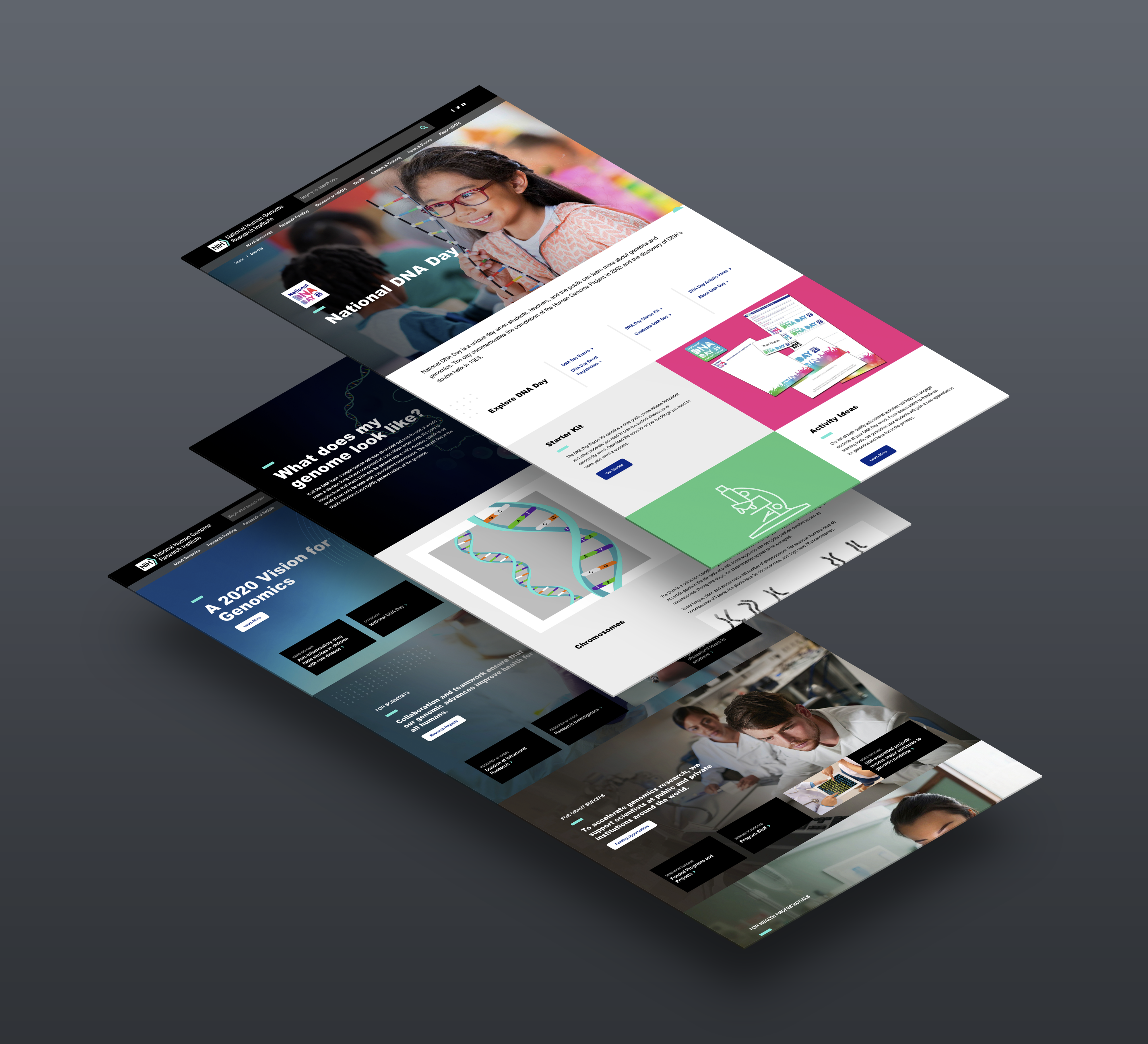
As we prepared to launch a new website for NIH’s National Human Genome Research Institute this past year, we at Grafik were particularly focused on this idea of “perpetual beta.” The NHGRI site houses thousands of pieces of academic research and educational resources related to the field of genomics, serving as a comprehensive library for scientific concepts ranging from evolution to adaptation and DNA. On their previous site, there was a prevalence of content that was outdated, uneditable or impossible to find. Our challenge was to build a more scalable site—one that could disseminate the Institute’s groundbreaking research and information to target audiences within the scientific, education, health, and public communities for generations to come.
Here’s how we ensure a site like NHGRI’s will be sustainable and adaptable over time:
Think beyond the traditional information architecture. Because our research showed that NHGRI’s many different types of users had a broad range of intersecting information needs and vastly different levels of expertise, we decided that a traditional information architecture (often oversimplified and visualized as a tree, with nice, neat categories of content) would not be a scalable or user-friendly solution. Instead, we recommended a search-first site, with a system that directs users to type in their queries on the NHGRI home page to find the results most applicable to them. We added in the ability to refine search results by audience, topic, subcategories, and more so that users can easily access decades worth of research and tools without having to navigate through an overly complicated navigation menu.
To best organize all the different types of content on the site, we used a content management web platform to ensure content was updated, rich with images, and categorized to appear in search queries. Achieving this experience required a heavy strategic lift during the content strategy and SEO phase of our project to understand and recategorize the content from research abstracts and papers to webinars, symposia, videos, fact sheets, educational resources, and more.
Consider a flexible website development strategy like atomic design. For a site of this magnitude, Grafik designed various components to act as lego blocks that could be mixed and matched to allow NHGRI’s content editors maximum flexibility while ensuring that each individual page could be customized for its own character and content flow. An atomic design methodology supports breaking a large website into its smallest pieces to maximize efficiency throughout the site. This flexibility and efficiency allows for effective customization without the added costs and parts.

Build a site that’s within the capabilities of your technical team to maintain. Grafik and NHGRI’s Development teams worked together to build the site, implementing various integrations, bridging references throughout the site to one another (something that we refer to as “interstitial tissue” here at Grafik), and checking for compliance, readability, and optimized user experience along the way. Our teams mapped all of the old pages of the site to new pages, ensuring that each old page would have an updated mate on the new site.
During the Implementation phase, Grafik and NHGRI migrated content, tagged each page with keywords and terms for search functionality, user tested the site with a network of supporters at NHGRI and Grafik, updated and fixed bugs, and ran the gamut of edge case test scenarios to ensure that the final site would fulfill the vision that we all imagined more than two years ago.
And because we co-developed the site, the NHGRI team is well equipped to call this site their own as it grows and evolves with NHGRI and new technology. The site continues to evolve as we monitor user interactions to inform decisions on incremental growth. This analysis is just a part of how we’ll continue to help NHGRI audiences find answers to their questions in even faster, better, and easier ways. After all, we’re never really done growing, improving, and evolving.