Ligado
Making stronger connections
Reliability. Security. Capacity. These were the most important themes for a satellite network service that had a vision of delivering next generation connectivity. Working closely with the client to guide them through a robust rebranding effort that spanned strategic planning, naming, testing, logo and visual identity development, as well as launch of a new website design, we wrote a new chapter in the company’s history and launched Ligado Networks.

Brand strategy
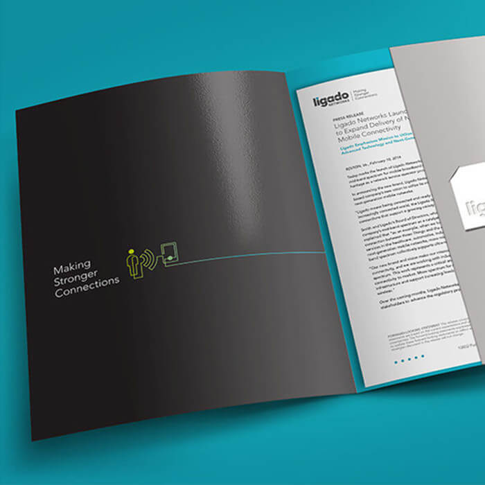
The name Ligado—the clear winner of all the names tested—is Portuguese and Spanish for “switched on” or “connected.” The Mantra we developed, “making stronger connections,” describes how their technology benefits customers and speaks to the relationships they foster with partners. Together, these brand elements provide a framework for storytelling.

Brand identity
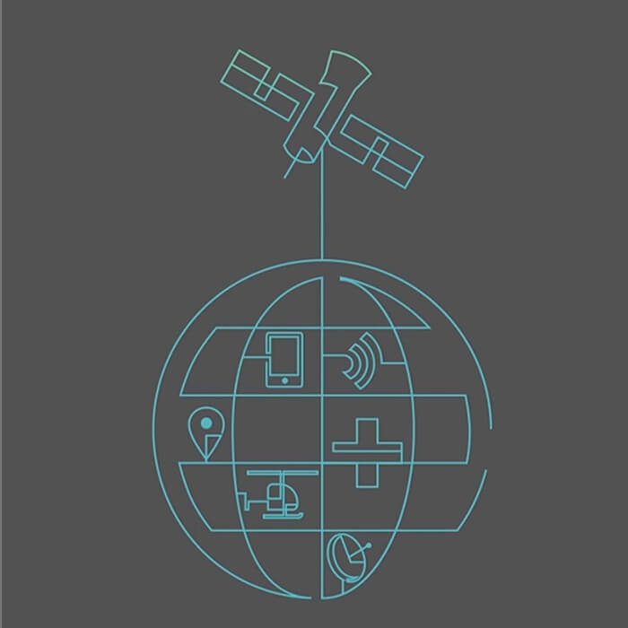
To bring Ligado Networks to life, we created a new visual identity and design vocabulary that would emphasize connectivity. We then applied the new identity across numerous brand elements, incorporating visual components and revisiting existing language to quickly communicate their offerings.
Read more about the rebranding effort here. You can view the full Ligado website at this link.


