Great logos defy trends, endure, are memorable, and serve as the visual shorthand for their brand. However, logos are also expected to remain relevant within their cultural context. This is a tricky tightrope to walk. Customers often form emotional connections to logos; when companies dare to update theirs, a predictable uproar follows. In May 2016, Instagram transformed their logo to reflect the evolving nature (and young age) of its users and the internet completely lost it. But, as my colleague Scott predicted, after just a few weeks of using the new icon on their phones, people forgot the change even happened.
Reflecting on that particular logo evolution got me thinking about how designers, traditionally, are taught to approach logos. What if rather than thinking about logos as fixed and static, finite pieces of branding that need a whole refresh down the line, we look at logos as living, breathing branding that constantly changes and evolves from the very start. We already approach websites and other user experiences with this perpetual beta strategy, so why not logos?
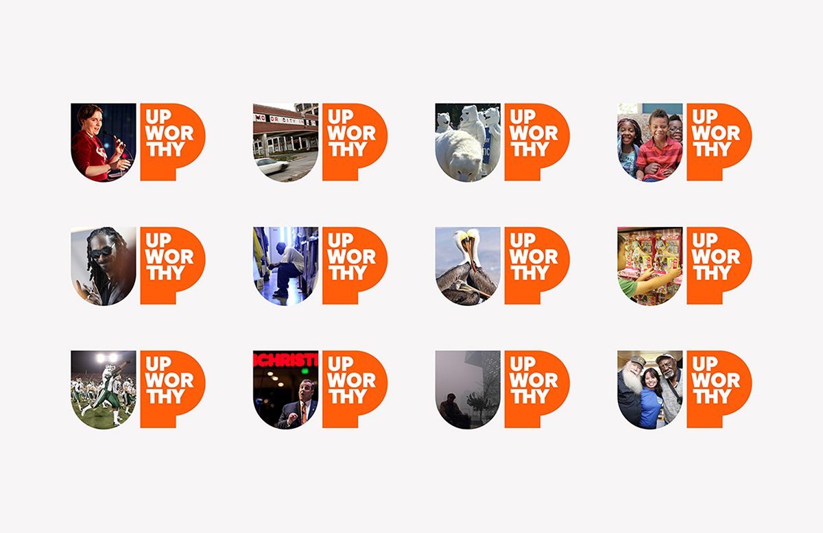
Some brands are already creating “living logos” that transform infinitely to reflect the rapidly changing culture we live in. But for these living logos to succeed, there must be constant visual cues within a rich visual identity so customers can still recognize the specific brand. Design icon Michael Beirut calls such logos “consistently inconsistent.” Indeed, in Beirut’s identity for the media company Upworthy, the logo shape is fixed, but new visual content continually inhabits the “U.”

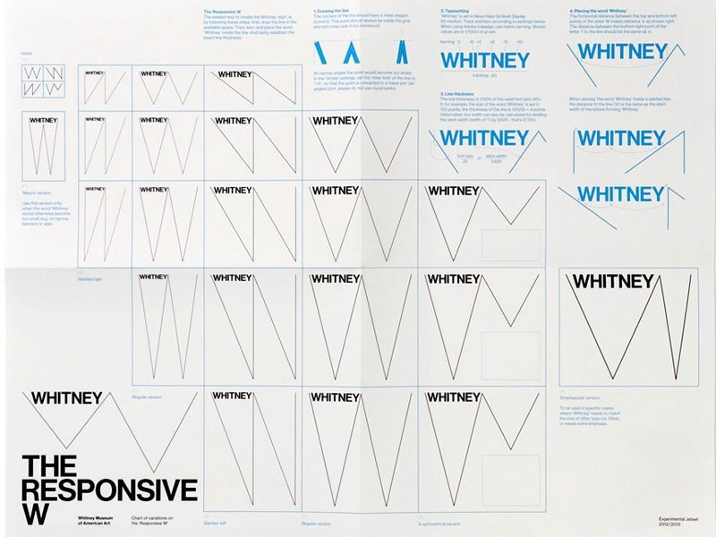
Design studio Experimental Jetset designed a “responsive W” for the Whitney’s new visual identity. The logo contracts and expands as it adapts responsively to the context it appears in, but always appears as a thin hairline with the name “Whitney” locked in the upper left-hand corner.

Google famously replaces its logo with an illustration or animation to celebrate a holiday or topic, but does so consistently by spelling out “Google” horizontally and placing it in the same spot.

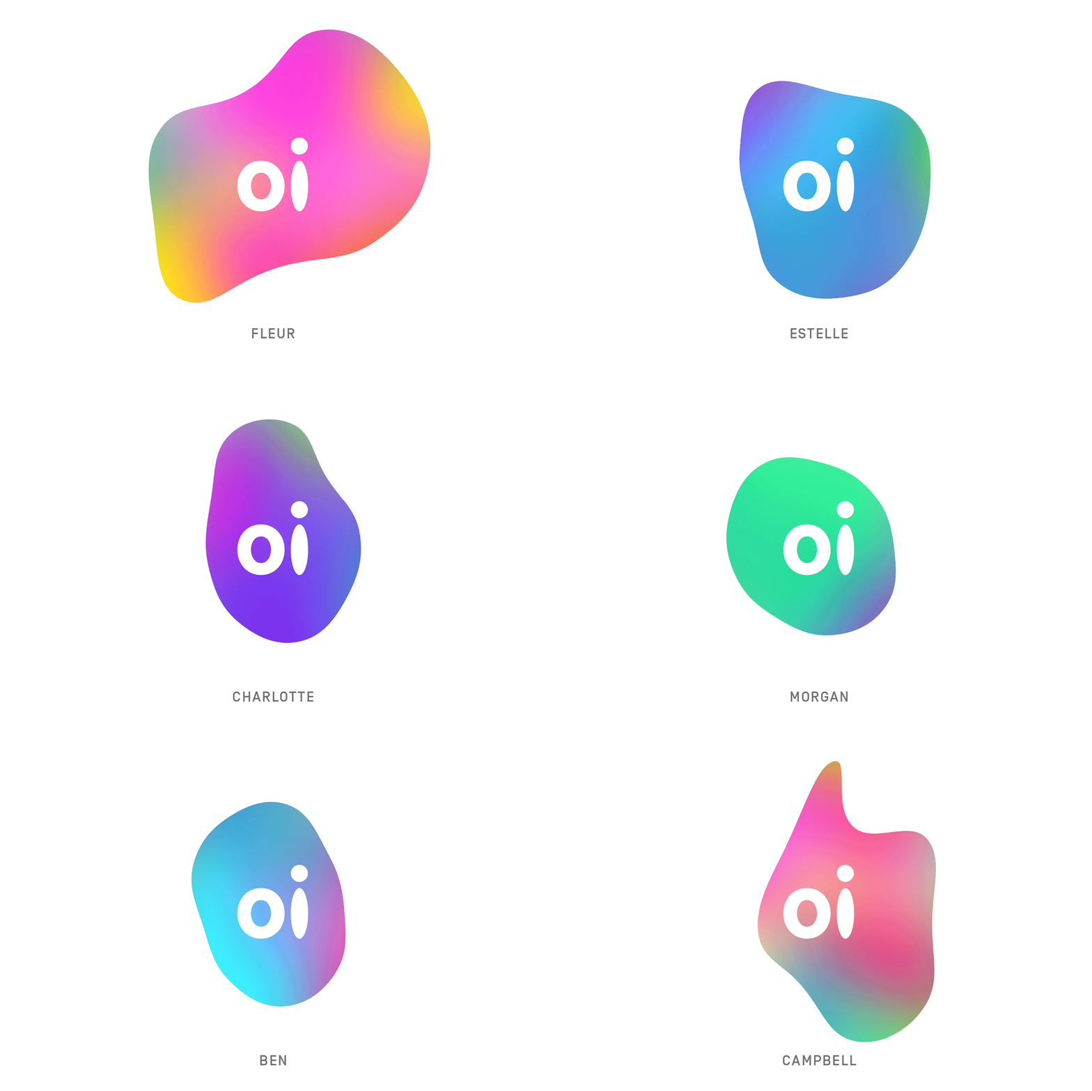
Oi, a Brazilian telecom company, took it a step further and developed an interactive approach to its logo. The logo is a shapeshifting mark that allows anyone to animate it with the sound of their voice or music. The result is an infinite array of logo marks as unique as each of Oi’s customers. In Oi’s case, the name Oi is a fixed logotype, set in the same place, while the shape, in the same color gradient scheme, shifts and morphs around it.

As customers increasingly engage more with brand and, in turn, shape their own unique experiences with each brand, it’s entirely plausible that purely static logos will become a thing of the past. This doesn’t mean that traditional logos will be one more casualty of the digital age. The creative process remains the same—logo design begins with a concept and is driven by designers playing (smartly) with shape and form. Living logo systems simply allow logos to be more engaging, customizable, and relevant wherever and whenever they appear—a win-win for all.