In B2B, complexity is often unavoidable—technical products, long sales cycles, multiple stakeholders. But complexity doesn’t have to mean confusion. The right user experience (UX) strategy can simplify how your audience engages with your brand online.
Great UX doesn’t just look good, it helps your customers understand who you are, what you do, and how you solve their problems. Through intuitive navigation, smart information architecture, and purposeful design, we reduce cognitive load and build user confidence.
Understanding the B2B journey
Unlike B2C, the B2B user journey is rarely linear. A single purchase decision may involve procurement officers, end users, legal teams, and senior leadership. Each has distinct goals and informational needs. A good UX strategy maps those needs across stages—awareness, consideration, and decision.
We often start with user journey mapping exercises. For instance, we might identify a pain point for procurement officers: difficulty comparing product specs across a catalog. For end users, it could be lack of how-to content or demos. We then shape UX solutions—comparison tables, expandable content modules, and rich media assets—to address these gaps.
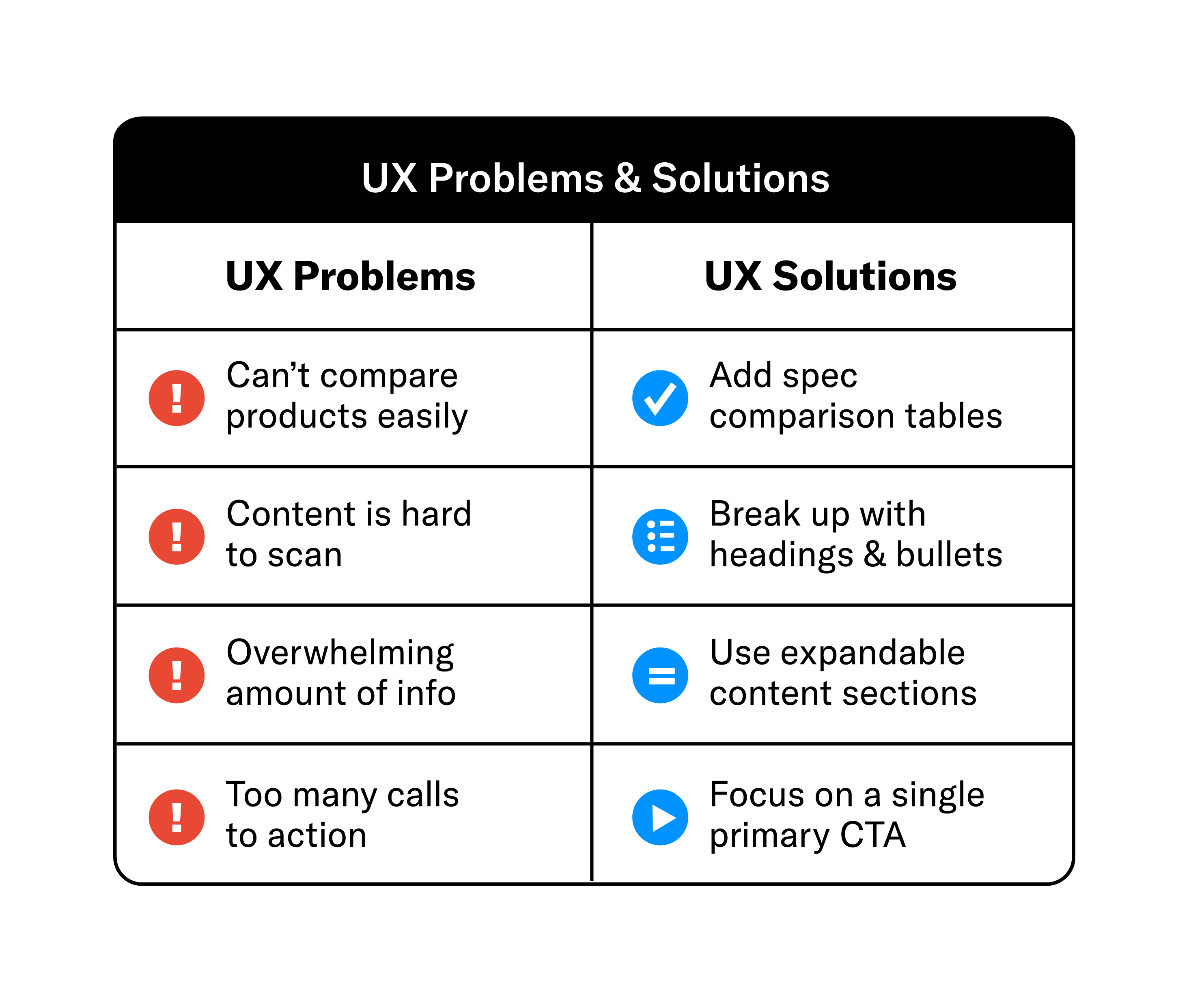
UX in action: a real-world example
We saw this challenge in our work with Aireon, whose platform delivers highly complex, global aviation capabilities to a wide range of stakeholders. The original experience made it difficult for users to quickly understand what Aireon does, how the technology works, and why it matters—especially for visitors evaluating the solution from different perspectives.
By mapping primary user journeys and simplifying the information architecture, we restructured the experience to prioritize clarity over volume. Using progressive disclosure, we surfaced essential concepts first, then allowed users to explore technical depth as needed. Navigation and calls to action were aligned with user intent, reducing friction and helping visitors move through the site with greater confidence—without oversimplifying the sophistication behind the technology.
UX best practices for B2B sites
- Clear, hierarchical navigation. Users should always know where they are and where they can go.
- Content chunking. Break long content into digestible blocks with headers, icons, and visuals.
- Responsive, accessible design. Mobile usability and ADA compliance are non-negotiables.
- Intent-driven CTAs. A single, relevant next step is better than a wall of buttons.
- Data-driven improvements. Use heatmaps, scroll depth tracking, and feedback loops to fine-tune.
Journey mapping deep dive
In a typical project, we create journey maps for each key persona. These maps detail:
- Touchpoints. Where and how users interact with the site
- Goals. What they’re trying to achieve at each stage
- Questions. What they need answered before moving forward
- Actions. What are the ultimate CTAs and actions we want these users to take
We then align UX solutions to each step. For example, early-stage content might include product overviews and thought leadership, while late-stage users see technical specs and ROI calculators.


At Grafik, we bring clarity to complexity. Our UX work starts with stakeholder workshops and audience research, and ends with digital experiences that are intuitive, accessible, and conversion-focused. Because if users can’t navigate your site with ease, they won’t stay to learn what makes you different.