After absorbing their existing research, we conducted internal and external interviews with stakeholders on the Hill, the media, and C-SPAN’s funders. What we found was universal agreement that C-SPAN is more relevant today than ever before, and a desire to see C-SPAN toot their own horn a bit more.
C-SPAN
Refreshing an iconic brand
No other entity is so often parodied with so much fondness. C-SPAN is like your straight-laced aunt everyone loves precisely because she is so straight. You don’t want to change her, but you’d love the chance to go through her closet and “retire” a few outfits.
We were thrilled when this stalwart of American media asked us to freshen up their look as they approached their 40th anniversary. The challenge was to ensure that the essence of C-SPAN—what makes them so iconic—remained.
In their own words
Hear how we formed a true partnership with the C-SPAN team, and the unforeseen positive outcomes that grow out of such deep involvement.
A cohesive logo system
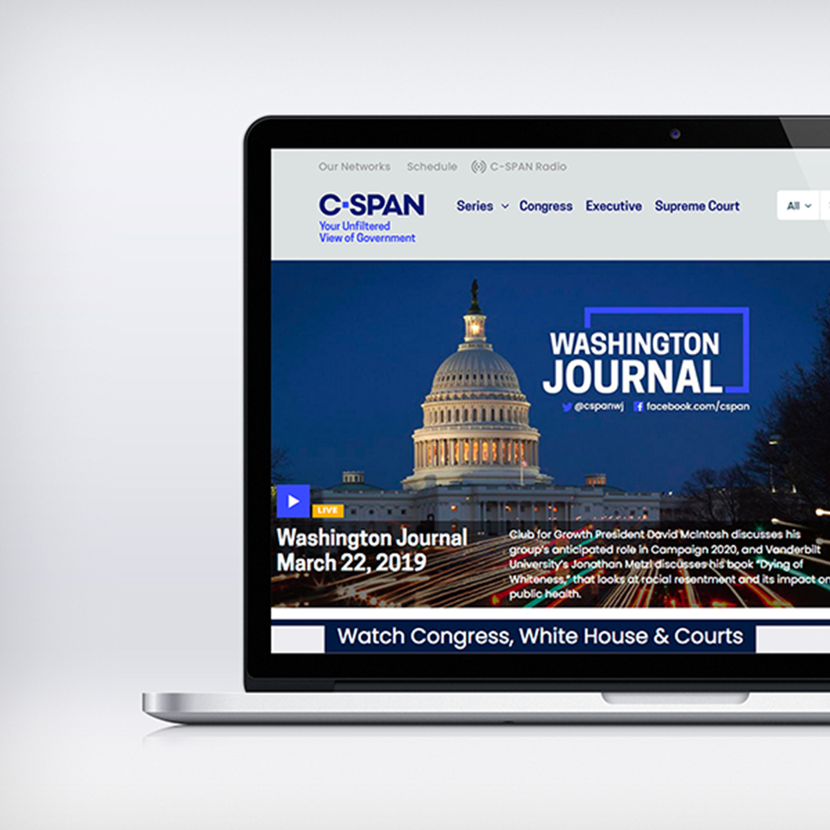
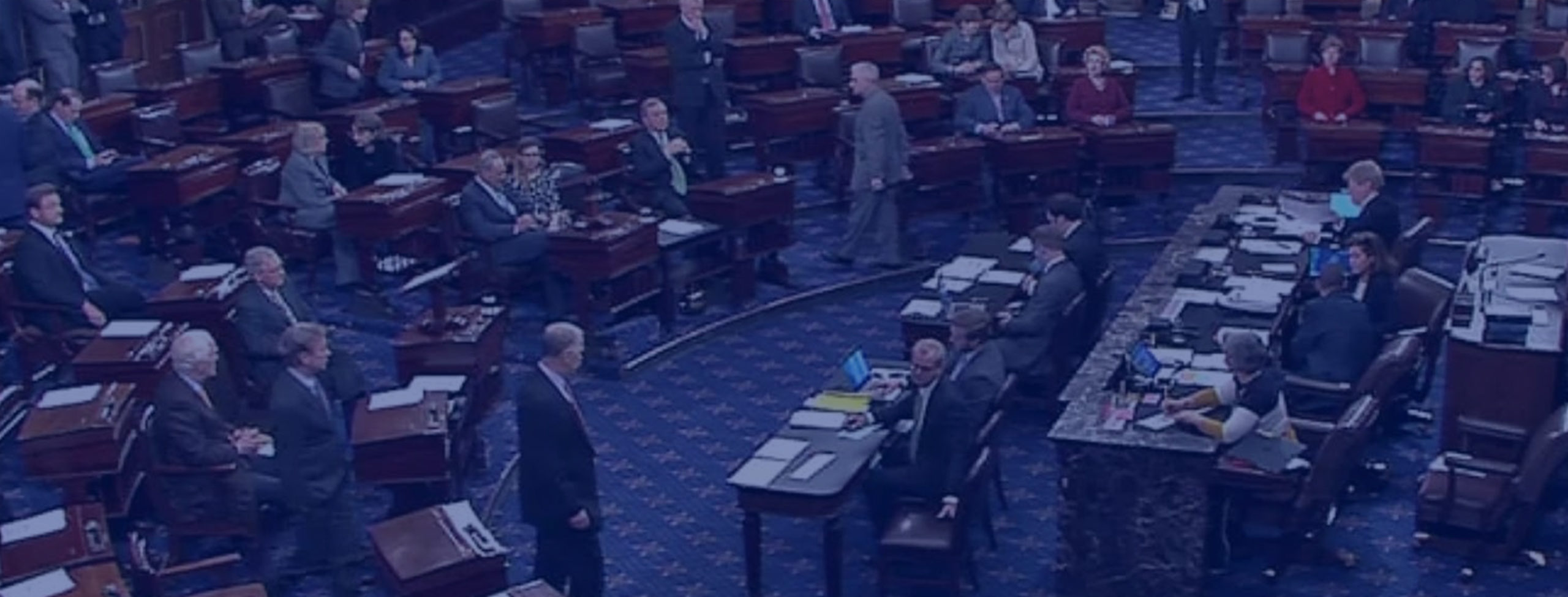
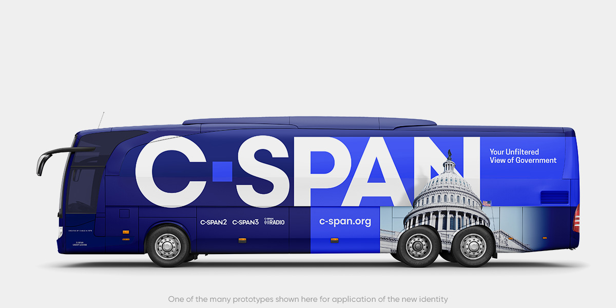
Far more than a single channel covering the House, there’s also C-SPAN2 & C-SPAN3, original programming like BookTV and American HistoryTV, the C-SPAN Radio mobile app and, impressively, an archive—searchable and editable—of nearly a quarter million hours of broadcast video. A new visual identity needed to work seamlessly across this entire landscape—on air, online, and in print.
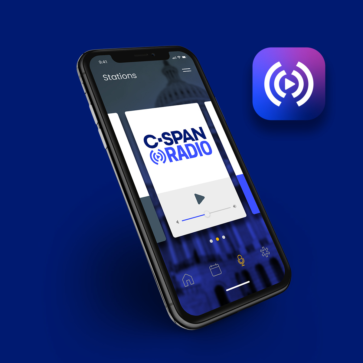
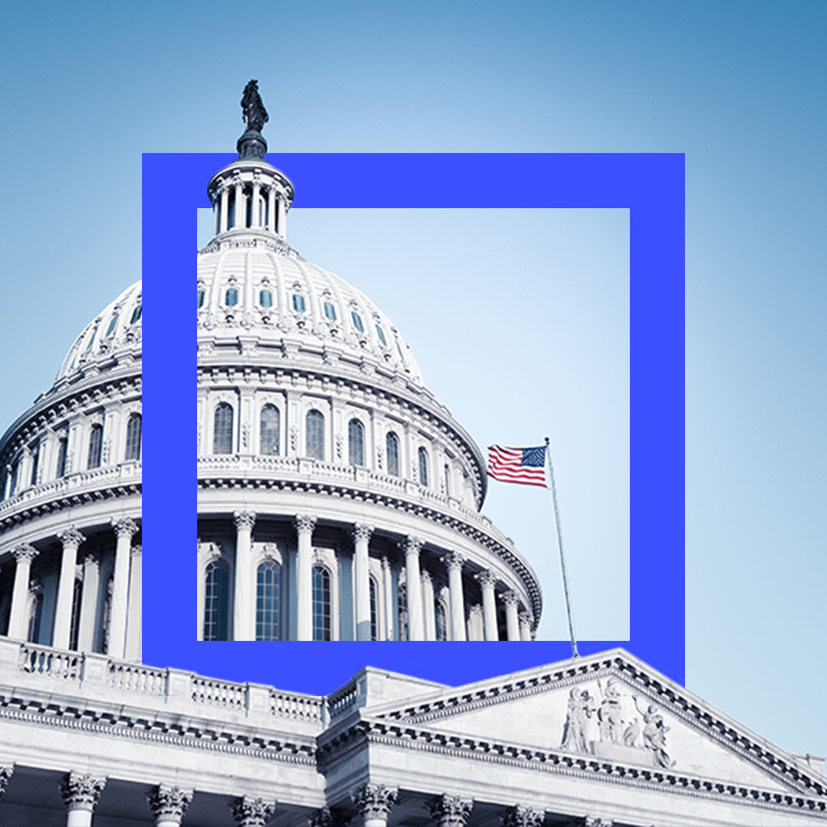
The most visible part of the refresh—designing a new logo—appears to be a straightforward task. But the art and discipline of balancing letterforms and colors did not take place in a vacuum; it was part of an overall look at their positioning around the 40th year anniversary and into the future.
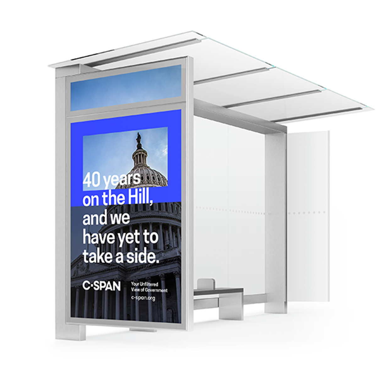
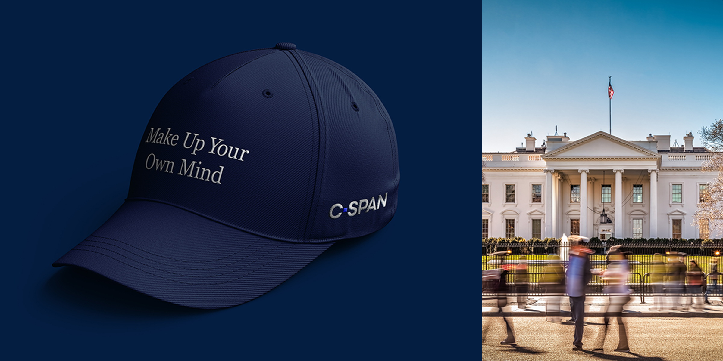
The line Your Unfiltered View of Government was adopted and introduced to remind viewers that C-SPAN is unique in its unbiased reporting. We worked with C-SPAN as they implemented the design changes across all media, revisions wholeheartedly welcomed by staff who rose to the challenge of revising hundreds of templates, documents and web pages. We also created a :30 television spot versioned for all the cable stations that fund C-SPAN, crediting their public service in making C-SPAN possible. A longer version of the spot garnered over a quarter of a million viewers in the first two weeks of the campaign as #cspan40 trended on Twitter.