You’ve probably seen the logomarks—the Good Housekeeping seal of approval, the fleur de lys from Relais & Chateau, or the JD Powers emblem. And you probably have certain emotions—even if subconsciously—attached to them. But, not much thought is given to the heavy lifting that these tiny logos have to do in the marketing space.
Like the famed Michelin stars, these logomarks often indicate that a person or business has met a specified standard, or, may signal that an organization is approved by a larger association (see the American Institute of Architects mark below). Whether it is the Heart Healthy mark that appears next to menu items that are low in fat or the Better Business Bureau’s blue B’s that give buyers confidence in purchasing a service, all of these logos have several things in common—they all have to co-exist with other brands.

Logomarks for the American Institute of Architects, Better Business Bureau, and Relais & Chateau.
This presents the designers of these marks with a lot of design challenges; they have to be recognizable, but they can’t pull rank over the major brand. Legibility is also a critical factor, as they often have to appear very small (like a union bug). And there must be an educational campaign to let consumers know what the marks stand for.
Recently the NY Times ran an interesting article on Sanitas Per Escam (SPE), which is a fancy Latin way of saying “health through food.” Founded by the lead chef Emmanuel Verstraeten of Rouge Tomate, he believes that SPE is a “promise for a unique third-party certification and consulting program designed to enhance the nutritional quality of meals, without compromising taste.” This group is trying to certify that the food that is served to you in restaurants is healthy for you as well as the environment. The meal portion is correct, it is low in fat and sodium and it is properly sourced. As the Times article says: “Their stamp will let you know that each dish is dense with nutrients—vitamins, minerals, antioxidants—and low in salt and ‘bad fats.'” In appetizers and main courses, you won’t find any cream or butter. As one promotional document puts it, “SPE dishes contain more of what you need and less of what you don’t.”

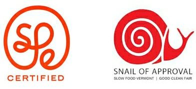
(Left) Official seal for Sanitas Per Escam (Health Through Food), a nutritional charter developed by chefs and dieticians. (Right) The Slow Food Vermont Snail of Approval, awarded to establishments that contribute to the quality, authenticity and sustainability of Vermont’s food supply.
This is a challenging endeavor from lots of standpoints—including getting chefs to let other people into their kitchens to monitor the fat count and ingredients of their creations. But it is also hard to try to get the SPE mark to stand for something. SPE would like it to mean that the food associated with this mark is not only tasty but also good for you. But this is a tall order for sure.
First of all, most people will have no idea what SPE means—and referring back to a the Latin phrase Sanitas Per Escam will not achieve the desired results since we are not a nation of Latin speakers. (In fact, there are 237 acronyms listed for SPE, and the Society of Petroleum engineers is at the top of the list. Oddly enough, Sanitas Per Escam is not even on the list.) So it forces the diner to try to figure out what the mark stands for. Secondly the mark itself is difficult to read and the letters S,P,and E are configured to look more like a brain. It is even more problematic when you reduce the mark down to a very small size. Add to that to the fact that restaurants are reluctant to add logos to their menus, and, while some have embraced the Heart Healthy logo or the Slow Food snail, how many will be willing to add yet a third mark? Already some famous chefs like Eric Ripert are dismissing the initiative and saying that putting the SPE logo next to some dishes on the menu seems to indicate that the balance of the items are not healthy, and he feels that it demonizes certain ingredients like butter, oil, or salt.

The familiar seals of approval for JD Power & Associates, Heart Healthy, and Good Housekeeping.
It takes a lot of time and effort to imprint a certification logo on consumers’ minds. So creators have to make it as easy as possible for the consumers. While SPE may be healthy for diners, one wonders if the mark might just be too complex to digest.


