Vintage Ivory soap
Okay. I freely admit that I love old packaging. My house is filled with thousands of antique tins, old boxes, and discarded packaging from days gone by. I notice packaging, so when Procter & Gamble decided to pump up the packaging and advertising for one of its oldest brands, Ivory soap, I was eager to see what change was in store.
The new campaign devised by Wieden+Kennedy is nothing short of brilliant. But the new packaging by Sterling Brands is uninspired. One has to wonder why their advertising agency did not show the new look on any of their ads, TV spots, or online placements. If you want to look at 125 years of Ivory soap packaging, Procter & Gamble has set up a Facebook page that shows all the different ways they have wrapped their pure white soap.
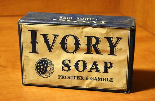
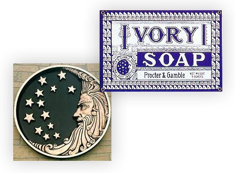
The most controversial aspect to their simple blue and white packaging was the Procter & Gamble logo which was thought to have ties to Satan.

Old Ivory soap packaging the showcased a P&G logo that was thought to have Satanic themes
For years urban legend maintained that the man in the logo was proof of the company’s ties to Satan. Supposedly the curlicues of the moon man’s beard was an array of 6’s and if you connect the dots with the 13 stars, three 6’s appear. The curlicues at the top of his head resembled the horns of a ram representing the false prophet. Eventually in 1985 the Procter and Gamble logo was taken off of Ivory soap. Over the years the Ivory logo has been modified and most recently Wieden+Kennedy modernized the wordmark. Tag lines have also changed and those in use over the years have included:
- Pure Clean. Pure Ivory.
- 99.44% Pure.
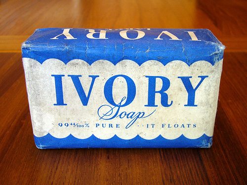
- So Pure it floats.
- Keep it pure, clean and simple
“Ivory is P&G’s oldest and most beloved brand, and while consumers relish in the nostalgia and heritage of the product, it’s time for a holistic reinvention of the brand as we work to touch and improve more consumers’ lives in more parts of the world more completely,” says Jay Sethi, Ivory brand manager. “We’ve answered the call for consumers wanting a ‘simple and clean’ solution and the most powerful aspect of Ivory still remains the simplicity of the product.” Lisa McTigue Pierce—Packaging Digest Oct. 4, 2011.
Karl Lieberman, creative director, Wieden+Kennedy, spoke about the new advertising. “Unlike a lot of other brands, Ivory has stayed true to its equity. It has remained the antithesis of the overly complicated—from its ingredients, packaging and advertising—it’s a throwback to an era where there wasn’t time for such things. And that’s what makes its new voice so refreshing.”

Ivory has changed its look over the years, but has always kept it simple.
But while Ivory has remained a strong brand since 1879, competition in the soap category has changed. The Ivory brand has been running third to Dove and Dial. (Source: NY Times, Nov. 7, 2011). Product managers felt that with the increased consumer focus on cost savings during the recession years, it was a good time to promote the Ivory brand promise of “value and simplicity.” “Renée Richardson Gosline, an assistant professor of marketing at the MIT Sloan School of Management, also predicted the simplicity of Ivory and its campaign could appeal to consumers. However, she also questioned the absence of the new Ivory packaging in advertising. ‘If you’re proud of the packaging, show it off,’ she said.”

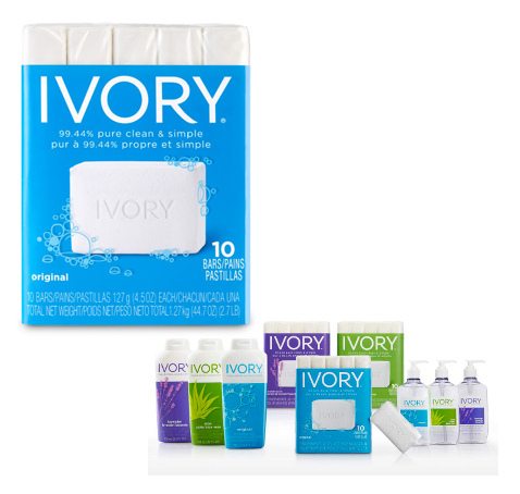
Display of Ivory soap products