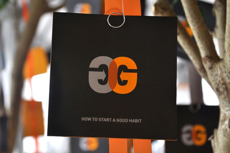
My life is riddled with the letter G. My name, Gregg Glaviano, contains four of them. My friends sometimes affectionately call me G4 or Double-G. My company, Grafik, where I’ve worked for 26 years, has a Gotham G at the center of its logomark. Why my parents gave me an extra G at the end of my name is beyond me; I’ve had a love-hate relationship with the letter ever since. As a child (and budding designer), trying to find the perfect way to sign my name was frustrating. How can I loop the second G into the first? Why couldn’t I just have one G? It would be so much nicer. Or am I just not creative enough to make a ligature of a double G that is elegant enough to stand the test of time—like the signatures of those other great artists Salvador Dali and Picasso? What’s wrong with me, I thought?
So when I saw the new Google logo, and in particular, the overhauled san serif capital G that will replace the all too familiar and “goofy” lower case serif G as its mobile app icon, I was left a bit cold.

Granted, perhaps I have G fatigue? I’ve never been successful at designing my own logo. And I’ve only designed one “G” logo for a client that I’ve truly liked—“Doing Good is Good for Business” for our client Anybill’s philanthropic program.

Google has given us sound reasons for making the switch and developed a new font—meant to resemble the simple printing in a grade school book—called Product Sans. The lowercase E is slightly tilted and edited to reflect “Google’s sometimes off-kilter thinking”. I buy it. So what’s bugging me? That perfectly crafted uppercase G.
Sure, it’s simple, clean and smart. There’s a new set of icons that will be introduced across devices to represent voice, sound and more. And it maps well to Google’s new restructuring and introduction of the holding company Alphabet. I believe this is the right idea for Google. So why do I want to ask “does G stand for generic?”
What I’m experiencing is actually very common amongst our clients when rebranding. We all have our own stories we create about the logos we must say goodbye to. Some good. Some bad. And no new logo can stand on its own without a carefully scripted brand voice and visual identity designed to support it. It’s up to us as branding professionals to craft these stories and strategically introduce them to our client’s internal and external audiences. It’s as much about developing the full brand story and a plan as it is the design.
So for now, goodbye little g. I hope this change doesn’t change your corporate motto, Don’t be evil. I’m looking forward to seeing how this new brand story develops.