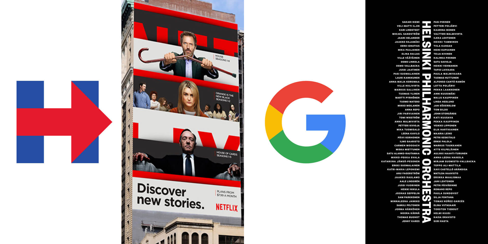
Before we settle too deep into 2016, we thought we’d look at three of 2015’s most visible brand updates—plus a less-well known favorite of mine— now that the world has had a little time to interact with them.
Hillary Clinton 2016
What’s a 2015 identity recap in Washington, D.C., during an election year no less, without a presidential candidate’s logo? The design community almost broke the internet with Hillary’s logo reveal. “Way too simplistic!” “Arrow points to the…Right! In RED!” “What was she thinking?” “Rip off of a hospital sign AND FedEx!” The armchair design enthusiasts went on and on. The über-simplistic shapes also invited the inevitable, “I could have done that myself, and for much less money!” chatter that we designers just *love*. Personally, I was ambivalent about it at first—as a static mark it’s an “eh,” but as the campaign wore on, a cool thing happened. It evolved to be a living, breathing, flexible graphic system. Those simple shapes became empty vessels, open to be filled with infinite permutations of colors, photos, and imagery to reflect the electorate, the issues, and the many audiences Hillary tries to reach.
At Grafik, we stress that a logo should not be static and that, ultimately, a brand’s success lies within its endless dynamism. This serves as a great example of how a seemingly simple mark can profoundly inform an entire graphic system and continually evolve a brand.
One of our creative directors and partners, Gregg Glaviano, wrote about the Google rebrand in September, so I will not spend too much time on it. But, I will say this — love or hate the wordmark, Google brilliantly executed a new monogram G, solving the scalability issue of their old logo. From a car to a watch to who knows what in the future, almost no other logo needs to exist across so many media and sizes. A logo system that scales from very large to teeny tiny is a complex design problem to solve. The perfectly compact colorful G rises to this challenge.
Netflix
Eight years after Obama (and just about a million other brands) made the Gotham typeface ubiquitous, I never again expected to love an identity that used it. But I was wrong. The new Netflix visual identity is super smart, endlessly flexible, and visually stunning. The “stack” motif — panels of imagery and information lying atop one another — perfectly drives unlimited dynamic content and executes Netflix’s brand promise to “see what’s next.” Of course, the beautiful imagery of movie stars doesn’t hurt. The logo refresh is a nice wordmark, but unlike Hillary’s H, it does not inform the brand. The entire visual identity system, with its endless graphic crops and beautiful executions, is what makes this rebrand so good.
Plenty of cases suggest a logo redesign is not strategically feasible, forcing branding agencies to think beyond the logo informing the brand. Netflix shows just how evocative a brand refresh can be.
Helsinki Philharmonic Orchestra
On a much smaller, indie scale, the type nerd in me is obsessed with this new identity. At Grafik we’re very familiar with the idea that a company is only as good as its people. Helsinki Philharmonic Orchestra takes this concept to the next level with their new logo. The logo is comprised of a beautifully typeset wordmark surrounded by the names of all 102 orchestra musicians. When reduced in size, the names become lines of various lengths, perfectly replicating the now familiar visual representation of sound waves. The typography is stunning, partly due to the myriad of relationships between the loud, bold headlines and the small, quiet nuance of orchestra members’ names. Along with the typography, the signature visuals are gorgeous—time lapse photographs of musicians that dynamically capture rhythm and sound in still, black and white images. The classic, simple color palette consisting only of black, white, and red goes to show how a good concept executed through beautiful typography sometimes is all you need.
_______________
I’m looking forward to seeing how these brands evolve over 2016, as well as what new inspiration lies ahead.


