Infographics have gained a lot of traction as visually stunning and engaging ways to share and communicate information online and in print. Examples of data visualization date as early as 1858, with Florence Nightingale’s “Diagram of the Causes of Mortality” and the works of William Playfair, who are considered the fathers of charts and diagrams.
Infographics are easily digestible, attractive, and memorable visual tools for communicating complex information. Clever and creative charts and diagrams make the information visually stimulating. The human brain is able to remember images easier than text, making infographics a very effective communication tool. Why are infographics so adored now? Thanks to the web and social media, infographics are easily shared, reaching massive amounts of people and telling complex stories within seconds.
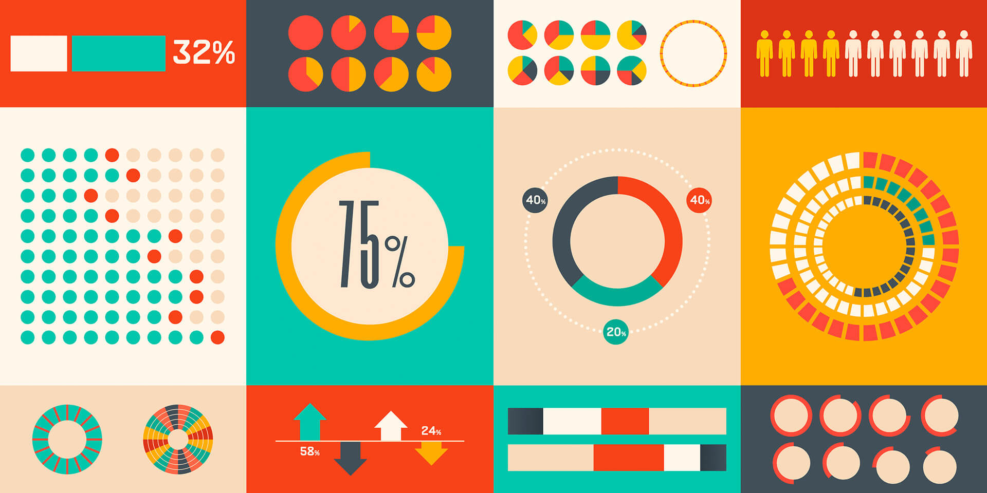
Being able to distill complex data sets into visuals that properly tell the story and are still easy to understand is a difficult skill to acquire. Below is a list of books, websites, and courses for learning the best practices to creating effective infographics. The list is comprised of educators, designers, illustrators, and companies who are producing some amazing infographics in the world.
Books:
- Design for Information by Isabel Meirelles
- Information Graphics by Sandra Rendgen
- Infographics: The Power of Visual Storytelling by Jason Lankow, Josh Ritchie, Ross Crooks
- Nigel Holmes on Information Design by Steven Heller
- Ed Tufte: The Visual Display of Quantitative Information
Websites:
- New York times Graphics Department
- David McCandeless, Information is Beautiful
- Good.is Magazine, Infographics
- Infographics works of The Design Surgery
- Infographics works of Bureau Oberhaeuser
- Infographics works of Nicholas Felton